Go Compare brand boss calls comparisons ads ‘shouty’ as he tones down Gio
The price comparison category is a loud one, filled with Italian opera singers, oligarch meerkats, wombats and talking bulldogs. But now, Go Compare wants to switch tactics and let its credentials take the spotlight.

Is it time for insurance advertising to quiet down? / Go Compare YouTube
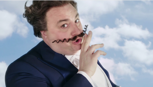
Last month, Go Compare overhauled its brand identity, advertising and, most importantly, Gio Compario, its mascot of 15 years. Marketing director Paul Rogers tells The Drum that it wanted to distance itself from its competitors in what he calls a “loud” category.
“Price comparison is one of those categories where everybody does broadly the same thing and you are all shouting quite loudly to get attention,” he says.
Advertisement
The category has four major players in the UK: Go Compare, Compare the Market, Confused.com and Churchill. Each of them is a significant above-the-line advertiser that has built brand recall from repetitive TV ads.
“We all live in a fantasy world of singing Italian opera singers and talking meerkats,” says Rogers. Compare the Market not only has meerkats in its ads but now a wombat too, while confused.com released a surreal brand platform in 2022 to make light of confusion.
“14 years ago, price comparison was a disruptive phenomenon and it needed to shout. It’s a reflection of the category and we need to grow up a little bit and say we are established now and tone it down a little.”
Advertisement
Toning down Gio Compario
Go Compare doesn’t have an awareness problem; recall rates are high, but brand awareness doesn’t equate to brand equity, says Rogers. According to YouGov, Go Compare has a fame score of 92% but a popularity score of just 53% and is disliked by 7% of the UK population.
“There is a difference between being famous and infamous. We needed to transcend some of the fun and humor that Go Compare has because I think it’s fair to say if you look at the advertising, it doesn’t necessarily shout insurance expertise.”
The challenge then was to strike a balance between showing Go Compare’s expertise without “destroying” the fun and the joy of the advertising. The big debate at Go Compare HQ then was whether Gio should get the axe.
“We’re probably all tempted at some point to go, ‘Let’s start again.’ But I look at some of the other brand mascots – the Churchill dog, Colonel Sanders at KFC, the Bird’s Eye fish finger man. They’ve all evolved over the years and there’s no reason we can’t.”
Rogers made the decision not to kill off the loved/hated opera singer but to instead turn him into a “watermark” for the brand, explaining that this means there will be a subtle nod to Gio across Go Compare’s communications to help with brand recall. “We should be able to do lots of things with him, but he doesn’t have to be front and center.”
Suggested newsletters for you
The rebrand
Go Compare tasked design agency Ragged Edge to make its advertising connect to the rest of the customer journey and co-founder Max Ottignon says adapting Gio was the hardest part of the rebrand.
“We had to take him from a character that showed up in advertising to an asset that has a really clear role throughout the experience,” he explains. The idea was to give Gio a job. Now, he shows up on the website at moments when the customer is making insurance decisions.
Ottignon then needed to find a way to make the character “scalable,” he laughs. “We had to take him from somebody who is live-action, real human being to somebody that could live in a digital product and come to life all across the experience.”
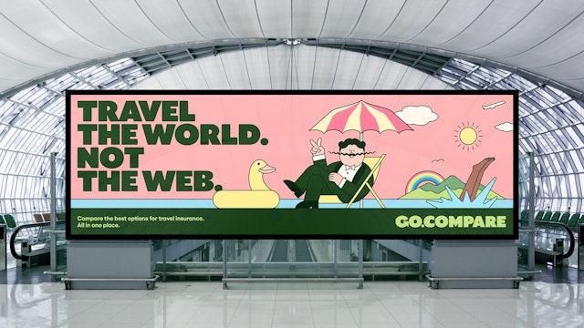
The answer was to transform Gio into an exaggerated cartoon character, but that also proved tricky as Ragged Edge’s design team grappled with what features to keep and what to exaggerate. What are Gio’s distinctive features? The agency had to ask itself.

In the cartoon version of Gio, the mustache and carefully quaffed hair remain, as do his build and bowtie. After dealing with the mascot, attention turned to the color palette, brand tone, logo, typography and advertising.
The brief then, says Ottignon, was: “How do we take all these things we’ve already got, optimize them, exaggerate them, simplify them where we can and just tell one coherent, distinctive, clear customer focus story?”
The agency wanted to avoid unnecessary changes. For example, Go Compare’s primary color is green for ‘go.’ “We’d be crazy to change that,” says Ottignon, so the green was made brighter and used across more assets.
The tone change was another challenge for the brand. The aim was to shift Go Compare’s tone to be warmer, relatable and inclusive. “We wanted to make it feel like it was on your side.” This informed the typeface, logo and cartoons.
Ragged Edge worked with an illustrator to create stories that showed different products and different insurance needs. This gave Go Compare “ownable” assets rather than relying on stock images, which often make up the bulk of price comparison sites. “It felt like a really simple way of creating distance between Go Compare and the other competitors,” adds Ottingnon.


