FSC on how it made its website as interconnected as the forest itself

The Forest Stewardship Council and MRM have won the Website category at The Drum Awards for B2B. Here is the award-winning case study.
Check the award-winning campaign here.
Forests clean our air, protect biodiversity, and provide the products that make daily life possible. Yet 15,000 square miles of forest are lost every year.
Today, FSC is the world’s leading certification system for responsible forest management. Its “check tree” label—found on millions of products worldwide—is recognized by 54% of consumers as a symbol of sustainable forestry.
The FSC system depends on a complex value chain of forest managers, product manufacturers, and retailers that follow strict sustainability standards from forest floor to retail shelf. But FSC’s front door—FSC.org—did a poor job recruiting new organizations to the cause. The site was cold and complex. Language and imagery were bureaucratic and drab. Maze-like navigation reflected FSC’s internal organization rather than user preferences. B2B audiences left the site knowing little more about FSC than they did going in—which kept them from seeking FSC certification.
Our remit was clear: Turn a complex, technical site with low user rankings into an inspirational, educational, motivational destination. Success would be measured by increased engagement: Rather than immediately bouncing, could we get more people to spend more time engaging with more content?
STRATEGY: During our discovery process, we realized that all the site’s issues had one root cause: inside-out design. It wasn’t just the navigation that reflected FSC’s internal complexities. Content, tone, and the entire structure reflected an “insider” orientation. It was a site for scientists, specialists, and policy wonks—not for organizations looking for ways to operate more sustainably and to attract eco-minded consumers. We created a simple “from-to” matrix that guided every facet of our work:
- From FSC-out to user-in
- From technical to motivational
- From fragmented to flowing
- From operations to recruitment
- From standards enforcement to inspirational leadership
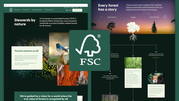
With our strategy in place, we didn’t have to look far for our big idea. Our “ah-ha” came from the source: the forest. Our goal was to make FSC.org as inspirational, useful, and seamlessly interconnected as the forest itself. Forests naturally do many of the things we needed FSC.org to do. They are extraordinarily complex but simple to enjoy. They offer both beauty and utility. They provide different kinds of value to different kinds of visitors—novices and experts, environmentalists and entrepreneurs, casual drop-ins and long-standing devotees.
With the forest as our guide, we began a complete site overhaul that reimagined every facet of the experience: information architecture and navigation, content and utility, imagery and tone, user journeys and calls to action. Making FSC.org as inspirational, useful, and interconnected as the forest came to life in many different ways:
- Aesthetic experience: We replaced a coldly formal and dense design with a rich, open, visual approach that invites users to take a breath and explore. Dark backgrounds accentuate key visuals while also saving energy, so the site is both beautiful and more sustainable.
- Navigation: An elegant “megamenu” structure lets many different kinds of users—from different industries, different parts of the value chain, needing different certification types—quickly find information specific to their interests. The megamenu combined with smart lateral linking lets users easily chart their own pathway through the site.
- Content: We replaced technical, jargon-filled pages with content written to an interested but nonexpert audience. What was coldly instructional content is now inspirational, educational, and motivational.
- Templates and content authoring: Like the forest, FSC.org is never static. We created Drupal components and content authoring tools so FSC could continue creating beautifully designed content after our initial redesign was complete.
- Accessibility: Protecting forests takes all of us,— so we needed to make the site inclusive for everyone. We’re proud that FSC.org is accessible to all regardless of circumstance.
RESULTS: By every measure, the redesign of FSC.org has been successful. Our primary KPI was engagement. Since the site relaunch:
- Bounce rates declined 98%.
- Visitors spend 49% more time on the site.
- They’re viewing 49% more pages.
In fact, FSC.org has 140% more content engagement than the average in the Green Living and Environmental sector. User studies fielded before and after the relaunch show improvements across the board. Scores across every metric—including ease of navigation, design, and content quality— increased by an average of 26%. Understanding of FSC climbed 32%, and its Net Promoter score increased 20%.