Why Deliveroo did the unsexy job of updating its brand guidelines
Rulebooks can be a bit of a buzzkill, but as the food delivery company matured, it realized it needed to go back to basics and bring its codes up to date, explains brand director Emily Somers.

Deliveroo revisits brand guidelines for first time since 2016
After a decade of growth and international expansion, Deliveroo has reached a point of maturity. But getting there required it to go back to its brand guidelines.
“That pace of growth in such a new and innovative sector has led, over time, to quite a lot of fragmentation and inconsistency in the way that the brand shows up,” says Deliveroo’s global director of brand and creative Emily Somers.
She says its brand guidelines hadn’t been updated in over seven years, which meant that “no one was following anything.”
“In any sort of startup business, that speed of growth means it’s all happening so fast. Some of those rigorous things that you do within a massive organization that has been around for the last 100 years aren’t the commonplace starting point for such a new business.”
Creating rules might be the unfun bit of marketing, Somers admits, but a framework is necessary to help give creatives a starting point rather than a “blank sheet of paper.” The latter, she says, wastes time, resources and money. “That means that you’re reinventing the wheel each time and what we needed was an ability to get to a start point immediately and then you add on the creativity, flexibility and the pazazz.”
Advertisement
The challenge with outdated brand guidelines was exposed when Somers’s team started to work on Deliveroo’s first consistent global brand positioning. There was a need for a centrally agreed identity and personality before landing on a new brand platform.
Deliveroo currently operates in the UK, France, Belgium, Ireland, Italy, Singapore, Hong Kong, the United Arab Emirates, Kuwait and Qatar. The business pushed into groceries in 2021, launching the Deliveroo Hop service to compete with the likes of Gorillas and Getir.
Without a clearly defined global personality, when Deliveroo opened in a new territory, it was up to local marketers to decide for themselves what Deliveroo stood for.
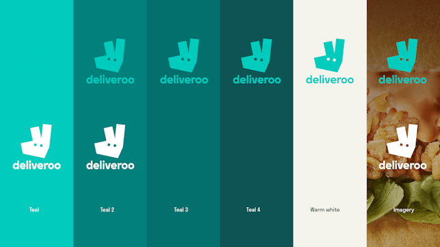
“There are certain elements of the brand that we are very well known for but were not coming through consistently in our comms,” says Somers. These included its teal coloring and ’Roo Head’ logo. “Ultimately, we weren’t being recognized enough for the money that we were spending or getting the right level of credit.”
Advertisement
‘House for teal’
Somers put Deliveroo’s global head of creative, Paul Hewitt, on the task. The problem Hewitt discovered is that Deliveroo riders (“the best free out-of-home you could ask for,” he says) were adorned in its teal and strongly branded with its name and logo, but this was completely at odds with its communications. “To have a set of marketing materials that were more premium looking, black and in a more cinematic style wasn’t adding up. There was a lack of cohesive experience.”
As a starting point, Hewitt had to decide how far to change Deliveroo’s identity, he says, keeping in mind how Coca-Cola is regularly praised for remaining the same while people question Pepsi’s ever-changing logo. “The brief, then, was to delve into what we’ve got.”
Suggested newsletters for you
Branding agency DesignStudio was behind a 2016 rebrand that introduced its now unmistakable ‘Roo Head.’ “It felt silly to move away from that, so this was really about looking at what we had, our really distinctive assets, and then building upon them.”
The decision was taken to play on the angular nature of the logo, incorporating it into the delivery map line and marketing messages.
After defining the use and the angles of the marque, the color pallet was the next element to be enshrined in its brand codes.


Hewitt acknowledges that the grocery sector is hugely color-dominated, such as Tesco’s blue and Sainsbury’s orange, while Getir, its biggest competitor in the grocery delivery game, has previously had its success put down to its dominating purple color by brand analysts.
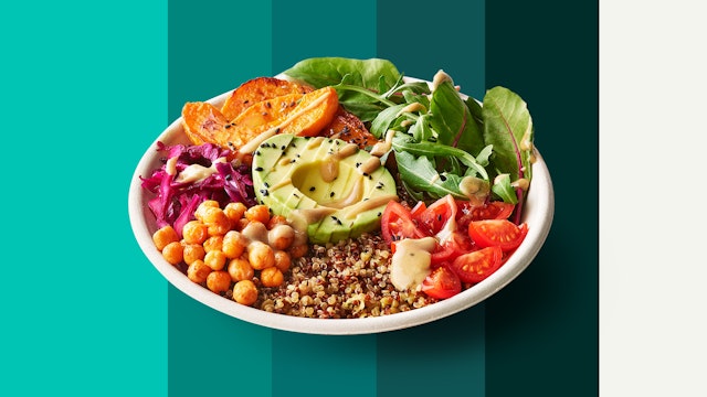
Hewitt initially tested a broad palette to reflect the colors of food but decided to reel back the range and let the actual images of food become the star. This formed the next code: “being a house for teal.“
Getting rest of the business behind the refresh
Going in-house was crucial to the brand refresh, says Somers. It required buy-in from all departments and stakeholders. “We made sure we understood all the challenges and all the different inputs at the beginning so that they all bought into the need for a solution,” she recalls.
“It’s about making people feel invested in the outcome and part of the solution as guardians and custodians of the brand, just as much as we, the brand team, are, as opposed to telling them, ‘This is our brand and this is our idea and you must go along with it.’”
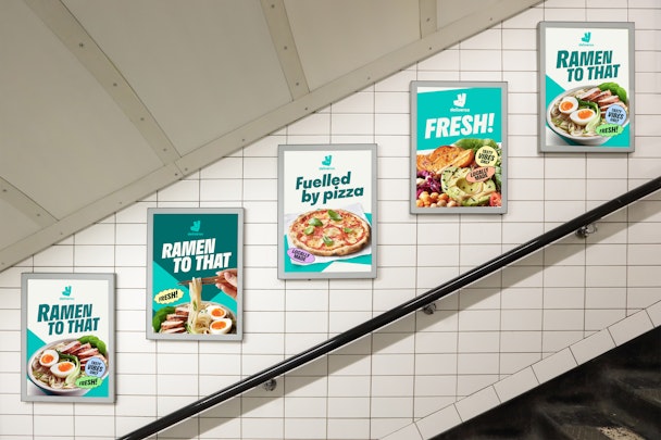
Hewitt adds that the new guidelines have already started to improve agency briefs, with Deliveroo’s latest brand campaign from Pablo London being the first work to emerge since they were implemented.
The next ambition for next year is for Hewitt to bring together all its agency partners to create a single view of Deliveroo’s personality. “I need to bring all those creative directors together to take this cohesive view of the brand and what personality really means to us, so that is the next big thing for me to do,” he says.

