‘An appalling instinct for branding’: designers react to Twitter’s ‘X’ rebrand
The bird is no longer the word. In his boldest move yet, owner Elon Musk has unveiled a sudden and drastic brand overhaul for the social media platform. Here’s what the industry makes of it.
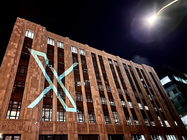
Twitter rebrands to X / Linda Yaccarino
Twitter has undergone some major changes under the tenure of its new owner but a rebrand to ‘X’ is arguably the most significant to date as Elon Musk does away with the name and instantly recognizable bird branding.
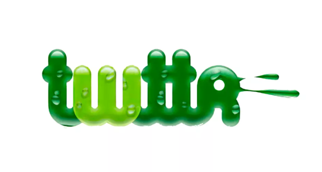
Of course, it’s not the first time the app has undergone design changes (the original logo simply read ‘Twittr’), but since making its debut in 2010 the bird graphic has become synonymous with the company.
Here, we asked top creatives, designers and branding specialists – along with a prominent former employee – to give their thoughts on the new X logo... and they didn’t hold back. “Pure comic book,” “empty” and “an HR nightmare” are just some of the responses from those we canvassed.
Advertisement
Bruce Daisley, consultant, author and ex-vice president EMEA Twitter: “From start to finish Musk has been intent on burning down any evidence that someone was there before him because it serves to remind people that someone other than him has helped form his product. It speaks to a fragile ego and an appalling instinct for branding.
“Do you think news outlets are going to say, ‘On X someone sent a tweet...’ or ‘Parped an X...’ (or whatever the clowns invent)? No, they’ll say, ‘On social media someone posted...’ The whole brand equity will be gone.
“Musk fired a lot of people I know. He never did it in person – he always sent security to their desk with a box. This isn’t a man who likes dissent. Which again speaks to an astonishingly fragile ego.”
James Kirkham, chief executive, Iconic: “Musk’s ambition to create a super app where we spend time messaging, making payments, and ordering pizza is surely a valid goal. We all want a one-touch frictionless life. But to do this, you need a brand that feels trustworthy and premium.
“Instead, this logo feels like one created in the first year of my graphic design degree. The tone is pure comic book, like an early 90s version of marvel mutants before the universe had its necessary glow-up. It will be ironic if this ends up being more of a deterrent to users than the platform’s perceived social toxicity.”
Advertisement
Stephanie McArdle, head of design, Droga5: “Twitter felt like a giant that would last forever. With this rebrand, the Twitter we knew is well and truly dead.
“The brand itself feels pretty empty. It’s more like a teaser. OK, there is a boldness to one letter, that’s cool. The glitchy animation is uninspiring, however. But what does it mean? What are we supposed to be buying into? People need to be given a reason to believe.”
Neil Cooper, head of design, Wolff Olins London: “As a designer, all of us have purchased domain names with the dream of one day using them to start a business. Elon Musk has done exactly this. But in doing so, he has destroyed one of the world’s best-known brands.
“An instantly recognizable color palette, a globally known logo and brand verbs such as ‘tweeting’ have worked their way into the zeitgeist of popular culture. All were destroyed overnight. This may or may not be the worst rebrand of the last few years, but it will certainly be a case study for design students for many years to come.”
Al Young, joint chief creative officer, St Luke’s: “Following the controversies surrounding Twitter since Elon Musk’s takeover it’s not surprising that they’re looking to rebrand. Rebrands can be successful and often happen after disasters. One example of this is Arthur Andersen becoming Accenture after a rancorous internal battle.
“But getting rid of the perfect little bird icon, which is instantly recognizable and charismatic, in favor of X is not going to be a successful solution for Twitter, in my opinion. X is ubiquitous and it is shorthand for danger. No one wants to put Xs in their search bars unless they are actively looking for trouble.”
Suggested newsletters for you
Frank Schouwaerts, design director at Mutant: “Although the character X triggers a lot in people’s minds, it will always be identified with something unbranded (brand name X) or even negative as it stands for a thing you cut (Ctrl/Cmd X). Furthermore, it’s not the best character to choose for ‘the everything app’ as you associate it with something violent or sex-related (X-rated). Pronunciation is also an issue.
“The logo itself feels rather generic as if Elon Musk wanted to pull the Nike Swoosh card by throwing the brief out to random designers.
“Musk claims the design will be further refined, and this might open up the opportunity for proper design agencies to create a serious identity with a certain foundation. Looking forward, with a skeptical eye, to see if this becomes anything more than another impulsive Elon Musk antic.”
Paul Woodward, lead motion designer at AnalogFolk: “It feels messy and thoughtless. The concept of Twitter with its ‘tweets’ felt clever and considered. X is anything but. Although, given the changes Elon has in mind about making this the ‘everything app,’ will this even feel like Twitter once was?
“It’s interesting to see how the biggest social platforms approach rebrands and the evident battle between the two. Mark rebranded Facebook to Meta behind closed doors in typical fashion while Elon openly rebranded to X with full transparency, Even giving users the opportunity to create the interim X logo that was live on the platform within 12 hours of it being chosen.
“It’s clear both are trying to react and get ahead, especially with the new Threads app recently launched.”
Ryan Lacey, head of content, Pitch: “Elon Musk brought us X.com, Space X, his first child X Æ A-12, xAI and now Twitter has become X. Where you will now send ‘Xs’ instead of tweets.
“From a naming POV it is therefore not a surprise, although sending ‘x’s’ does sound like a HR nightmare. From a branding POV there may be some interesting, subverted messaging going on.
“Let’s get all technical. Elon says the design of the new X is inspired by the art deco style. The art deco style reflected admiration for the modernity of the machine and the inherent design qualities of machine-made objects. This does seem at odds with a social network, yet you could say reflects his vision for the world.
“So is this a brilliantly thought-through branding strategy, or a very quick and dirty response to Threads, using a logo someone sent him last night? Let’s wait for Elon’s X to find out.”
Ajab Samrai, global chief creative officer at Blitzworks: “The bird logo is recognized by billions around the world so why reinvent the wheel? It’s a friendly symbol in a hardnosed tech sector. It symbolizes what the product does, ‘tweet.’ It symbolizes flight, your message. It appeals to all age groups and is welcoming. Blue is an optimistic color. It’s unique.
“The X Logo has foreboding black-and-white vibes. Looks militaristic. X is a brutal character. Hard lines crossing each other, negative connotations. Looks serious.”
Pietro Soldi, head of art at Dude London: “Musk has decided to destroy everything built so far, making it all about himself. Again. X is nothing but a dystopian futuristic bit of an empire that revolves around his personality only. It has no soul, purpose or connection with Twitter’s legacy. The positive side is that it can help us to, once and for all, debunk the myth that wealthy people are smarter than the rest of us. We had a lot of fun with Twitter, but it’s time to move on with our lives.”
Vicky Bullen, chief executive, Coley Porter Bell: “Take it at face value and the X is a symbol of the ‘future of unlimited interactivity’ that we have been told the new business will provide - X representing the idea of amplification when things come together. It seems like a much more serious, corporate image than Larry the Bird was - quite possibly exactly what they want to achieve.
“But I’m not sure he is going to get us to drop the word tweet from our lexicons very quickly. Twitter and tweets created a new language that entered our culture - the idea of sending an X might take a while to catch on. When I send an X, I am usually sending a kiss.”
Warren Beeby, chief creative officer, Rankin Creative: “Don’t call it a rebrand. This is a ‘de-branding’ by Musk. A clear signal that Twitter is no more. The bird is deceased - dead (In the words of John Cleese — “I know a dead parrot when I see one”). In terms of using brand to signal change this signal is loud and clear. By filling the void with the single letter ‘X’ Musk is creating a space to do whatever he wants with, posing a question only he knows the answer to. Or at least buying some time (and a bucket load of PR) while he gets his ducks in a row.”
Twitter reacts to... Twitter: brands have fun with the ‘X’ rebrand

