Advertisement

Street artist Stephen Doe paints an educational mural about Ebola in Liberia, 2014, Credit Dominique Faget, AFP, Getty Images
As coronavirus misinformation sets off an international scramble for accurate public health communications, The Drum explores the stories behind the iconic campaigns designed to save lives before Covid-19.
Can graphic design save your life? It may seem like a trivial question on the surface but it’s one that London's Wellcome Collection aimed to answer in a 2017 exhibition.
Unveiled at the London home of all things medically curious, the show considered the artworker’s role in constructing healthcare messages across the world, through the lens of 200 objects and posters.
In its own way, the show was an incomplete encyclopedia of humanity’s ills.
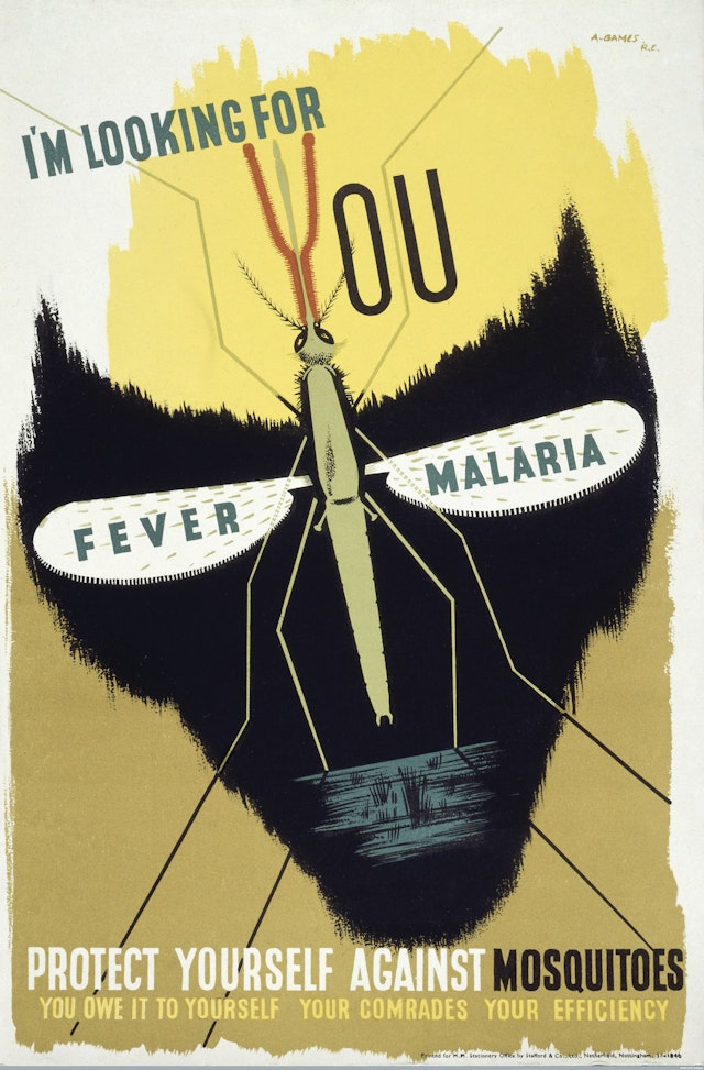
There was a broadsheet warning of Indian cholera symptoms issued in 1831, and malaria warning posters from the dark days of 1940s wartime. Modern afflictions were addressed too: the colorful graffiti painted onto Liberian walls that educated the illiterate on the symptoms of Ebola, and warnings of the late 20th century’s principal medical menace – Aids.
“It was the biggest threat to civilization since the H-bomb,” recalls Malcolm Gaskin, who created the UK’s 1986 ‘Aids: Don’t Die of Ignorance’ campaign at TBWA.
“I’d had friends who had recently died of the disease. There was a great deal of confused information with a lack of scientific knowledge and a witch-hunt brewing.”
The brief was interpreted by TBWA as a rally to fight the spread of the disease, rather than focus on those who had already contracted it.
Aids was not only a politically divisive subject matter, but one that had no official name, let alone a cure.
“The only ammunition to fight this threat was information and honesty,” says Gaskin.
“We ‘branded’ it with a logotype I’d devised – a capital Aids underscored – and David [O’Connor]’s seminal line ‘Don’t Die of Ignorance’. [It] encapsulated what we were offering, which was that only knowledge and vigilance could help to protect the country and contain the spread of the disease.”
A less urgent but no less serious health crisis that needed addressing in the latter part of the 20th century was the pervasive culture of smoking.
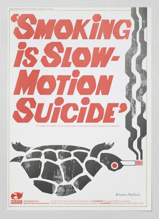
In 1972 – seven years after the scientific link between cancer and cigarettes had been made, but long before it was taken seriously – one lone designer took it upon himself to tackle passive smoking.
“I thought if tobacco smoke can give cancer to smokers, the same smoke would have the same harmful effect if inhaled by others,” says Biman Mullick. “Based on that thought, I started campaigning.”
Without a client or commission, Mullick’s designs were produced on a shoestring; he recalls having to forego hiring a typesetter and cutting his own typefaces out of paper.
The message of his creative was not necessarily one of anti-smoking, but one designed to “create a smoke-free environment”. His relentless campaigning was acknowledged by the World Health Organization in 1988, but he never made a cent from his distinctive work until an art dealer recently asked him to reproduce the creative for a set of commercial prints.
Mullick, now 86, is humble about the aesthetic of his work, marveling: “I never thought of my posters as art objects to put on a wall.”

Looking back at public health campaigns from the past, it’s clear that a little humor and color go a long way. One could be forgiven for thinking these traits are lost in today’s health communications, which appear to hold presentation of messaging above all else.
Ebola warnings that still preside in European airports, for example, appear overly clinical when compared to Abram Games’ graphic ‘Protect yourself against mosquitoes’ poster, while international coronavirus materials are also lacking in original, eye-catching creative.
“We have moved from definitive poster-style public health awareness campaigns in the 70s, 80s and 90s, which favored highly campaign-able slogans, messages or visuals, to fostering our need for detail and deeper levels of information and explanation,” explains Jonathan Ford, founding partner and chief executive of Pearlfisher.
This resulted in the rise of infographic materials in the 00s that soared in popularity across all sectors, not just in the area of public health.

Divergence of budgets could also be a factor.
Public Health England, for instance, promotes an app as a central part of its campaign to encourage people to eat healthier. Change 4 Life’s Keith Haring-style graphics may not be as striking as those from past PSAs, but in this case, technology – not 2D design – is the main form of communication.
Lucienne Roberts who co-curated the Wellcome Collection's exhibition, uses the Scottish government’s 2008 shock ad ‘Kill Jill’ to argue that effective creativity can still be found in modern public health messaging.
The campaign by Edinburgh agency The Union encouraged organ donation by equating unregistered donors with killing those in need of transplants.
"The Scottish government defended its controversial approach by explaining how ‘softer’ campaigns failed to motivate the public, whereas ‘Kill Jill’ led to a 242% increase in registered organ donors," says Roberts.
And outside of government, health charities continue to use graphic design as a powerful medium of communication.
As Ford puts it: “As our closest advisors today, brands may now succeed where public health has seen to be lagging. The involvement of brands in more pertinent areas of our health is becoming an expected part of their ‘remit’ in our relationship with us as they take on a more holistic direction in our lives.”
Samaritans’ ‘We Listen’ campaign, featuring hidden messaging, was one of a selection of modern creative projects to feature in the exhibition.
Paul McDonald, Samaritans’ executive director of external affairs, not only believes that graphic design can save your life – he has evidence it can.
“While encouraging people to seek help when they are struggling to cope, the ‘We listen’ campaign coincided with an 11% fall in rail suicides in 2016,” he says.
