Advertisement

Dragon Rouge has completed a rebrand of recruitment group Reed
As UK employers scramble to fill vacancies across the country, recruitment site Reed has unveiled a fresh rebrand. Design agency Dragon Rouge explains how it hopes to position the brand as a destination for workers looking to propel their careers forward.
Family business Reed Group is best known for its job-finding site Reed.co.uk. But the group operates 10 additional verticals, spanning the consulting, wellbeing and outsourcing sectors – each with their own branding. To rationalize its sprawling brand footprint and prepare the company for a crucial period, design agency Dragon Rouge has rebranded the company from top to bottom.
As the British economy restarts, employers nationwide are competing to fill vacancies amid the biggest labor shortage in a quarter century. Reed’s services will likely be in high demand, so its rebrand has been timed well.
Lily Drake, group head of customer experience at the Reed Group, tells The Drum: ”As we emerge from this pandemic with optimism and business confidence improves, now is the perfect time for us to go to market with a vibrant new look that brings together our family of brands across the talent ecosystem, and positions Reed as dynamic, here to help our customers define what’s next for them in the world of work, whatever that may be.”

Dragon Rouge set out to create a ’brand story’ that pulls together the company’s disparate organizations and products, answering a brief to ”define an overarching brand story that encompasses all of its operations and drive a refresh of the brand identity, answering the challenge of maintaining high-level consistency while enabling flexibility between sub-brand businesses”.
Dragon Rouge’s Becky King, creative director on the rebrand, tells The Drum: ”It’s a uniting story for the Reed Group. They’re known for reed.co.uk, but actually it’s broader than that.
”[This is] a company that’s grown massively, organically, coming together under one element. From a design point of view it’s about finding a system that could work individually for all of them, but has that red thread going through them too. They all have their own little personality that they can play on.”

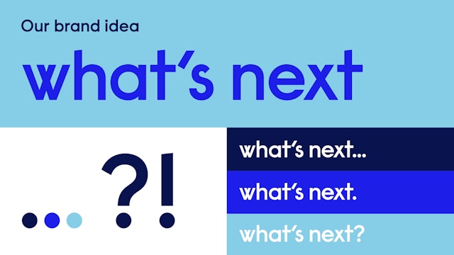
Central to Dragon Rouge’s concept is the phrase: ’What’s next?’ Referencing the way that its products are future-facing – the next gig, recruit or staff initiative – the question pops up again and again in the company’s redesign and is directed at both its B2B and consumer clients, as well as Reed itself. The agency also created three ’character traits’: ’curious’, ’dynamic’ and ’optimistic’.
The idea is that they guide and define Reed’s branding going forward, particularly in its sub-brands.
James Reed, chairman and chief executive of Reed Group, says: “I thoroughly enjoyed working with Becky King and the Dragon Rouge team on this important rebrand for Reed. Becky and her team approached the brief with great creativity and flair, and we now have an approach that works for all our businesses as we define what’s next for Reed’s seventh decade.”

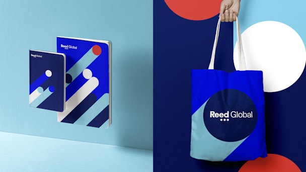
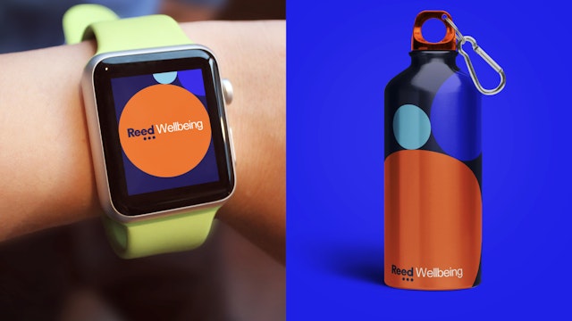
That idea lives on in its new rebrand; the ’dots’ from its older wordmark now form an ellipsis. The company’s 11 brand verticals have each been given their own brand identities within the design ’family’, utilizing a bigger color palette and more typographic options.
Drake says: “The vibrancy of the color palette and the creative direction has given our businesses an exciting new look, coupled with the creative freedom to have their own distinct identity within our family of brands.”