Colour psychology and branding

Kellogg's, Fanta, McDonalds, Spotify, Dell and Cadburys - well-known brands that all utilise different elements of the colour wheel
What is colour psychology?
Colour psychology is the connection between colour and human emotion. The theory is, colours, whether they’re primary, secondary or tertiary, can evoke weird and wonderful psychological responses to humankind. Responses to colours can vary from person to person with some more evolutionary, some personal and others cultural.
That said, in general, colours tend to trigger the same sort of emotions in all of us. For example, if you were to ask anyone about the colour red and what springs to mind when they think of this colour, they’re likely to say it’s the colour of love, passion and anger. Although these emotions are varied, they’re the most common emotions associated with the colour red.
It’s this knowledge that designers apply when generating colour schemes for organisations. So to ensure the most fitting colours are chosen, designers will consider how the business wants people to feel about their brand.
For example, an eco-friendly company that sells green products may want to choose green as one of their three branding colours, but green alone won’t set them apart. So to stand out from the competition, a designer may suggest that the organisation choose a colour such as orange or blue to complement, evoking feelings of energy and trust.
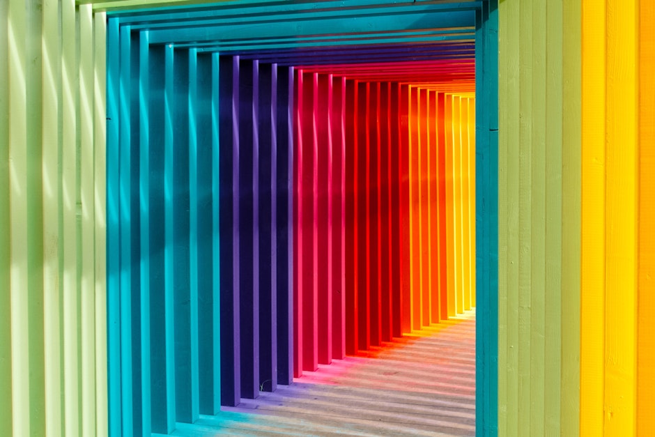
Get a better feel for the colours and take a look below.
Warm colours and their associations
- Red (primary colour) - Passion, love, anger
- Orange (secondary colour) - Energy, happiness
- Yellow (primary colour) - Happiness, hope
Cool colours and their associations
- Green (secondary colour) - Nature, abundance
- Blue (primary colour) - Calm, sadness, trustworthy
- Purple (secondary colour) - Creative, wealth
Neutral colours and their associations
- Black - Elegant, formal
- White - Clean, pure
- Grey - Formal, conservative
- Brown - Wholesome, nature
- Tan and beige - Devotion, conservative
- Cream and ivory - Calm, elegant
It might seem strange at first to consider the warmth of a colour but people commonly associate red, orange and yellow as warm colours - and as seen above, these colours tend to evoke feelings of passion, energy and happiness. Whereas cool colours such as green, blue and purple tend to make people feel calm and at one with nature.
You may not realise it, but colours can have an effect on our moods - would you agree to the above? How do they make you feel?
The colour wheel
As you may know, there are primary, secondary and tertiary colours, all of which are components of the colour wheel, a concept created by Isaac Newton in 1666.
It was this colour wheel that categorised colours into three separate groups.
Primary - red, blue, yellow
Secondary - the results of red and blue, red and yellow, blue and yellow - and red, blue and yellow being mixed together
Tertiary - when primary and secondary colours are mixed together
Colour schemes
Complementary colours are ones that sit opposite one another in the colour wheel and complement one another when used together. For example, blue and orange, or red and green.
Colours opposite one another in the colour wheel, i.e. ones that contrast, help to make an eye catching display - which is not only visually appealing but memorable too.
Analogous colours
Analogous colours refers to colours that sit next to one another in the colour wheel such as purple, blue and green. So when creating an analogous colour scheme, you’ll want to have a dominant colour, a supporting colour and a colour to accent the palette.
Triadic colours
Triadic colour schemes are colours that have been chosen from opposite sides of the colour wheel, these are typically well-spaced and bright. Triadic colour schemes are more common with branding and marketing because they all work in harmony together and make sure all elements of a logo stand out.
Why are branding colours important?
Branding colours are used for more than just a website. They’re used for shop fronts, in-store design, staff uniforms and advertisements. Essentially, the purpose of brand colours and logos are to make your brand memorable.
Let’s say, we took the Cadbury’s logo away from the chocolate bar. Would you still recognise the bar by it’s colour? You used the Google colours for a different word - would you instantly recognise what this is trying to mimic?
That’s the power of branding and colour!
About Digital Ethos
We’re an award-winning omni-channel marketing agency that works as an extension of a business, providing you with business digital strategy, expertise and results. Want to talk about digital marketing? Visit Digital Ethos’ website to learn more.