What can the Olympic Games teach us about brand design?
The Olympic Games are founded on symbolism. From the flame to the flag to the five-ringed identity, the competition would be nothing without its iconography.

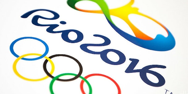
Rio 2016
But every four years, a new city is faced with a mammoth task. It must create an entirely new brand logo that not only has to satisfy a whole range of competing cultural interests, but retain a sense of familiarity, building on what has come before. Given the design will be subject to intense scrutiny, this is no small feat. Some step up to the plate and deliver an identity with real meaning. But others flop. What better case study is there of the challenges behind brand design?
Design at the Olympics goes back to a mustachioed French aristocrat named Baron Pierre de Coubertin, the father of the modern Olympic Games. Like all great ideas, his idea for the Olympic rings wasn’t an original one. He 'borrowed' it from another sporting body he chaired, the Union des Sociétés Françaises de Sports Athlétiques (USFSA). Expanding on the organisation’s two interlaced rings to incorporate five, de Coubertin created the now unmistakable logo we know today.
According to de Coubertin himself, the Olympic rings “represent the five continents of the world, united by Olympism”. The design has lasted all these years because it’s simple and striking. The circle is a powerful symbol. It denotes timelessness, inclusivity and universality, nailing the concept of international unity the logo of the Olympics ought to represent. In fact, the universality of the design is its saving grace. For host cities, with their localised complexities and people to please, there’s a lot more at stake.
Host cities also have to bear the full weight of design history on their shoulders. They can’t be seen to rehash previous designs or remain stuck in the approaches of yesteryear. But we’ve come a long way from the 1924 Summer Olympics in Paris, the first to have its own fully-fledged logo. Previous Olympiads simply had poster campaigns (a striking tradition in its own right), but Paris kick-started a new trend by leading with its medieval coat of arms. The design is actually a little muddled, especially in the placement of its typography. But it remains a significant starting point nonetheless. It encouraged Olympic host cities to showcase their heritage to an international audience in a new, exciting way.
However, you’d be forgiven for saying the early Olympics host country identities were a mixed bag. Black and white was the order of the day for several decades. And it wasn’t until the 1960 Winter Olympics, held in Squaw Valley, California, that something really interesting emerged. Not only did the design involve some colour and abstraction, it marked the first use the snowflake motif, which formed part of all Winter Olympics identities until 2010.
Of course, it’s the Summer Olympics – no doubt the main event – that has produced the designs that really stand out. The best of these manage to strike a balance between an expression of national identity and genuine accessibility. Mexico 1968, Montreal 1976, Moscow 1980 – these designs, while simple both in terms of colour and graphics, all stray into more experimental territory, while also maintaining a level of intelligibility and pleasing integration with the Olympic rings. Looking back in 2016, these designs have withstood the test of time because they both are functional, fit for purpose, and prove that, in some cases, less is more.
But design, by nature, is subjective. And some might argue that by playing it safe, you risk being boring. An identity like Barcelona 1992 is more progressive. It deftly weaves in Barcelona’s rich artistic heritage, nods to its wider Spanish and Catalonian cultural characteristics, while also bringing it all together with the universal image of the jumping athlete. It’s masterful really when you think that the design is nothing more than three expressive brushstrokes.
Ultimately, any boundary-pushing identity will have its detractors and champions. And many of us let out a sigh of relief when the identity for Rio 2016 was revealed, especially after the much-maligned London 2012 design. The team who take on the responsibility of designing a host city’s identity have a lot on their plate. They can take two different approaches – try something different and risk failure, or take the cautious line without ruffling any feathers. I know what I’d choose. It’s the Olympics, you should play to win.
Simon Gore is group creative managing director at Sun Branding Solutions
