How 7Up is trying to inject ‘zestiness’ back into its brand
The soft drink’s global brand boss explains its renewed marketing strategy as he readies major summer campaign.

7UP beams in giant coolbox on London Southbank / 7UP
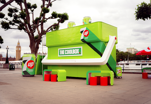
A giant 7Up Zero Sugar branded cool box has popped up on London’s Southbank, serving food and drink to kick off the soft drink brand’s new visual identity and brand platform.
The lime green structure has a roof terrace that houses massive 7Up cans that double as tables, with giant ice cubes for chairs. There is also bright green merchandise on sale and street food that has been paired with 7Up Zero Sugar. It’s a traveling cool box that will be open at four other UK locations throughout the summer.
Advertisement
The activation is part of 7Up’s revamped logo campaign and new brand positioning, ‘Uplifting’, which was rolled out in February. At the time of the rebrand, The Drum sat down with Eric Melis, its vice-president of global brand marketing. He said the inspiration behind the new look was to put “zestiness” back into its brand identity.
He told us: “When we talk with consumers, they continue to tell us our key asset is the liquid. It’s the formula and what they say is that it’s the zesty refreshing lemon-lime taste they engage with. We want to ensure that, from a content development standpoint and from a visual graphics standpoint, we tap into that.”
Advertisement
7Up’s first brand refresh in seven years won over the typically polarized design community, with publications including Creative Bloq running headlines along the lines of ‘Pepsi’s 7Up rebrand is rather gorgeous’.

Previously, 7Up was trying to zero in on the Gen Z demographic by leaning into the brand’s nostalgia and vintage, which typically resonates with younger audiences. “The last visual identity we were very much focused on the Gen Z demographic, but we realized that we needed to take both Gen Z and millennials into account,” Melis admits. “This is a more modern, vibrant look that isn’t for one demographic but for a broader audience.”
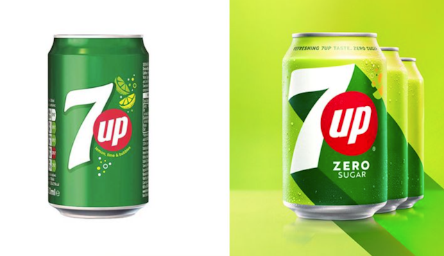
Based on this insight, the team decided to add a lime green color into the packaging design to improve the consumer connection to the citrus taste in 7Up. While the original ’green grass’ color palate still features on the cans, it is less dominant next to the new brighter green.
The red circle that houses the ‘Up’ asset was also enhanced, both in size and brightness. Melis says it was important to establish that refreshment is “associated with emotional upliftment”.
Suggested newsletters for you
“7Up has always been, from a functional and an emotional standpoint, a brand that owns the heritage of refreshment. Now is the perfect time for us to double down on the emotional side of bringing good vibes and bringing upliftment to consumers.”
Along with the packaging redesign, 7Up has rolled out a new slogan, ‘New get up, same 7Up’, which is a slight variation from its original ‘New look, same great taste’.
The 7Up rebrand follows a trend of brands simplifying their logos, with the likes of Subway, Yves Saint Laurent and Toblerone all stripping back their branding in recent years. “From a branding standpoint, there’s just so much news, tech and trends that consumers are all receiving, so simplicity and clear messages can cut through.”

