How The Works rebranded Uefa’s Women’s Euros
Ahead of the Uefa Women’s Euros final at Wembley Stadium on Sunday, The Drum catches up with brand experience agency The Works to learn about its revamp of the competition’s identity.
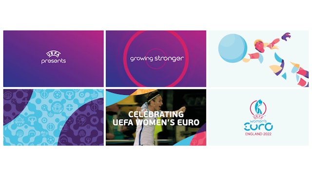
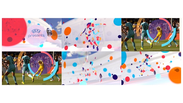
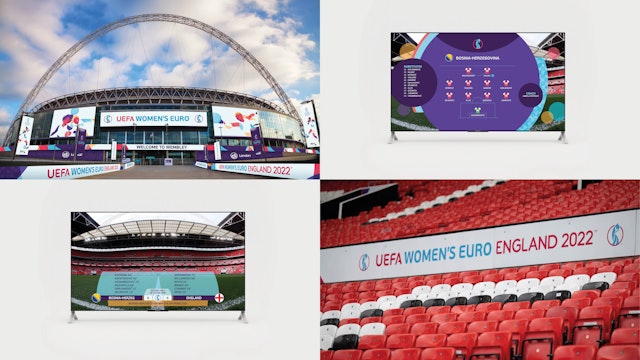
With the aim of putting women’s football ‘on the map’, Leeds-based agency The Works was commissioned to create a new logo, visual identity, TV graphics and opening sequence for the tournament.
No stranger to developing competition and event branding, the brief came off the back of the Women’s World Cup 2019 that The Works had developed for Fifa.
“This brief was different,” notes Mike Robinson, the agency’s managing director. “It was not only about the competition itself, it was about Uefa’s driving force behind women’s football and its ambition to develop the game, transform competitions and increase participation across Europe.”
The pressure was on and during the various creative cycles the agency and the governing body of European football “worked in partnership to create a brand that was born out of Uefa’s vision and values for the Euro competition,” adds Robinson. The goal was to link the competition to Uefa’s longer-term strategy for women’s football, which was “just as important”.
Based on circles, the final design is combined with a clockwise rotation that, when in movement, represents openness, progression and expansion. Sitting in the center of the logo is the trophy, “the focus for all players who dream of victory”.

Alongside the logo is a set of graphics, known as the ‘player poses’, consisting of four distinctive moves associated with various positions on the field. Again, the circular theme comes into play making up each figure’s silhouette.
“Women’s football has seen a massive development over the last few years,” says Paul Birks, creative director at The Works. “It’s increasing in exposure and popularity, and this new look and feel has been developed to further support this growth.”
Knowing that the branding was predominantly going to live online, the team chose bright colors but were cautious not to be stereotypical with the designs.

It was important to move away from the ‘corporate’ feel of Uefa and appeal to a broader spectrum of fans, explains Robinson. “It’s a fresh, open and contemporary look to reflect the strength, diversity and ever-growing popularity of women’s football.
“For Uefa, raising the status of its competitions is central to the goal of transforming public perception of women’s football. This brand was developed to help do just that, to resonate with youth fans and engage wider audience groups on an international level.”
Progressing the narrative around women’s football is crucial and was a key focus of this project, with Robinson explaining: “There’s no doubt advertising plays its part in helping increase exposure and attract new fans. Digital and social channels have of course helped amplify the exposure internationally, but it’s so much bigger than this.” Growth, he says, must come from the ground up.

Interested in creative campaigns? Check out our Ad of the Day section and sign up to our Ads of the Week newsletter so you don’t miss a story.

