How to keep fans onside when rebranding a sports team
Crests and badges are key tools in a sporting brand’s arsenal. Considered sacrosanct by supporters, however, substituting these storied stamps for updated designs is an emotionally charged challenge. As part of The Drum’s Sports Marketing Deep Dive, we look at how design agencies approach such a sensitive project.

For Everton, DixonBaxi looked to produce something that was ‘elite but not elitist’ / DixonBaxi
A team’s crest is more than a brand logo. It’s a symbol of a club’s past, present and future and an anchor for fans as they follow the fortunes and failures of their team on the pitch. So when a team decides to update its crest, it’s a huge responsibility for those tasked with dreaming up a new design.
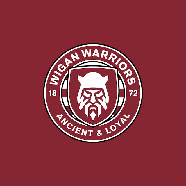
When Stuart Watson of design agency Nomad Studio redesigned the badge of rugby league club Wigan Warriors in 2020, the reaction was ”pretty brutal”. Not that that was a surprise. ”It was expected,” he tells us.
Watson’s proposal replaced the beloved town coat of arms with a modern design featuring a bearded Celtic fighter preparing for battle. The play thoroughly pissed off the club’s diehards. For two weeks, supporters laid into the work online. But a miraculous turnaround came from an unlikely source. ”The club released a Christmas jumper with the warrior on it wearing a Santa’s hat and everyone loved it. It went from hatred to epic love.”

Not every negative reception has such a happy ending. When Leeds United unveiled its new badge in 2018, fans kicked up a huge fuss. Simon Dixon of design consultancy DixonBaxi is a lifelong Leeds fan and wrote to the club offering to do a better job – for free. ”I got sent the design by two friends and I thought they were taking the piss out of me – I thought they’d mocked it up. I spoke to a couple of the people who run Leeds and offered to help, but they decided to leave it.”
Sporting talismans
Sports crests, emblems or badges are one of the few uses of graphic design that people outside marketing, advertising and art school courses actually give a damn about. Fans – the end users of a crest – are likely to be more engaged, more passionate and more critical of a change to their beloved team’s identity than they would be about a consumer brand design.
But agencies and clubs can score important goals with rebrands and crest activations. Last season, Leith Agency helped add a new crest to the shirts of Edinburgh rivals Hearts of Midlothian and Hibernian, promoting better CPR techniques.
’The Extra Time Badge’, ironed on to their respective maroon and green shirts and launched on derby day, was a hit. Charity client the Justin Edinburgh 3 Foundation eventually rolled out the initiative to another 30 professional teams and managed to reach an audience of 96 million fans.
The initiative worked because it was clued in to football culture – no fan would forget the footage of Danish captain Christian Eriksen collapsing on the pitch from a cardiac arrest.
Dixon says any redesign of for a sports club needs to be aware of the depth of fan passion. He says: ”You can’t change a football club – it’s passion-driven. It’s hardwired into who you are as a person. It helps define you.”
When his agency redesigned the typography and identity of Italian giants AC Milan, he says it was ”probably one of the very best projects” he has ever done in his career. ”But you’re also terrified of doing a bad job,” he adds.
”When you look at a football club, the crest, the icons on the jersey, they were created before computers, by people who were artisans, people who were creating semiotics that have a deep history. That means something. So when we do a sports franchise, we’re always cautious not to destroy that heritage.”
Though the agency didn’t touch AC’s crest, it based much of its design scheme for the club on the badge, using its distinctive oval shape and Rossoneri colors as key reference point. ”It gave more meaning to the badge, basically.”
Similarly, DixonBaxi’s recent work for Everton FC draws heavily on the tower featured in its crest. Dixon explains: ”We’ve taken a graphic motif of that and pulled it out to create a design system that sits with the crest. It gives [Everton] the license to be more contemporary and have a stronger social design system.”
The motif will be stitched into the playing kit itself and found in myriad other environments. ”It’s a graphic language that can be used on everything, from merchandise to the stadium – like the Adidas stripes or the Nike swoosh.”

Pass and shoot
Merchandising and brand awareness are important for clubs looking to increase their cash flow and modern brand assets like a crest are important elements of the winning formula. That goes for clubs hoping to score against the run of public opinion as well as the sporting titans.
Durham County Cricket Club, for example, rebranded itself in 2019 as the more modern-sounding Durham Cricket and hired Jarrow-based design agency Ynot to produce a contemporary crest. The result was a smart, aggressive emblem that served both regional pride (its new motto: ’For the North’) and the competitive cricket world.
Inter Milan took a more sweeping approach. It turned to Bureau Borsche last year to reimagine its black, blue and white badge for a new era and followed that change up with a new digital identity created by Dept, unveiled last week. The Dutch network’s CEO Dimi Albers says: ”With Bureau Borsche, [Inter] focused on revolutionizing its brand and logo. Now it’s time to take things to the next level across all digital channels. We’re proud to take on this journey together with Inter and are excited for everything that’s to come.”
Crests can help build a modern brand, but they can also hold a club back; there’s an opportunity cost for brands that pass on a chance to modernize. Take the Washington Commanders (formerly the Redskins), whose badge featuring a racist caricature of a Native American chief was replaced when the team finally renamed itself after years of indifference.
A new crest would help the club move on from its past and embrace a more inclusive future, so to get that job done properly it drafted in Stagwell design shop Code & Theory. Their new name, which honors the state’s connection to the military and the first president’s rank, features on the type-heavy crest.
Fresh start
Nomad Studio’s gig from Wigan came after a gig redesigning the Super League, the UK’s top club tournament for rugby league, for a contemporary broadcast audience. ”Rugby league is a working class, older person’s sport,” says Watson. ”We’re wanting to make it much younger, much more vibrant and exciting for a newer audience.”
”[The league] needed to level up the clubs,” he says, explaining that the logos and crests used by rugby league teams ”feel cheap and dated”. According to Watson: ”They don’t speak to a younger audience and you’re not leveraging your opportunities for merchandising – no one’s going to wear a shirt with the Castlefield Tigers logo on it, but they would if we drew it.” So far, the agency has rebranded four Super League clubs across the north – Huddersfield Giants, Hull Kingston Rovers, Wakefield Trinity, as well as Wigan (seen above and below).
In Wigan’s case, Watson says, the use of the town crest had ”an incredible amount of affection and loyalty towards it,” but that it was completely unfit for purpose in a digital world. ”Imagine that as a favicon or an app icon? It just doesn’t work.”
To replace it, Nomad Studio focused on another part of the town’s heritage – its link to the Brigantes, the tribe that controlled the north of England before the Roman occupation (the warrior’s helmet in the logo strongly resembles theatrical masks discovered by archeologists at Brigantes sites).

Virtue signaling
Communicating the reasoning behind a redesign to supporters and the club itself is vital, says Watson. To create Warrior’s new emblem, he says: ”We created a fan committee. We got permission from the fans to look at two things: redrawing the town crest and making it much simpler... and look at creating a warrior.”
The exercise of simplifying the coat of arms proved to fans that the old emblem wasn’t fit for use, Watson notes, and gave the agency permission to push their more radical design.
Dixon agrees with this approach. ”We want to speak to the fan groups, the community, the backroom staff. A lot of what we did in the design system for AC Milan was trying to be sensitive to what they had.”
His agency’s work with Everton trod carefully not to appear too slick – mindful of its image as ”the people’s club”. The club faced a harsh reaction from fans back in 2013 when it updated its badge; after an apology to supporters, it unveiled a second new design almost a year later, which was accepted. As such, the agency’s approach had to produce something that was ”elite but not elitist,” says Dixon.
Despite doing due diligence with fan groups, Wigan’s new crest’s success came down to the club’s management holding fast in the face of critique. Watson says: ”We didn’t design it for 80 year-old white men, we designed it for the next generation of fans. I think that, as long as you do it in the right way, you just have to help the client hold their nerve and ride it out, which they did brilliantly.”
Both Nomad and DixonBaxi have done extensive work with sports clubs, leagues and brands. Dixon says he anticipated a tough crowd at AC Milan, (”We were sensitive to the reality of how it would be received,”) but his team benefited from the backing of AC Milan’s club leadership. ”They really embraced it and believed it would make a difference.”
Events proved the quality of the work. As AC’s footballing fortunes improved, the stock of their brand has also risen abroad. ”Their awareness and brand strength have increased, but it’s on the merit of still being AC Milan; the way they win football matches, the way they play is still in the same spirit.”
Nomad Studio was behind the English Premier League’s own rebranding several years ago, which itself caught heat from fans and the press. The league stuck with the design, though. Guiding clients past the noise of an adverse reaction is ”like a badge of honor” for the agency, says Watson. ”I’d much sooner the big controversy rather than people just accepting it. What you don’t want is people to not know what to say or not care. Controversy is a sign you’ve got it right – people are talking about it.”
Check out The Drum’s latest Deep Dive, The New Sports Marketing Playbook, and learn the tactics employed by the world’s biggest sports organizations and their star athletes to stay top of their game.

