The art of football crest design: what makes for a good sports team symbol?
Football by its nature never stands still. Jerry Seinfeld once said, “you don’t follow the player, you follow the shirt,” and although he was talking about baseball, the logic easily translates to the beautiful game. Players, managers, chairmen increasingly come and go from clubs leaving only history in their wake and stories of their successes/failures spouted out by fans in the coming years.

Besides the reliable terrace chants – the likes of ‘the referee is a wanker’ and ‘who are yer’ – this changeable nature of the sport leaves little for fans to cling on to season after season as their hopes of clinching silverware slowly fade into a predictable tale of mid-table finishes and what could have been. Despite the personal drama and turmoil, fans remain united by a club name, its colours and the club's crest.
As a young lad my room was awash with the crest of my beloved team, on bed sheets, curtains, posters, annuals and even a bloody branded lamp. But to an avid fan of football, what crest you stand behind means everything. An icon on your shirt that brands you with the other members of your tribe, it is worn on hearts, kissed and clutched throughout the highs and lows of your club.
Like the rationale of a thousand design projects, football crests are modern yet traditional. In part this is due to their evolution from heraldry beginnings with a lot of the early clubs using the town’s local coat of arms, or versions of them, to adorn the shirts of special games such as cup finals.
The early heraldic look has been slowly chiseled at over the years, with each decade bringing new, shinier versions reflecting the modern trends of visual design. This evolutionary approach has led to some of the most iconic and recognisable pieces of design to come out of the last century.
But in the modern era of the game, what makes a good crest design?
Every crest should have a focus, one element that will act as a talisman to fans. A hammer, an eagle, a ship, a dragon, anything, as long as it has historical, geographical or has even a mythological relevance to the area. Without this cultural anchor, a crest bears little weight or significance and will simply not be doing its job.
Manchester City recently unveiled its new crest design. A consultation with fans helped shape which elements from the club’s heritage to include, resulting in a smart design that has been well received.

The execution of a crest should be strong, simple and memorable (design's equivalent of the Icelandic Thunder Clap). It should be illustrated with enough distinctive qualities to be completely owned by the club whilst being simple enough for a seven year old to scribble onto the front of their textbook from memory.
The Wolverhampton Wanderers crest is a perfect example of this. It is unapologetically simple, using only a few geometric shapes to form the profile of a wolf inside an robust hexagon. But within those few shapes a sense of strength, pride and hunger emanates.

This strength is also reflected within their colour palette. The gold and black marque, a nice little nod to the city council's motto “out of darkness cometh light”, is confident, decisive and striking – everything a crest should be recognised for.
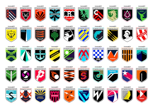
Instilling these qualities was the foundation to our approach when rebranding Lucozade Powerleague. Rather than create a corporate brand that filtered down into each club, we wanted to generate a sense of local pride and loyalty to each of them.
Our solution was to create a crest for each, a design built around the same framework but personalised for every club.
The idea mixed modern symbolism with cultural references to create a youthful yet meaningful outcome that would excite and inspire our audience. A conscious effort was made to avoid any association with nearby professional clubs, their colours and any associated symbology, creating a brand spanking new football club within each location with its own visual characteristics.
In the age of leaked shirts and media scrutiny, it’s harder for a club with a rich visual history to change anything significantly without a whirlwind backlash of biblical proportions from fans and critics alike, and this is even before initial rollout. Because of this, many redesigns often end up being little more than a tweak and finesse, modernising the period decoration and giving some crests a faux historical feel.
We all witnessed the ill-fated Everton crest evolution unfold, with fans asked to pick from a smorgasbord of designs each featuring a number of historical elements laid out in slightly different ways. The end result was pretty underwhelming, with the public picking the design closest to previous incarnations.
To succeed a crest has to unify, inspire hope, signify greatness and become timeless, no mean feat for any piece of design.
Daniel Lancaster is senior creative at Music
