The Drum brings you a round-up of some of the latest interesting creative work.
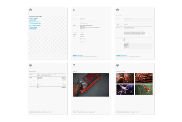
Every fortnight The Drum publishes a selection of new creative work. Now you can vote for the work you like best with the winners to feature in the next issue of The Drum (24 May).Submit your vote before Wednesday 15 May to guarantee your favourite makes it into the printed magazine.To submit work for future publication contact gillian.west@thedrum.com.
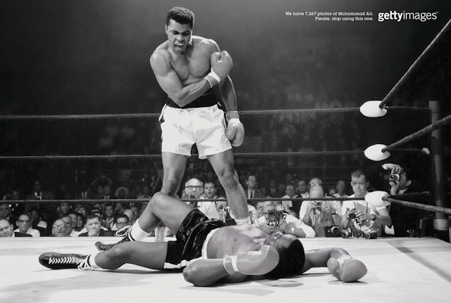
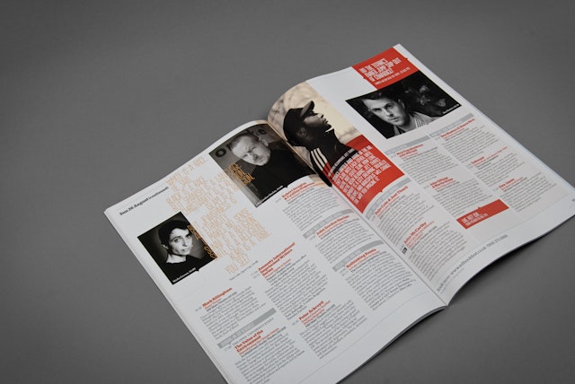
AlmapBBDO: Getty Images - Muhammed Ali print ad
Brand: Getty Images Title(s): Muhammad AliHeadline and copy text (in English): We gave 7,267 photos of Muhammad Ali. Please, stop using this one. Getty Images.Agency: AlmapBBDO, São Paulo, Brazil Agency website: http://www.almapbbdo.com.br/index.php#section=noticiat
Grey London: Vodafone Ireland 'The Wait' TV campaign
Brand: Vodafone IrelandTitle(s): The WaitAgency: Grey London, London, UK Agency website: http://www.grey.co.uk Executive Creative Director: Nils LeonardCreative Director: Simon BrothersonCopywriter: Mike KennedyArt Director: Pauline AshfordAdditional credits: Agency Producer: Rachael Long, Account Management: Ian Maybank & Ryan Deluchi, Head of Planning: Leo Rayman, Media Agency: OMD Ireland, Media Planner: Carolyn Odgers, Martina Stenson & Aoife Joyce, Production Company: Rattling Stick, Director: Sara Dunlop, Producer: Stuart Bentham, Editor: Art Jones @ Work Post, Post-production: Ludo Fealy @ MPC, Soundtrack: Dionne Warwick – Wishin’ and Hopin’, Audio Post-production: Ben Leeves @ Grand Central Published: April 2013
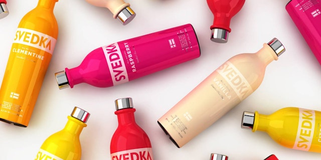
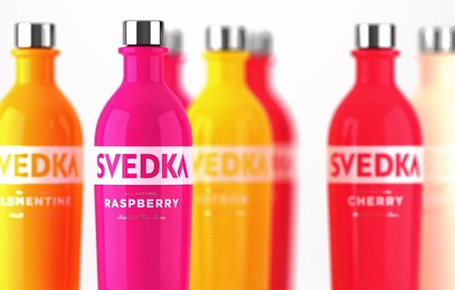
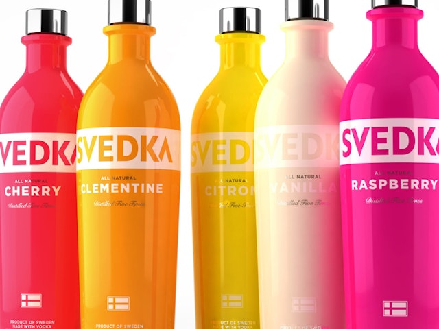
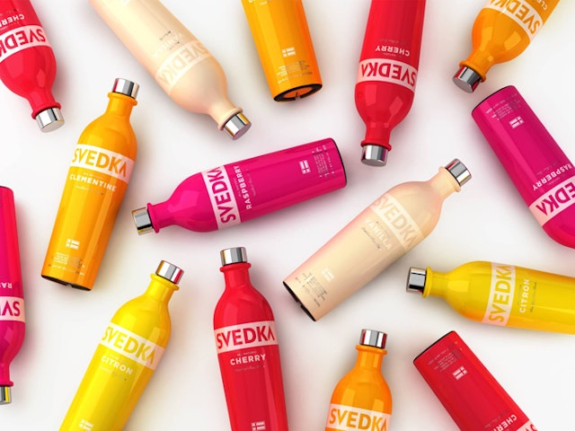
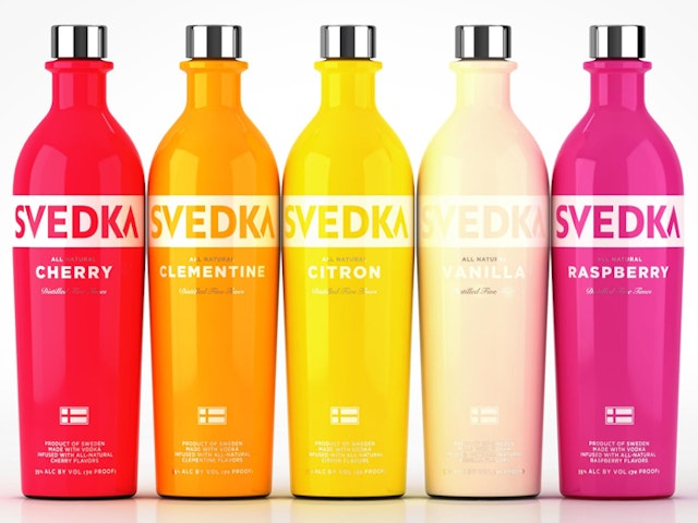
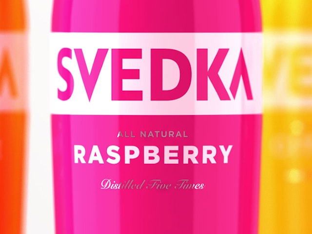
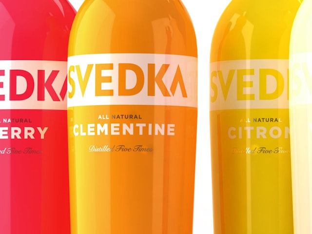
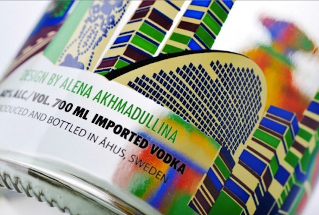
Established: Svedka Vodka packaging redesign
Brand: Svedka VodkaTitle(s): Packaging Redesign 2013Agency: Established, New York City, USAAgency website: http://establishednyc.comExecutive Creative Director: Sam O'DonahueCreative Director: Pierre Jeand'heurArt Director: Daniela SbarbatiPublished: April 2013Short rationale (optional): Established has redesigned Svedka's entire product range. Using a ground breaking approach, Established enabled the use of super saturated colours throughout the range through an innovative shrink wrapping technique. The strong colour perfectly reflects the bold attitude of the Svedka brand, while ensuring that the bottles pop off the shelf. The shrink wrap technique also allows Svedka to easily and efficiently launch special edition flavours throughout the year or to react to changing market trends quickly and at low cost.
Cream Consultancy: UK Water Features 'Water Bucket Walter Fights Back!' viral
Brand: UK Water FeaturesTitle(s): Water Bucket Walter Fights Back!Headline and copy text (in English): We Say Yes To GnomesAgency: Cream Consultancy, Barnsley, UKAgency website: http://www.creamconsultancy.co.uk Creative Director: Cream ConsultancyArt Director: Sixty Second VideoCopywriter: Cream ConsultancyAdditional credits: Production Company: Sixty Second Video (http://sixtysecondvideo.co.uk), Social Media Management: Matthew Patterson (UK Water Features)Published: April 2013Short rationale (optional): Ikea attacked the little guy in its latest ad. Now he’s fighting back. In this online ad from garden retailer UK Water Features, their mascot Water Bucket Walter stands up for gnomes and their owners everywhere. Walter, the self-proclaimed leader of protest group OMG (Opposing Mindless Gnomism), has issued a stark warning to the Scandinavian flat pack retailer – acknowledge the role Britain’s beloved gnomes have to play in our gardens, or Billy bookcase is sawdust!
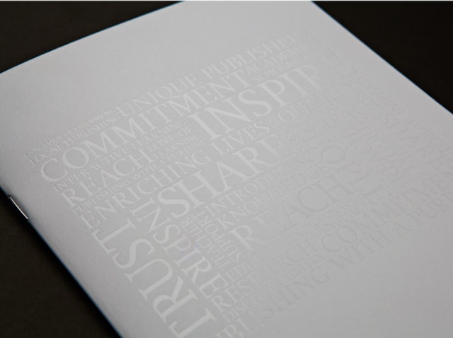
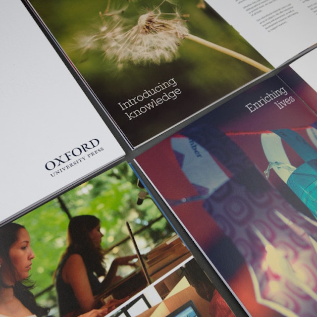
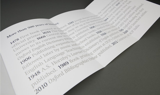
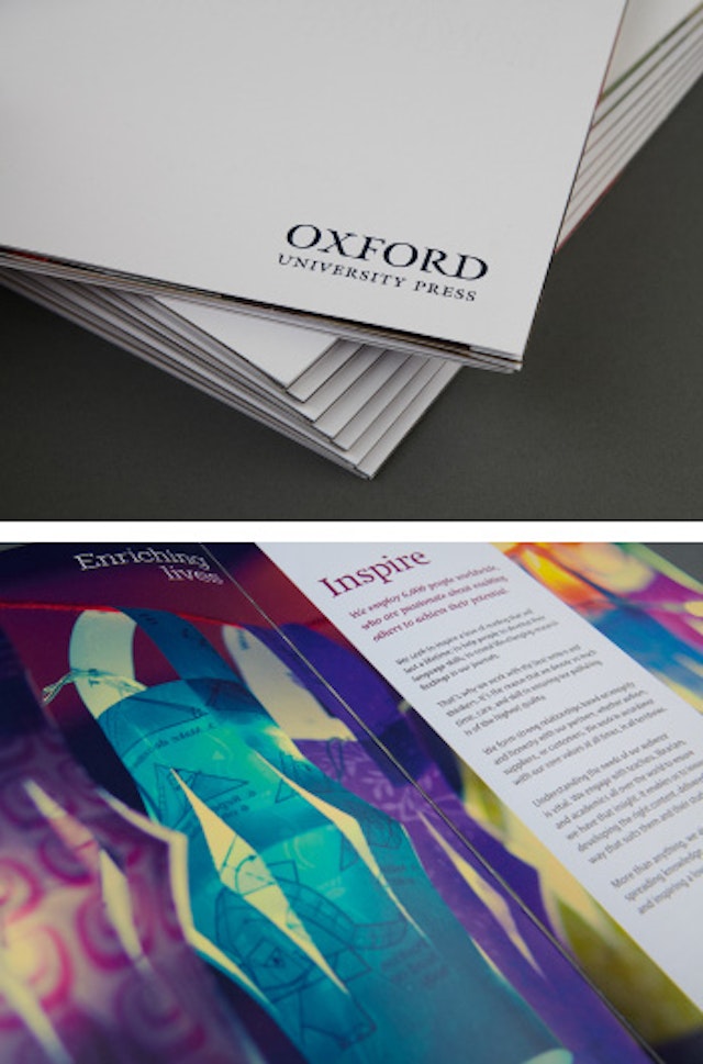
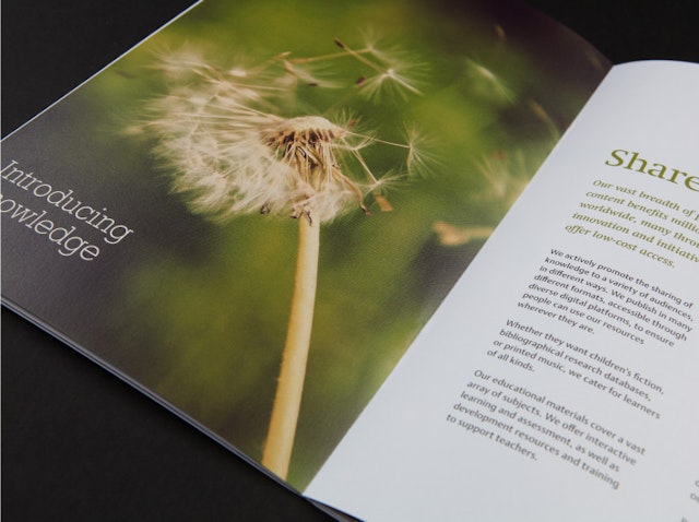
The One Off: Oxford University Press brand book design
Brand: Oxford University PressTitle(s): Brand Book Agency: The One OffAgency website: www.theoneoff.comCreative Director: Sam GoughCopywriter: Supplied by Oxford University Press Photographer: Supplied by Oxford University Press, finished book images by Sarah DarleyPublished: March 2013Short rationale (optional): Working with OUP on the design and creation of a brand book. Our brief was to produce something that could convey the brand and realign perceptions on an internal global scale. We worked closely with our client to produce a friendly, relaxed and understated book that was equally beautiful and elegant.
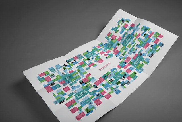
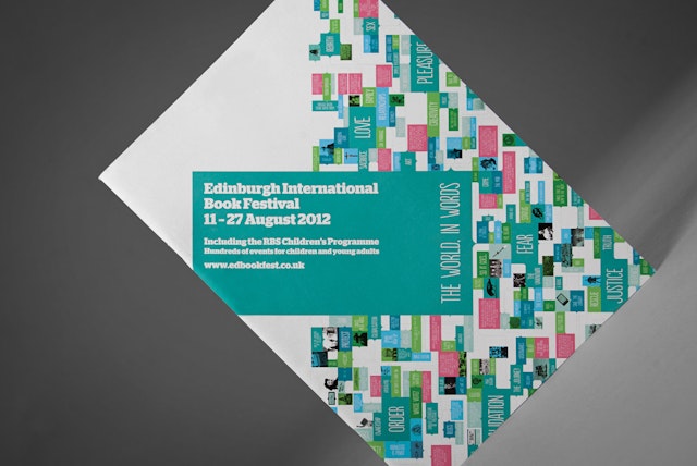
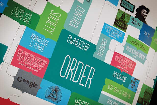
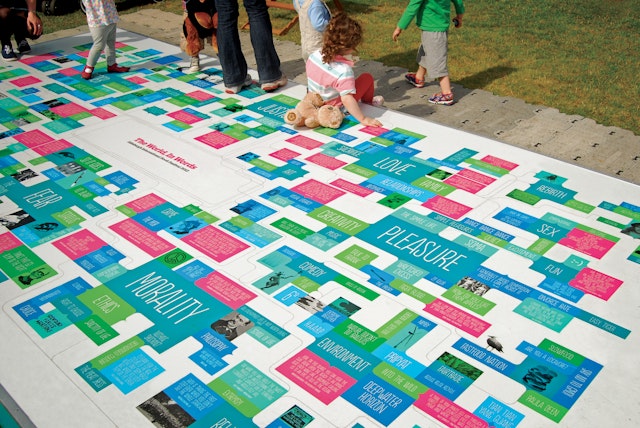
Tangent Graphic: The Edinburgh International Book Festival 2012 branding
Brand: The Edinburgh International Book FestivalTitle(s): The Edinburgh International Book Festival 2012Agency: Tangent Graphic, Glasgow, ScotlandAgency website: http://www.tangentgraphic.co.uk Creative Director: David WhyteAdditional credits: Andrew Stevenson, Gary Dickson, Dave Morrow, Leo PhilpPublished: 2012Short rationale (optional): The Edinburgh International Book Festival is a meeting of minds, welcoming novelists, scientists, philosophers, biographers, environmentalists, economists, Nobel and Booker prize-winners and many more besides. The programme is developed around the observation that contemporary literature is informed by issues in wider society.To highlight this link the festival identity was based on the simple concept of 'The World, In Words'. A topic board was designed as the centrepiece of the identity; quotes and passages from authors and participants were arranged around current world events and cultural trends, ranging from the global banking crisis to the ubiquity of social media.To structure such a complex arc of topics and contributors, the board was arranged around basic 'human motivations': The Desire for Justice, The Desire for Love, The Desire for Order, The Desire for Pleasure, The Desire for Validation, The Fear of the Unknown, and The Challenge of Morality.Since classical times it was believed that all storytelling was based around these simple drivers, because all human motivation could be traced back to them. The concept was applied to environmental dressing and installations, ambient digital, the festival programme and all related promotional materials.
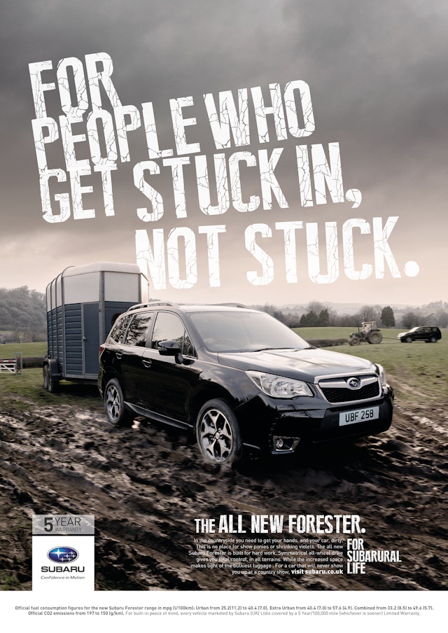
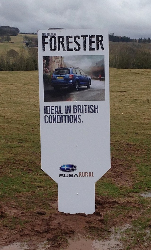
Brand: SubaruTitle(s): SubaruralHeadline and copy text (in English): For Subarural LifeAgency: BJL, Manchester, UKAgency website: http://www.bjl.co.uk Creative Director: Tom RichardsArt Director: Tom Richards, Paul KinsellaCopywriter: Pete Bastiman, Carla HawkinsPhotographer: Rob SmithPublished: May 2013
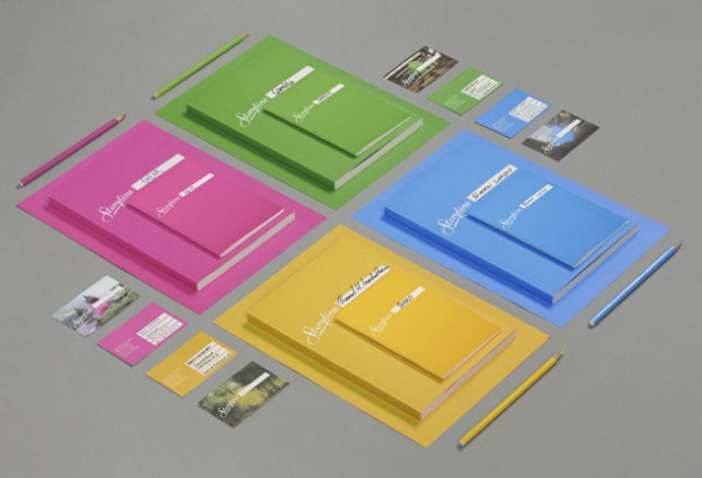
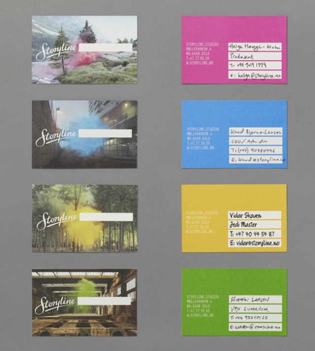
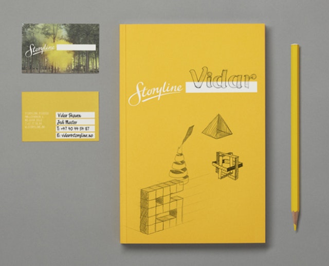
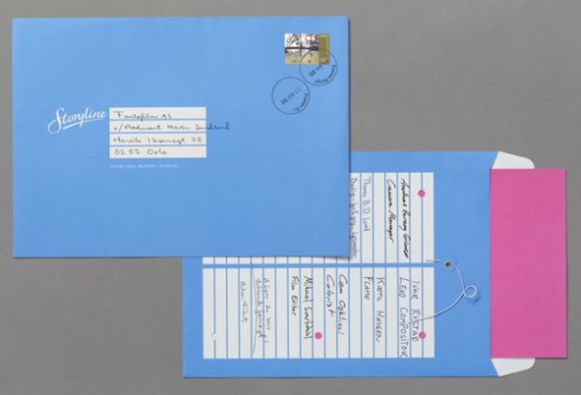
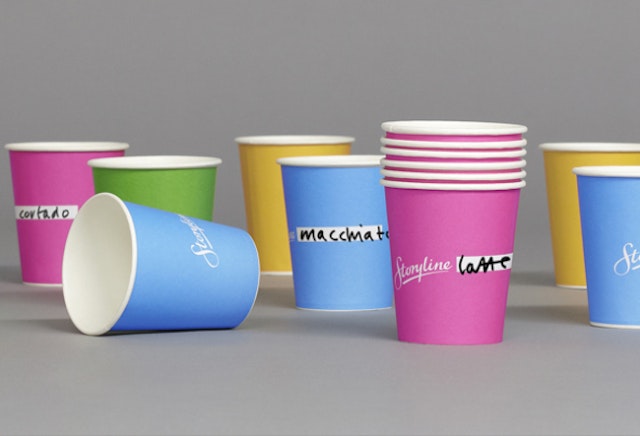
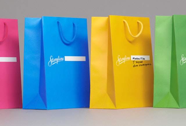
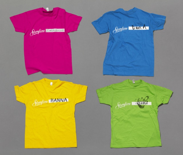
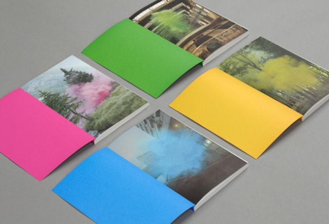
Work in Progress: Storyline brand identity
Brand: StorylineAgency: Work in Progress, Oslo, NorwayAgency website: http://www.workinprogress.no/Creative Director: Torgeir HjetlandArt Director: Torgeir HjetlandPhotographer: Filippo MinelliAdditional credits: Detailing of custom made typography for logo in cooperation with Magnus RakengShort rationale (optional): Identity, interior, signage system and art direction for Norway’s largest film studio. The logo’s white square creates a storyboard, a space for creativity, which encourages the user to interact. The name also implies a full-scale film production. People’s notion of film and commercials is an escape, a twist on reality, action and colourful special effects. The photos taken for the identity by Filippo Minelli are frozen moments where the future is yet to be revealed, and it makes the viewer engaged and curious. The signage system is inspired by the film studios of Hollywood.
McCann Erikson - Subway 'My Sub, My Way' TV ad
Brand: SubwayTitle(s): KeithHeadline and copy text (in English): My Sub, My WayAgency: McCann Erickson, London, UK Agency website: http://mccann.com Creative Director: Robert Doubal/Laurence ThomsonAdditional credits: Creatives: Lianne Galazka, James Rooke, Melissa Cain, Imogen Jones, TV Producer: Sonny Botero, Production Company: Blink, Director: Jonathan Herman, Producer: Andrew Studholme, Executive Producer: James Bland, Post-production: Craft London, Grading: MPC, Editing House: Marshall Street Editors, Editor: Tim Thornton-Allan, Audio: Craft London, Sound Designer: Tim SuttonPublished: April 2013
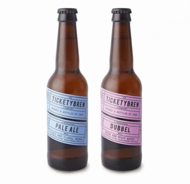
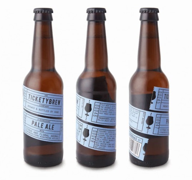
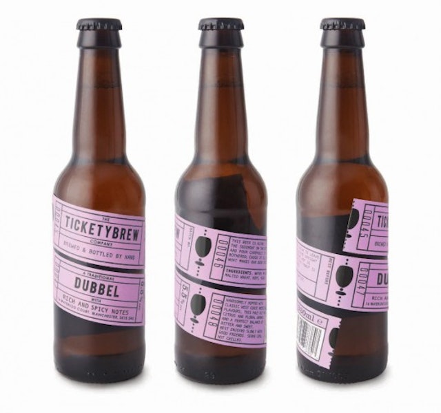
Carter Wong: Ticketybrew bottle design
Brand: TicketybrewTitle(s): Two Beers, Dubbel and Pale AleAgency: Carter Wong design, London, EnglandAgency website: http://www.carterwongdesign.com Creative Director: Phil CarterArt Director: Phil CarterCopywriter: Phil CarterIllustrator: Chris BoundsDesigner: Chris BoundsPublished: March 2013Short rationale (optional): Briefed by entrepreneurial brewer, Duncan Barton to create the name and packaging for his start up business, Carter Wong set to work trying to discover a memorable name that would then lend itself to a graphic treatment when it came to designing the label. Beginning initially with just two brews, a Belgian Dubbel and traditional Pale Ale, and in limited numbers it was important that we found a very cost effective way of producing and printing the finished label designs. All parts of the brief fell into place once we’d decided on the brand name being a take on the word ‘Ticketyboo’, meaning everything is going alright and proceeding quickly, something Duncan’s business was certainly starting to do. Therefore the name ‘Ticketybrew’ was agreed and from then on the design solution virtually solved itself. A run of four one colour tickets, enough for all the copy necessary wraps itself around the bottle with the two tickets showing the most important information strategically placed on the one front facing. Printed in black on one colour stock an extra visual detail is the appropriate glass shape for each of the two brews integrated into the ticket perforation. Printed as a gloss varnish this gives the impression of being a perforated shape in the label to reveal the bottle underneath. Suitably quirky, friendly copy completes the whole package. Available in well-stocked bars and pie shops now!
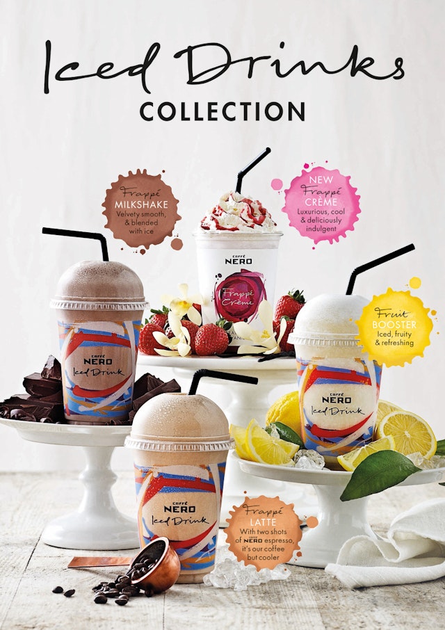
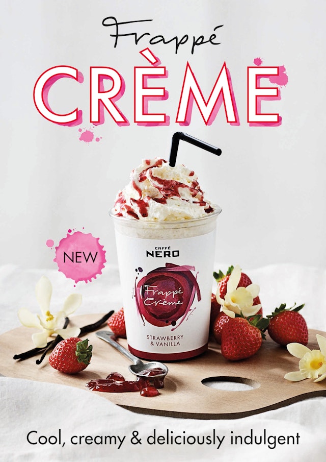
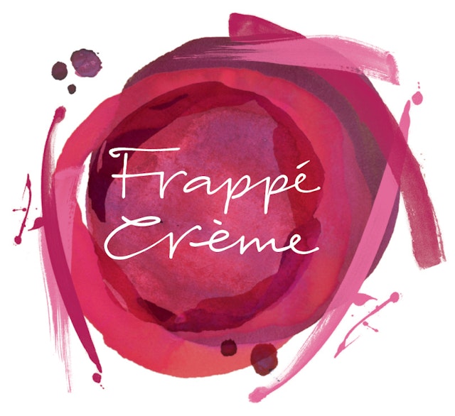
Together Design: Caffè Nero iced drinks packaging and POS
Brand: Caffè NeroTitle(s): Caffè Nero iced drinks packaging and POSAgency: Together Design, London, UKAgency website: http://www.togetherdesign.co.uk Creative Director: Katja ThielenArt Director: Bryony AkehurstDesigner: Roz FraserPhotographer: Anders SchønnemannPublished: April 2013Short rationale (optional): For summer 2013, Caffè Nero has expanded its Iced Drinks range with the wonderful 'Frappé Crème', an indulgent new drink that blends milk and ice with fruit purees and syrups. Together Design has designed a vibrant cup with a painterly motif in different colours to suit the three flavours: Strawberry & Vanilla, Coconut & Chocolate, Banana & Toffee. Together Design has also created in-store POS, posters and t-shirts focused on the whole iced drinks range which also includes Fruit Boosters and Frappé Lattes. The overall feel is unmistakebly summery, with emphasis on the array of ingredients, and clear labelling of the different drink names. Creative Director Katja Thielen says: 'The whole campaign is very light and fresh, complementing the new cream-topped Frappé Crème range.'
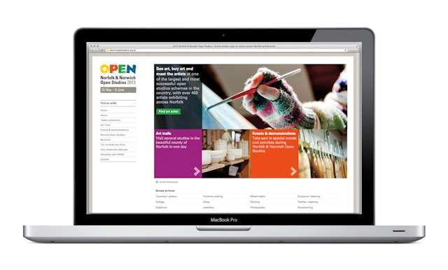
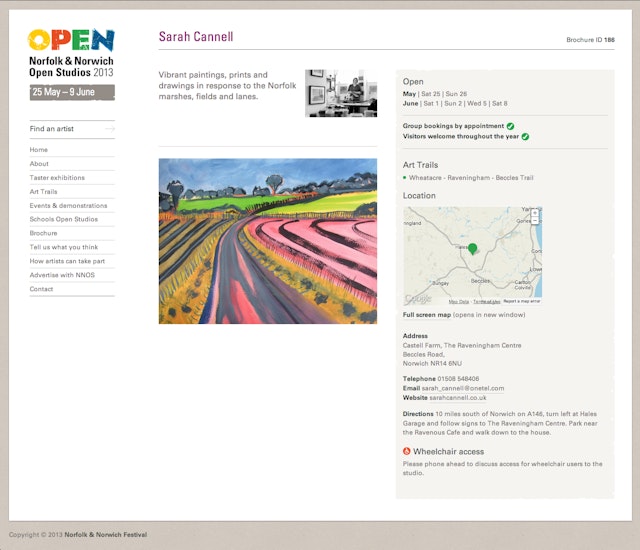
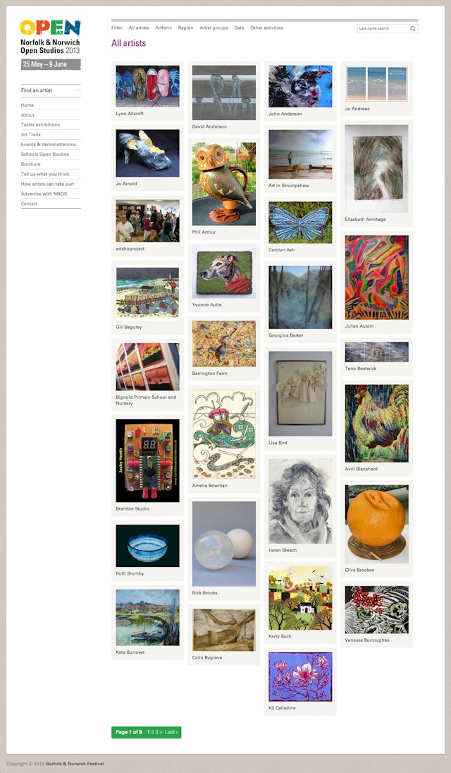
Silk Pearce: Norfolk & Norwich Open Studios website redesign and restructure
Brand: Norfolk & Norwich Open StudiosTitle(s): Website redesign and restructureAgency: Silk Pearce, Colchester, EnglandAgency website: www.silkpearce.comCreative Director: Andrew SharmanPhotographer: Home page photography: Jemma Mickleburgh, Artist directory page photography: Sarah CannellShort rationale (optional): Silk Pearce has redesigned the Open Studios website with larger imagery, improved navigation and displaying more images per page to showcase the breadth of creative work on offer via this arts scheme. The site has also been restructured ‘behind the scenes’ to enable the 450 or so artists signing up to set up online accounts and to directly upload their details. Previously information had to be supplied on paper, then re-keyed, proofed and approved before being used in literature and other promotional materials.
Fallon: PETA 'Do it like they do' video
Brand: PETATitle(s): Do it like they doAgency: Fallon, London, UK Agency website: http://www.fallon.co.uk Executive Creative Director: Santiago LuceroAdditional credits: Creatives: Rick Gayton & Darren Beresford, Producer: Lisa Mason, Director: Nico Kassakof, Production Company: Nunchaku Cine, Post-production: Electric Theatre Collective, 2D Operator: Giles Cheetham, Fasa Oyibo, Paul Wilmot, Andrew Stewart, Post-producer: Lee Pavey, Music: Simon Elms @ Eclectic Sound Published: April 2013Short rationale (optional): Highlighting the fact that vegans have bigger sexual appetites.
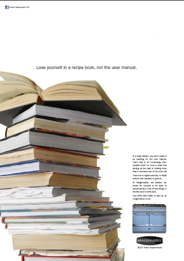
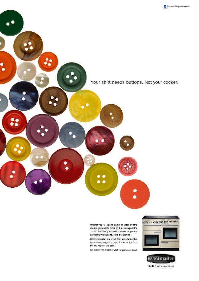
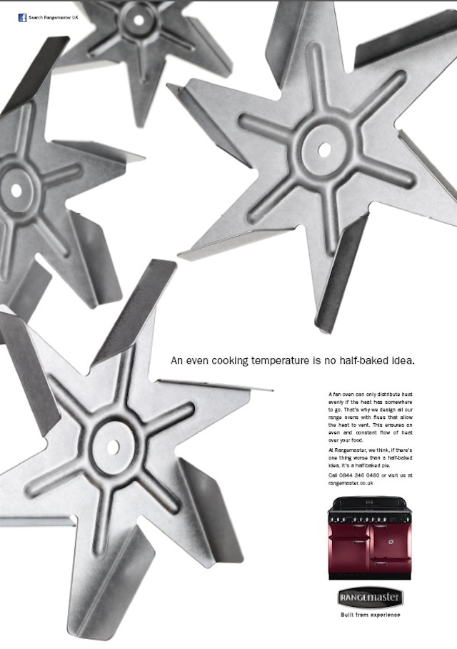
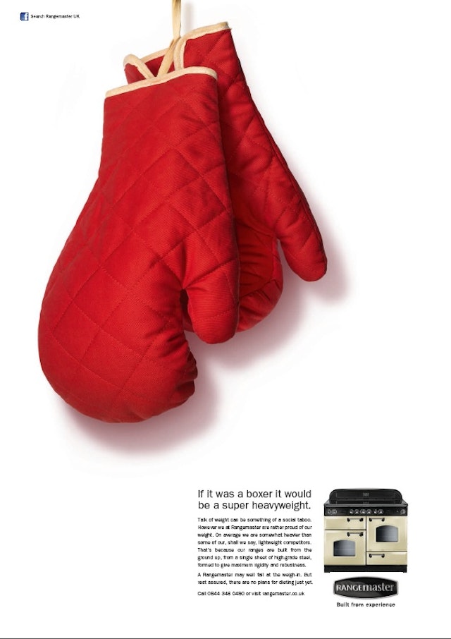
MNDB Advertising: Rangemaster “Built From Experience” press & digital campaign
Brand: RangemasterTitle(s): “Built From Experience” press & digital campaignHeadline and copy text (in English): Lose yourself in a recipe book, not the user manual - In a busy kitchen, you don’t need to be reaching for the user manual. That’s why in an increasingly complicated world it’s nice to know that turning up the heat is nothing more than a clockwise turn of the oven dial. There are no digital readouts, no fiddly buttons and certainly no gizmos. At Rangemaster, we believe our recipe for success is all down to remembering it’s the simple things in life that tend to work best. Call 0844 346 0480 or visit us at rangemaster.co.ukYour shirt needs buttons. Not your cooker - Whether you’re cooking beans on toast or lamb shanks, you want to focus on the cooking not the cooker. That’s why we don’t cram our ranges full of superfluous buttons, dials and gizmos. At Rangemaster, we know from experience that the easier a range is to use, the better the food and the happier the cook. Call 0870 789 6110 or visit rangemaster.co.ukAn even cooking temperature is no half-baked idea - A fan oven can only distribute heat evenly if the heat has somewhere to go. That’s why we design all our range ovens with flues that allow the heat to vent. This ensures an even and constant flow of heat over your food. At Rangemaster, we think, if there’s one thing worse than a half-baked idea, it’s a half-baked pie.Call 0844 346 0480 or visit us at rangemaster.co.ukIf it was a boxer it would be a super-heavyweight - Talk of weight can be something of a social taboo. However we at Rangemaster are rather proud of our weight. On average we are somewhat heavier than some of our, shall we say, lightweight competitors. That’s because our ranges are built from the ground up, from a single sheet of high-grade steel, formed to give maximum rigidity and robustness. A Rangemaster may well fail at the weigh-in. But rest assured, there are no plans for dieting just yet.Call 0844 346 0480 or visit rangemaster.co.ukAgency: MNDB Advertising, London, UKAgency website: http://mndb-advertising.com/ Creative Director: Adam Staples & Paul MilesArt Director: Adam Staples & Paul MilesCopywriter: Adam Staples & Paul MilesPhotographer: Eugenio FranchiAdditional credits: Account Lead: James DavisPublished: April 2013Short rationale (optional): To demonstrate the strengths of the Aga Rangemaster brand - simplicity, build quality and cooking ability; while at the same time breaking away from the tired "category" approach of most cooker advertising.
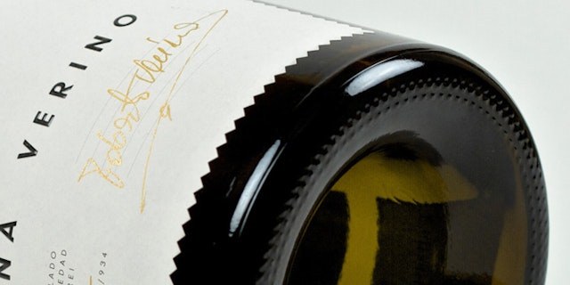
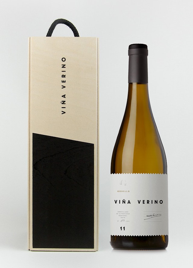
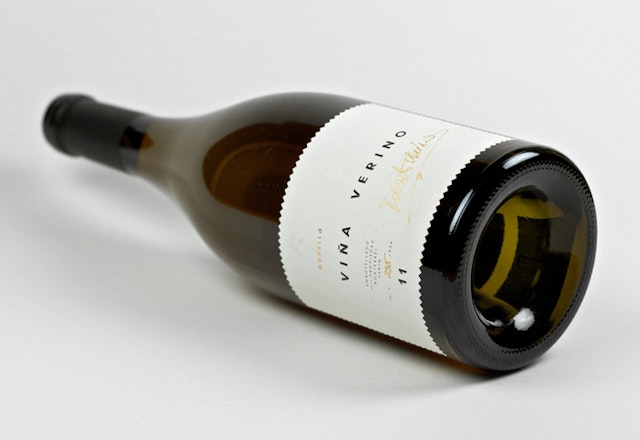
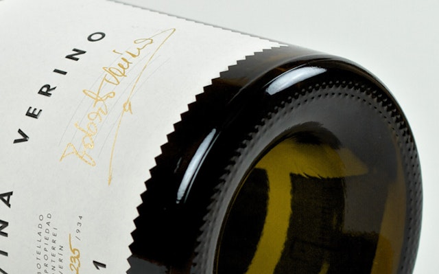
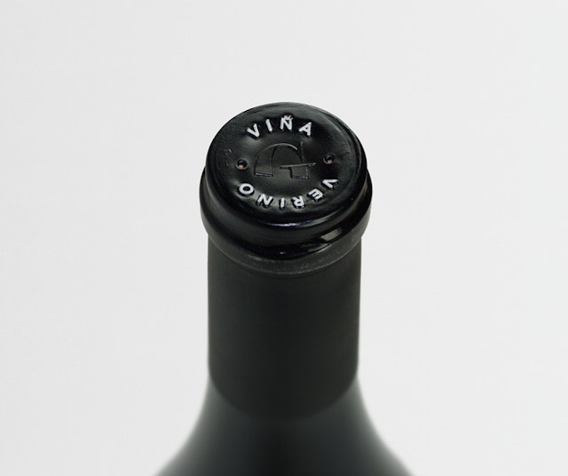
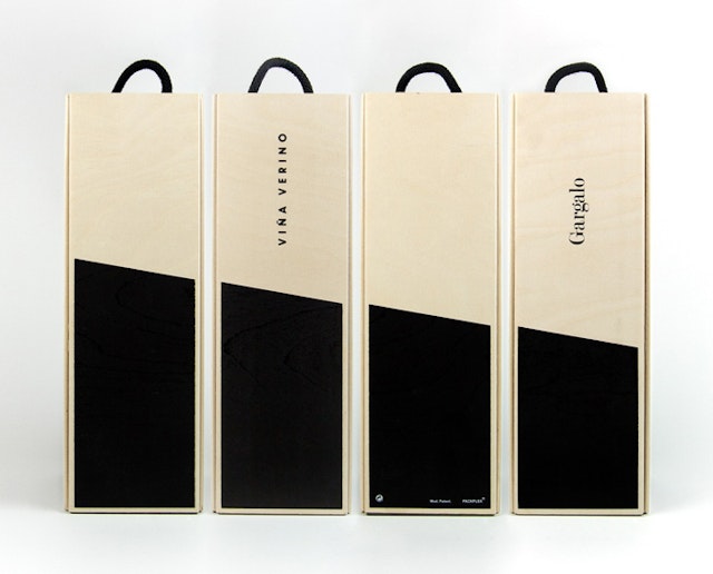
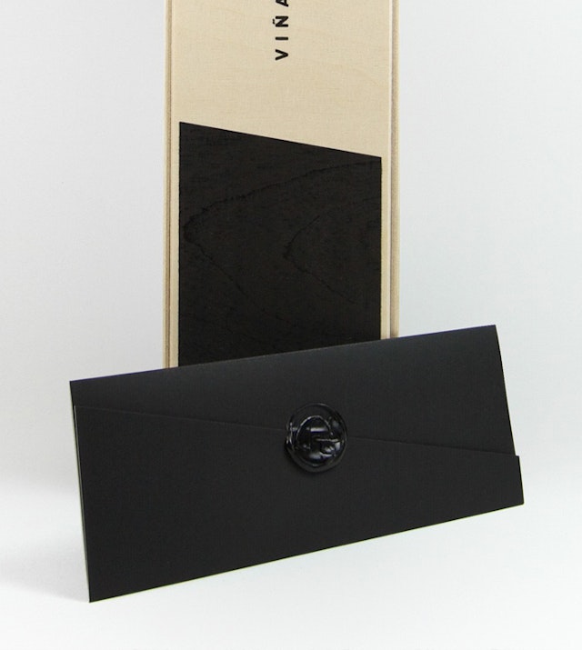
Solo: Gargalo 'Viña Verino' packaging design
Brand: GargaloTitle(s): Viña VerinoAgency: Solo, Barcelona, SpainAgency website: http://www.solofficial.comCreative Director: Óscar GermadePhotographer: José HeviaPublished: 2013Short rationale (optional): Label and case design for the most prestigious wine of Gargalo cellar. Based on the name —a reference to the winery owner, fashion designer Roberto Verino— we created a die cut label, metaphor to the seam, to handmade clothes, to homemade wine.
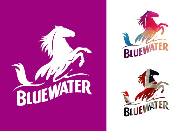
23red: Bluewater logo design
Brand: BluewaterTitle(s): Bluewater Unveils Dynamic New Logo Created by 23redAgency: 23red, London, UKAgency website: http://www.23red.com/ Creative Director: Sean KinmontBrand Illustrator: Chris MitchellBespoke Lettering Designer: Chris WeirPublished: May 2013Short rationale (optional): Bluewater’s brief to 23red was to create a logo that embodied the dynamic, inspirational and memorable nature of this leading UK brand.To meet this brief 23red worked together with the specialist craft duo – brand illustrator, Chris Mitchell, and bespoke lettering designer Chris Weir – to create the new logo. Chris Mitchell is recognised internationally for his skills in the development and execution of some of the worlds’ most familiar illustrative brands, including Tiger Beer, BAFTA and Absolut. In the newly enhanced logo, the Bluewater horse – a symbol of Kent – remains at the heart of the brand’s reinvigorated creative identity. It rears proudly above the hand-drawn lettering, representing the strength and passion of the brand. 23red has rendered the refined horse illustration in both solid and silhouette versions so that its form can reflect the ever changing and vibrant nature of Bluewater.
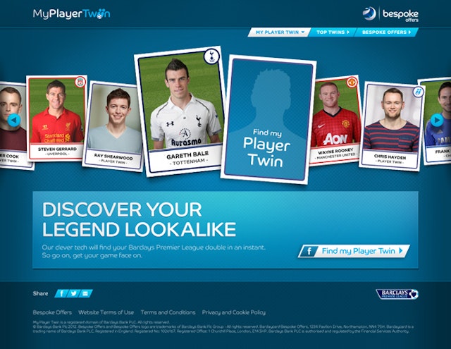
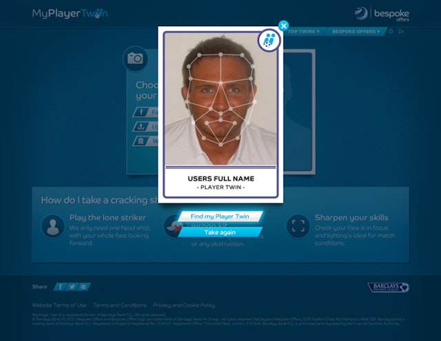
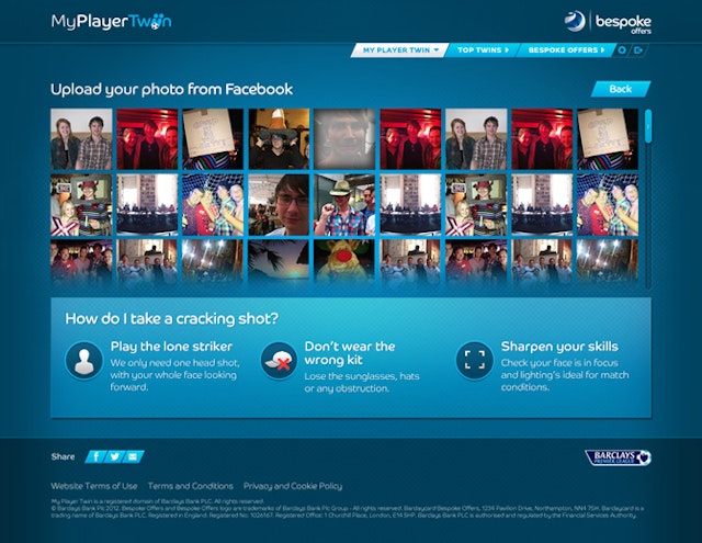
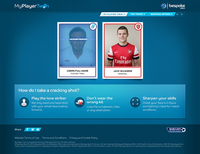
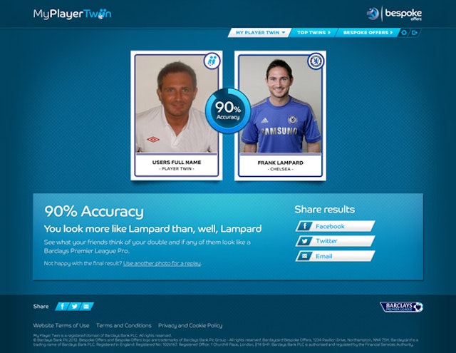
RAPP: My Player Twin website for Barclays
Brand: BarclaysTitle(s): Player TwinAgency: RAPP, London, UK Agency website: http://www.rapp.co.uk Creative Director: Rik HaslamArt Director: Phillipe WilsonCopywriter: Alex McGheeAdditional credits: Planner: Rick Mills, Designers: Adrian Whatman, Ralph Peskett, Developer: Unit 9, Account Management: Louise Morgan, Jessica Aspinall, Loes Wijsman, Project Manager: Henry ChuksPublished: April 2013Short rationale (optional): My Player Twin, a new application that uses the latest facial recognition technology, has been launched to help football fans find their Barclays Premier League footballer twin. Created by Barclays direct marketing agency RAPP, My Player Twin is a free and easy to use website that allows football fans to find their nearest match by uploading an image of their face, taking a picture on their webcam or connecting via their Facebook page. The website uses the same facial recognition technology that is used by airport scanners to then match your face to one of the 500+ Premiership football players. The website has a scanning process that detects symmetry, features and expression for a credible and often humorous match. An inbuilt accuracy rating enables users to distinguish the top scorers from the benchwarmers alongside an online gallery showcasing the most accurate top twins on the site. Once your twin is revealed, users are encouraged to share their unique lookalike through Facebook and Twitter, giving them bragging rights at the local pub or even helping to bag a contract at a non-league club.
BBH London: Zagorka 'A Taste Less Ordinary' TV and press campaign
Brand: Zagorka Title(s): A Taste Less OrdinaryAgency: BBH, London, UK Agency website: http://www.bartleboglehegarty.comCreative Director: Pablo MarquesAdditional credits: Creative Team: Daniel Schaefer & Szymon Rose, BBH Producer: James Laughton, Production Company: Argentina Cine, Director: Augusto Zapiola, Executive Producer: Cecilia Salguero/Rob Godbold, Producer: Mariano Scarpatti, DoP: Leandro Filloy, Post Production: Framestore, Editor/Editing House: Leandro Aste, SAE & Phil Currie @ Stitch, Sound: Aaron @ Wave. Published: April 2013
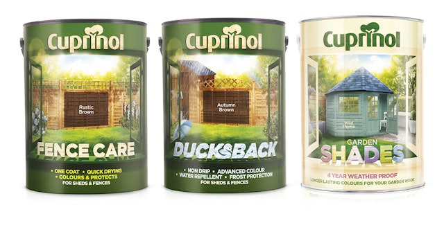
Springetts: Cuprinol brand redesign
Brand: Cuprinol Headline and copy text (in English): Cuprinol Redesign Agency: Springetts Brand Design Consultants, London, UKAgency website: http://www.springetts.co.ukCreative Director: Moyra CaseyArt Director: John SherwoodPublished: April 2013Short rationale (optional): Following an extensive respositioning and redesign exercise by Springetts Brand Design Consultants, the new livery for Cuprinol water-based fence treatments and Cuprinol Garden Shades is rolling out in-store this month. Based on the brand idea of “Brighter Outsides”, the new look features an ‘open window’ brand device intended to capture the transformational effects of the product and the emotional reward of cheering things up in the garden. In a very functional category, the new livery seeks to highlight the aesthetic, as well as practical, benefits of the product and to provide some much needed inspiration at point of sale.
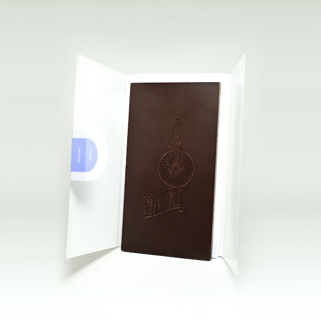
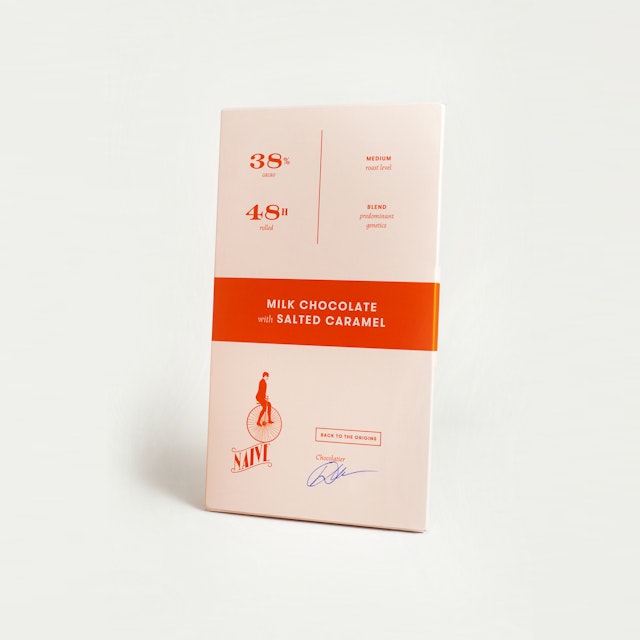
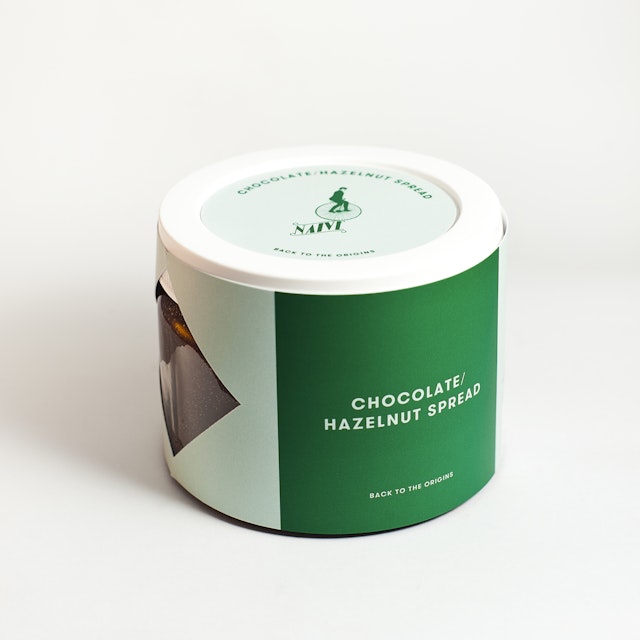
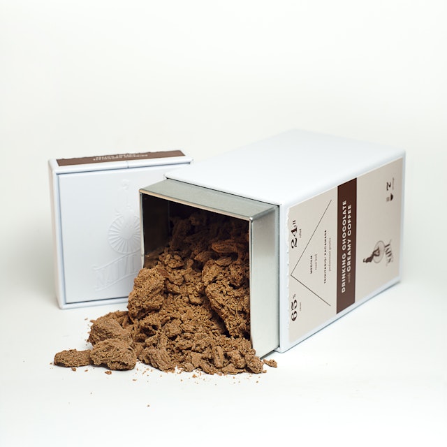
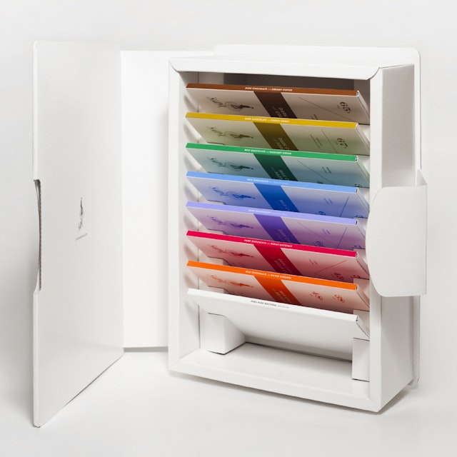
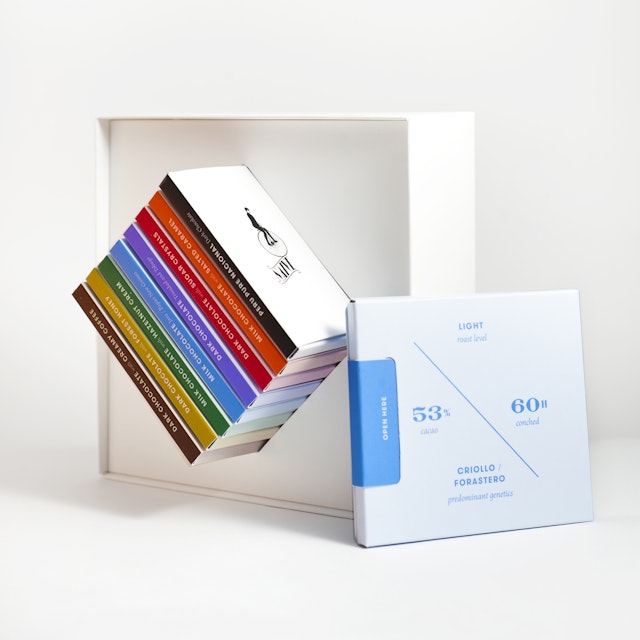
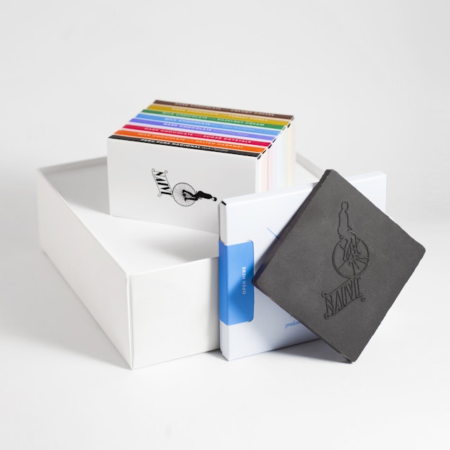
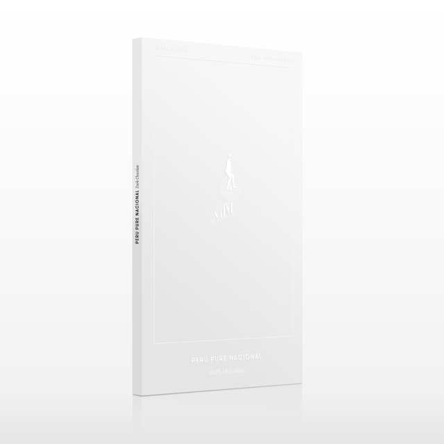
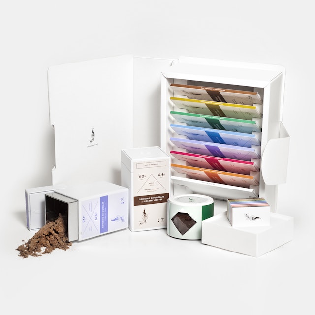
Chocolate Naive: Chocolate Naive branding
Brand: Chocolate NaiveAgency: Created & Produced by Chocolate NaiveCreative Directors: Arunas Matacius & Domantas UzpalisArt Director & Designer: Karolis KosasCopywriter: Domantas UzpalisPhotographer: Alma Galinskaite (Almu)
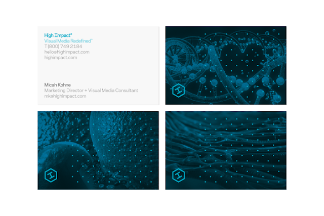
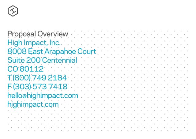
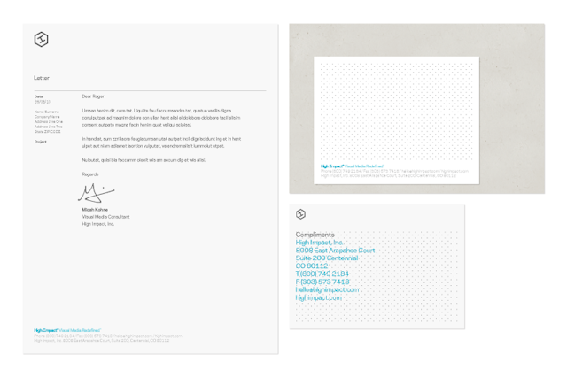
Proud Creative: High Impact identity
Brand: High Impact, IncHeadline and copy text (in English): Proud Creative identity for High Impact, Inc.Agency: Proud Creative, London, UK Agency website: http://www.proudcreative.com Creative Director: Dan WitchellPublished: May 2013Short rationale (optional): High Impact is a US based visual media company, creating 3D illustrations and moving image. Tilted one way the logomark is an H. Tilt the other and it's a cap I. Its container is both a hexagon and also potentially a cube, as a nod to the world of 3D that High Impact inhabit. We introduced an isometric hexagonal grid with hexagonal dots and a colour wash, unifying the diverse content and allowing the brand to be dialled up and down. Hero images can be used full colour and just badged with the logo. However, in a more branded iteration the grid and colour wash are applied. Overall we created a clean, modern feeling identity that is sector neutral therefore sitting comfortably within diverse content and contexts. The font is Galaxie Polaris from Chester at Village Type in Brooklyn.
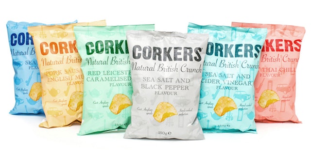
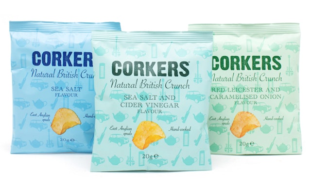
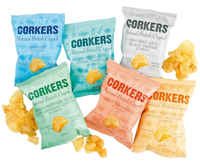
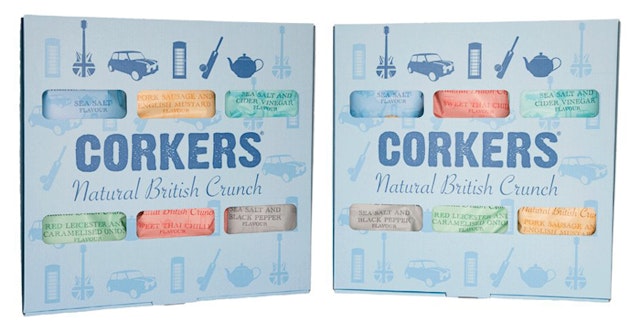
Bryt: Corkers Crisps packaging design
Brand: Corkers CrispsTitle(s): Corkers Natural British CrunchAgency: Bryt, Cambridge and London, UK Agency website: http://www.bryt.co.uk Creative Director: Mike NashArt Director: Mike NashCopywriter: Mike NashIllustrator: Mike NashPhotographer: Richard JacksonAdditional credits: Strategist: Eddie StablefordShort rationale (optional): To create a strong, new entrant to the kettle crisps product category around a British theme.
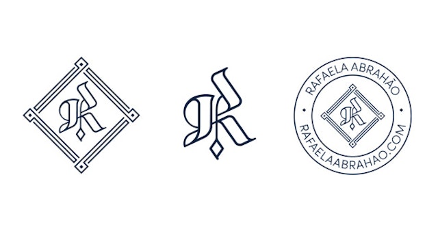
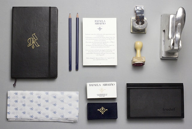
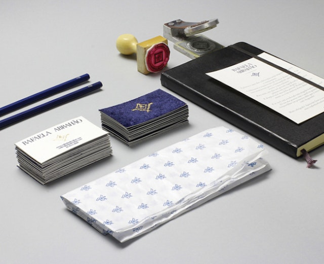
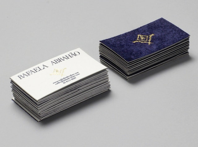
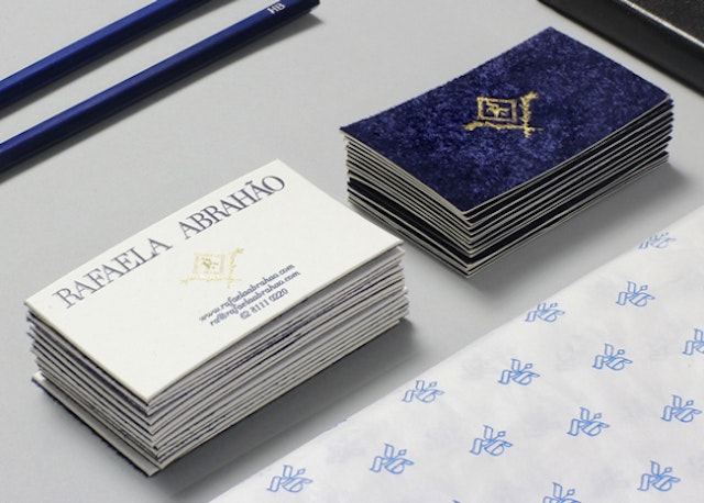
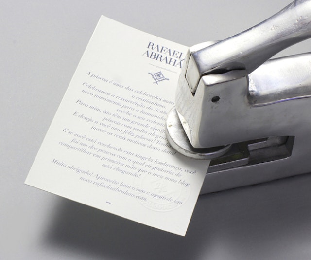
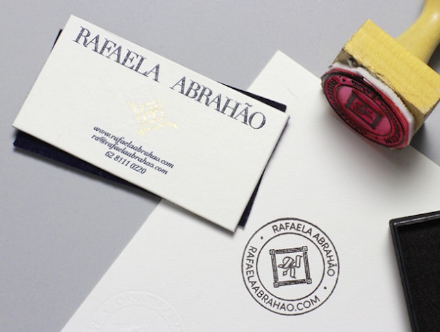
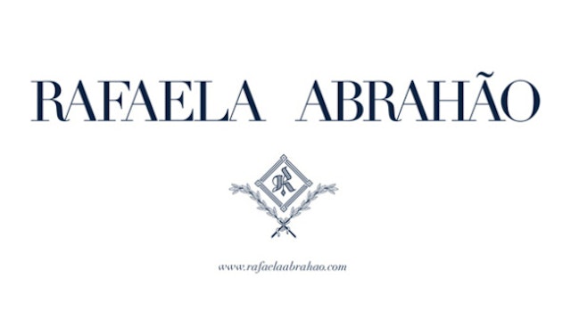
BR/BAUEN: Rafaela Abrahão brand identity
Brand: Rafaela AbrahãoAgency: BR/BAUEN, Goiânia, BrazilAgency website: http://www.brbauen.comCreative Director: Rodrigo Francisco & Braz de PinaStationary Photographer: Daniel BarrosModel Photographer: Pedro PrestesPublished: April 2013Short rationale (optional): The Rafaela Abrahão project consists of completely developing a visual identity for a Brazilian fashion blogger. We do not work with the idea that we were developing just a visual identity project for a fashionist, we went further, and developed something that represents the deepest from Rafaela Abrahão, from her external characteristics to her preferred consumer brands, going through the pride of her family's origins, to philosophical questions as her spiritual experiences, in this case, Christianity.
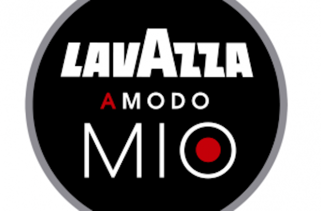
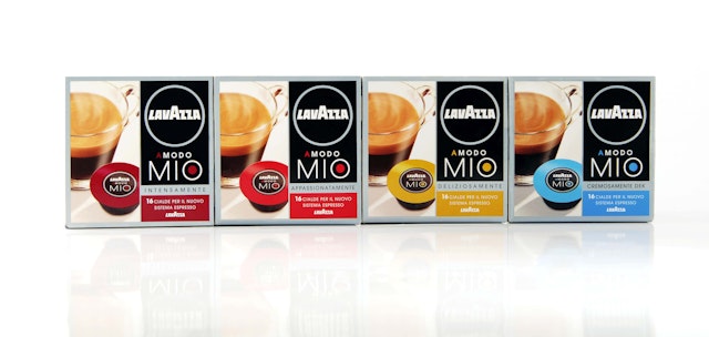
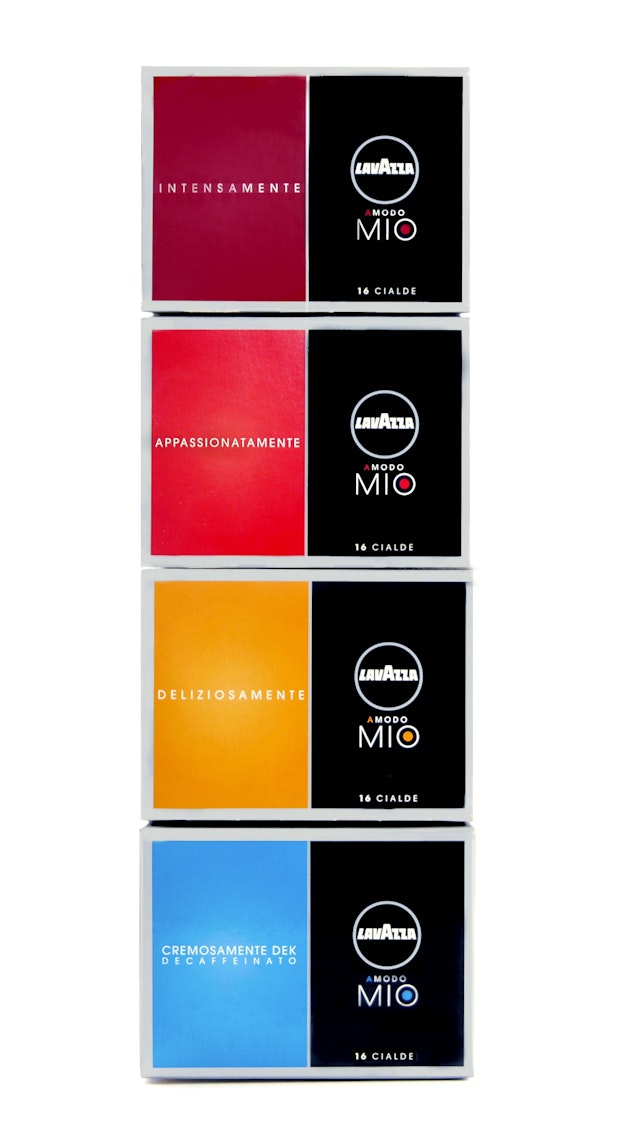
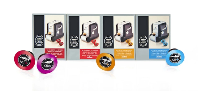
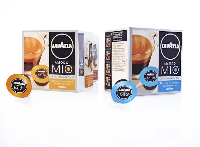
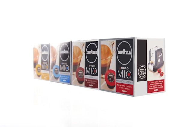
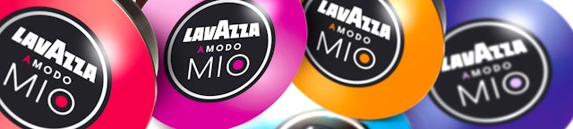
BREAK: LAVAZZA branding design
Brand: LAVAZZATitle(s): Lavazza A Modo MioAgency: BREAK, Milan, ItalyAgency website: http://www.break.itCreative Director: Alessandro Di BelloArt Director: Alessandro Di BelloCopywriter: Laura CremonesiPhotographer: Velvet Studio (Milano)Short rationale (optional): Lavazza is, simply, the synonym of the Italian espresso culture. After 110 years of experience, the market leader was able to establish a brand new consumer experience by introducing the first integrated coffee pod system: a new way of living, tasting and sharing the espresso philosophy. The company asked for a whole brand architecture and an exclusive graphic design to identify both the machine and the pods. Technology and tradition were the two key values to communicate in order to empower the brand awareness, suggesting a solid continuity with the family coffee ritual and introducing a refined technology to get an even faster espresso. "A modo mio" ("In my own way"): the innovative product experience became the new brand name itself, with a robust declaration of Italian essence. The modern, sober logo was enhanced by a sparkling packaging, featuring a linear, geometrical design and fancy, lively shades of colour, in a refined balance between institutional and emotional. The work crucially helped the brand to achieve a powerful retail positioning, which turned out to a relevant selling increase and brand awareness enforcement.
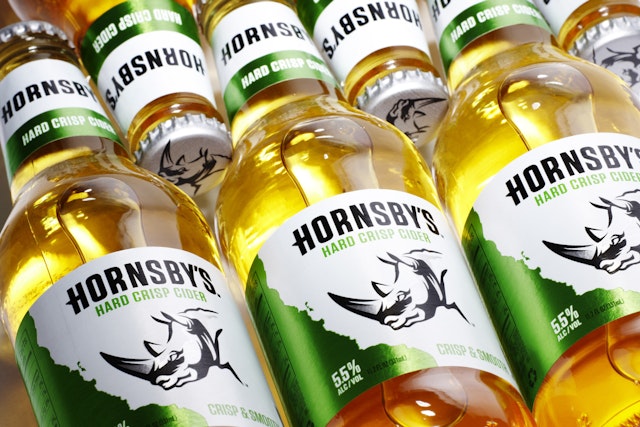
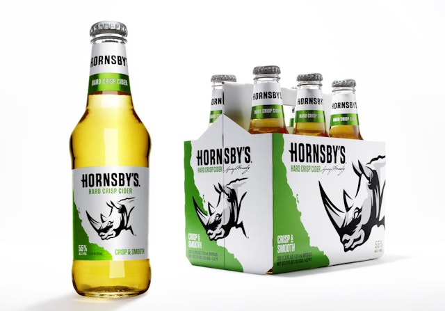
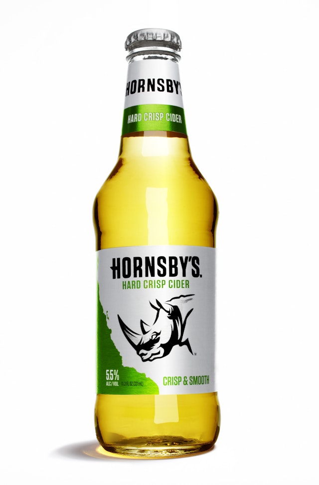
Blue Marlin: Hornsby brand identity
Brand: Hornsby's Title(s): Hard Cider Headline and copy text (in English): Hornsby’s Charges In with New Brand Identity by Blue MarlinAgency: Blue Marlin, Brookyln, USAAgency website: http://www.bluemarlinbd.com Creative Director: Mary Kay O'ConnorIllustrator: Chris MitchellAdditional credits: Senior Designer: Paul DemyanovichPublished: 2013Short rationale (optional): The new identity needed to celebrate Hornsby's 15 year heritage and break down barriers between beer and cider drinkers to bring the budding hard cider category into the American mainstream. With these aims in mind, we wanted to capture Hornsby's spirit of adventure. To visually represent its new identity, and achieve maximum shelf impact, we made heavy use of the colour white, which is a significant departure from the navy blue previously used. The Hornsby’s rhinoceros, which underscores the boldness associated with the brand, was elevated to brand icon status and redesigned to have a more contemporary, masculine look.
adam&eveDDB: VW 'Baby' TV ad
Brand: VWTitle(s): BabyAgency: adam&eveDDBAgency website: http://www.adamandeveddb.com Creative Director: Jeremy CraigenAdditional credits: Creative: Nikki Lindman/Toby Brewer, TV Producer: Lucy Westmore, Production Company: Outsider, Director: James Rouse, Producer: Benji Howell, Post-production: Work Post/Framestore, Audio: FactoryPublished: April 2013
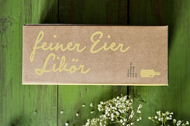
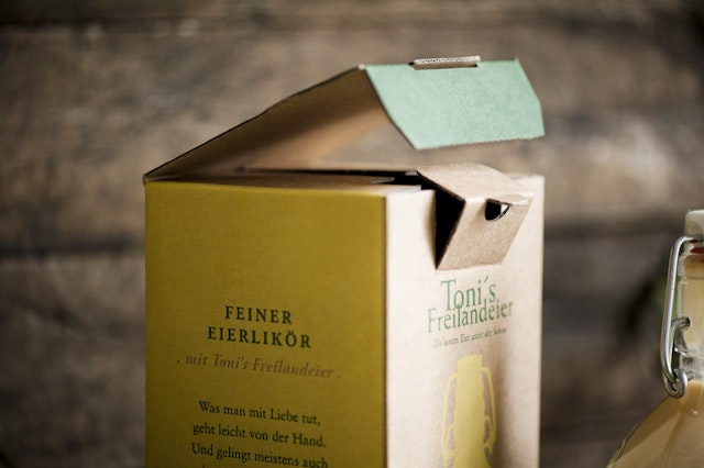
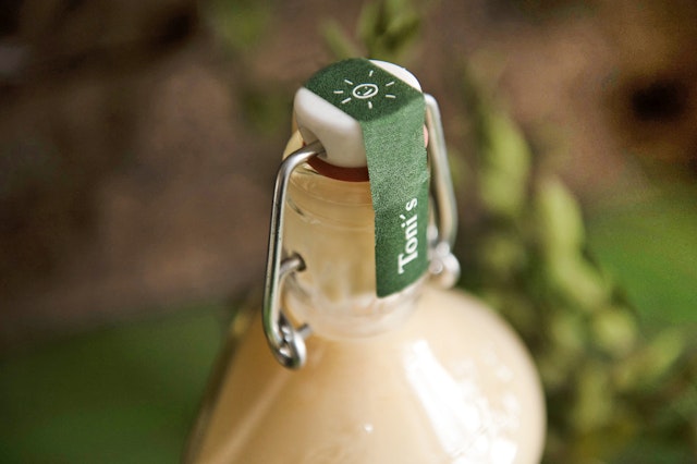
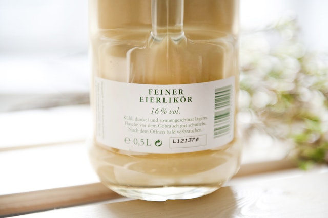
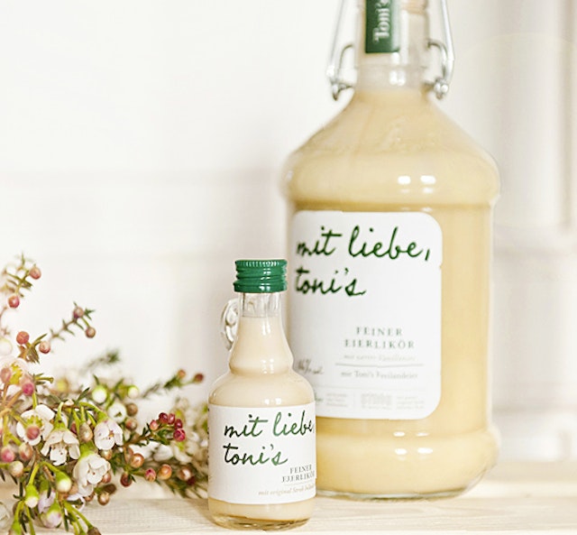
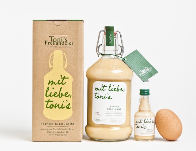
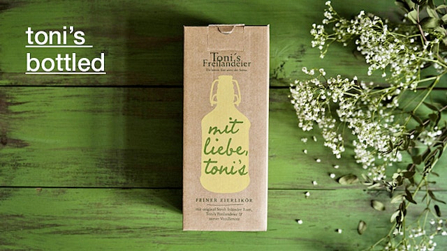
moodley brand identity: Toni Handels GmbH branding
Brand: Toni Handels GmbHTitle(s): Toni's Eierlikör Headline and copy text (in English): Toni’s fine egg liqueur Agency: moodley brand identity, Graz/Vienna, Austria Agency website: http://www.moodley.atCreative Director: Mike FuiszArt Director: Natascha TrieblPhotographer: Marion Luttenberger Additional credits: Graphic design: Natascha Triebl, Sabine Kernbichler Short rationale (optional): Products from the Toni’s brand have always stood for the theme of “freedom” – as the brand is the pioneer of the famous organic free-range eggs in Austria. The hens at “Toni’s” have been enjoying life, roaming around in freedom, for more than 25 years, - a question of attitude and of good taste. Therefore, the visionary, Toni Hubmann, continues to adopt new and sustainable approaches. How wonderful that there is now also Toni’s fine egg liqueur, made of original Stroh Inländer Rum, real Fairtrade vanilla, lots of love (after all, the slogan is: “From Toni’s with love”) experience and of course, fine Toni’s free-range eggs. In order to protect the taste even more, it is filled into shapely glass, swing top bottles and wrapped in a sturdy, beautifully illustrated box. The typography and colours of the new, 100 per cent recyclable, packaging have high brand recognition. A feast for both the eyes and the palate.
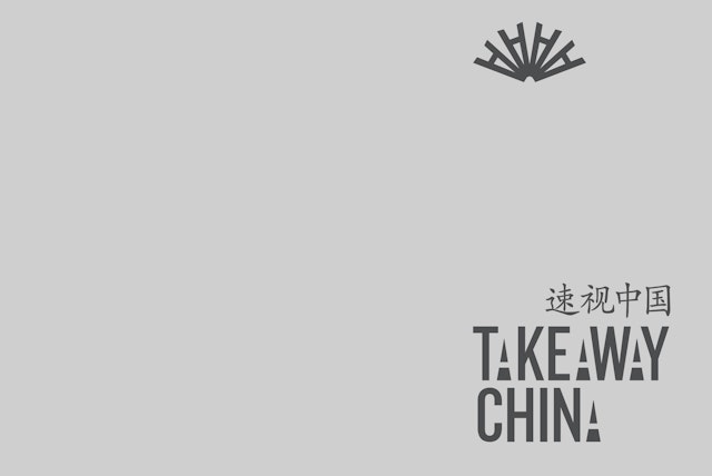
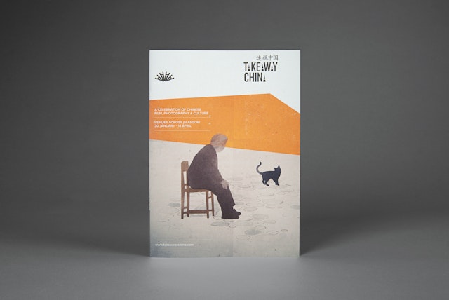
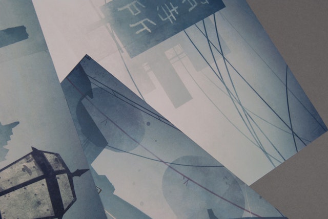
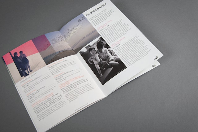
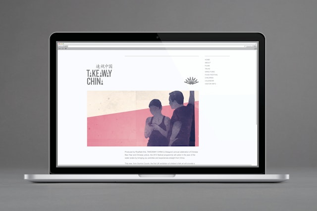
Tangent Graphic: Takeaway China brand marque and identity
Brand: RicefieldTitle(s): Takeaway ChinaAgency: Tangent Graphic, Glasgow, ScotlandAgency website: http://www.tangentgraphic.co.uk Creative Director: David WhyteAdditional credits: Dave Morrow, Gary Dickson, Andrew StevensonShort rationale (optional): Takeaway China is an annual festival held in Glasgow, celebrating contemporary Chinese film, arts and photography. The brand marque features an iconic symbol of Chinese culture – the hand fan. The fan is formed by displacing the four uppercase A’s from the event title. The identity symbolises the core objective of the festival. By attending the diverse range of events and activities, the audience is able to ‘takeaway’ a slice of Chinese culture. We created a series of illustrations based on Chinese filmic style, where atmosphere, sense of place and character are key. These illustrations evoked a strong feeling of cinematography and were used throughout all communication material. We applied the identity across all printed promotional materials.
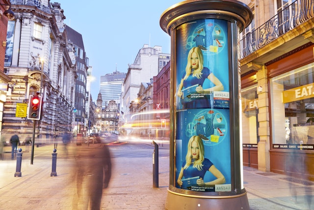
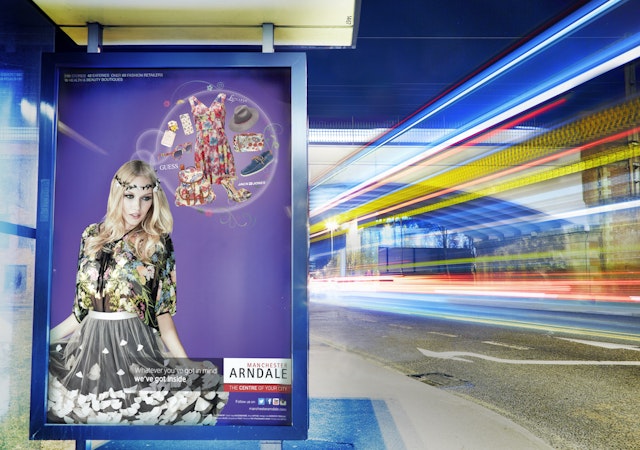
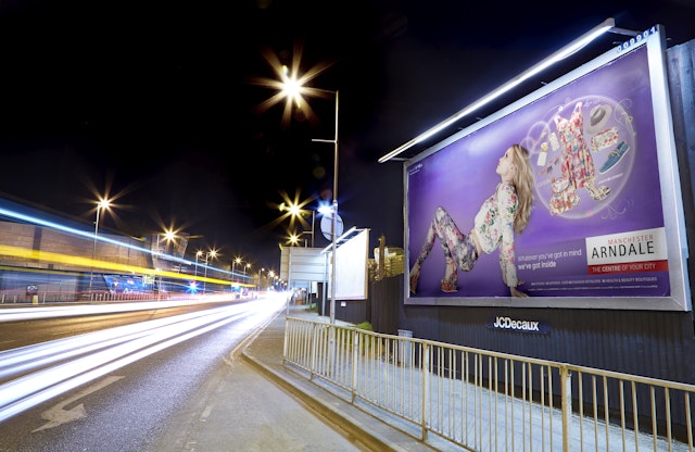
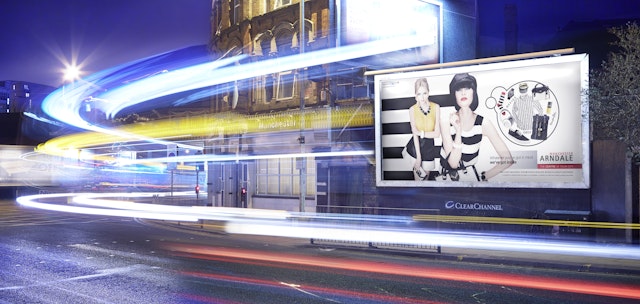
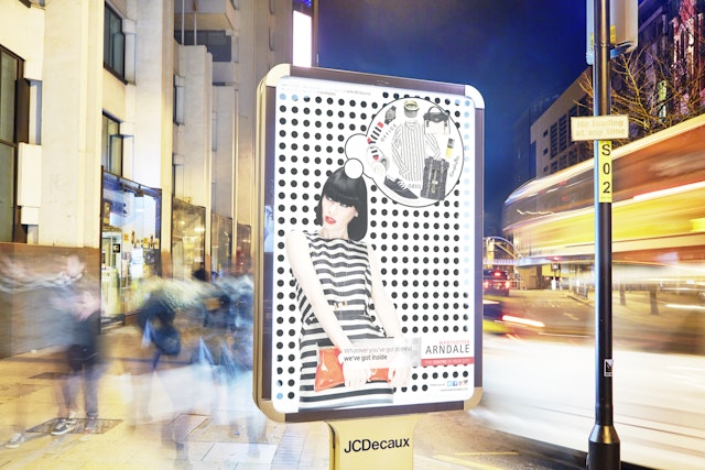
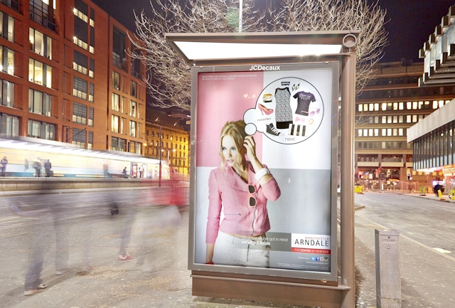
Refinery: Manchester Arndale creative campaign
Brand: Manchester ArndaleAgency: Refinery, Manchester, UKAgency website: http://www.refinerygroup.co.uk Creative Director: David PyeSenior Art Director: Stephen BagshawPhotographer: Ben Spriggs Published: April 2013Short rationale (optional): Showcasing products from Manchester Arndale’s 240 stores, 19 health and beauty boutiques, 60 fashion retailers and 42 eateries, the campaign creative reinforces the centre’s core brand message – Whatever you’ve got in mind, we’ve got inside.
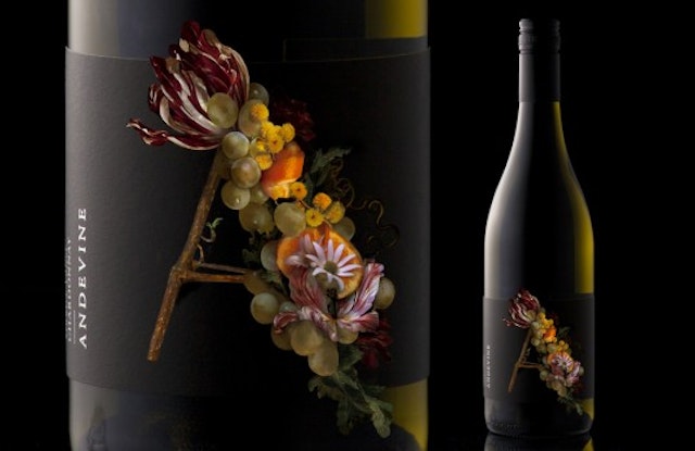
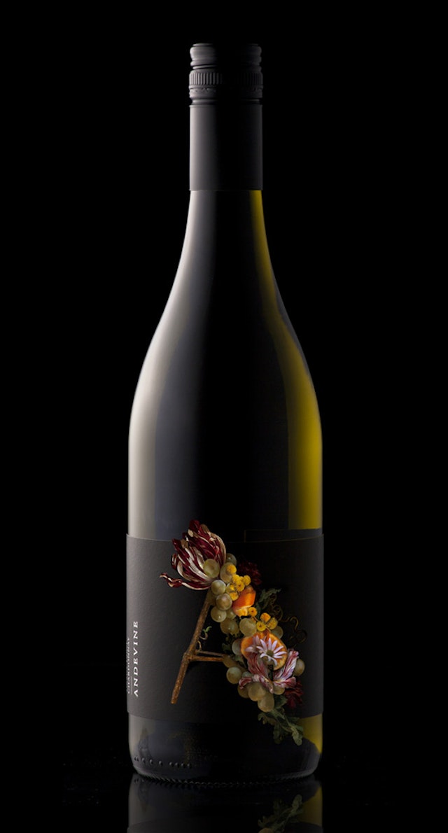
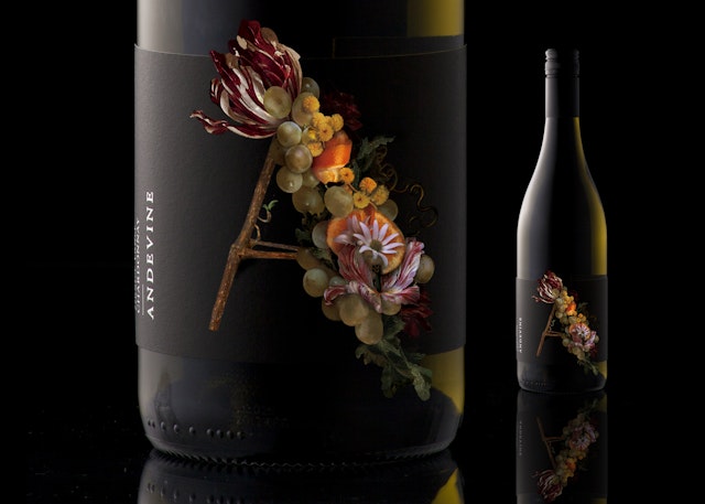
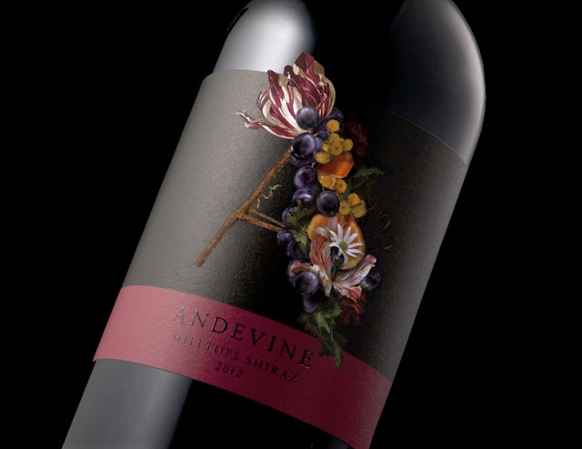
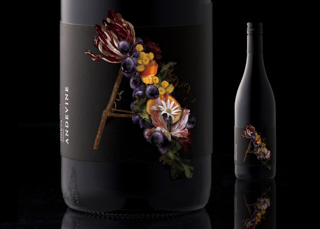
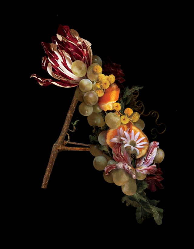
_Co Partnership: Andevine bottle design
Brand: AndevineTitle(s): AndevineHeadline and copy text (in English): AndevineAgency: _Co Partnership, Sydney, AustraliaAgency website: www.co-partnership.com Creative Director: Zoe GreenArt Director: Max Harkness & Zoe GreenCopywriter: Max HarknessIllustrator: Zoe GreenPhotographer: Carl DruryShort Rationale (optional): Andevine is a wine brand created for Hunter Valley winemaker Andrew Leembruggen’s first release. As a signature wine it was important for the design to reflect Andrew’s two biggest influences, his Dutch ancestry and his Australian upbringing. The story is illustrated with the national flowers of Holland, Australia and the state federation flower of New South Wales, creating a memorable letter A in the style of the Dutch Masters. We created the name Andevine, a fusion of the winemaker’s first name and the very beginnings of the story, the grape vine.
AMV BBDO: Snickers 'Google' viral search campaign
Brand: MarsTitle(s): Snickers Headline and copy text (in English): Google Search Agency: AMV BBDO, London, UK Agency website: http://www.amvbbdo.com Creative Directors: Alex Grieve & Adrian RossiArt Director: Andy CloughCopywriter: Rich McGranAdditional credits: Agency Planner: Amy Witter, Agency Account Manager: Katy Davis, Dhane Scotti, Chloe Harding, TV Producer: Robbie Kilgour, Digital Producer: Steve Bond, Media Agency: Mediacom, Media Planner: Lucy Mitchell, Digital Production Company: Media MonksPublished: April 2013
BBH London: Robinsons Cordials 'Pals' TV ad
Brand: Robinsons Cordials Title(s): PalsAgency: BBH, London, UKAgency website: http://www.bartleboglehegarty.com Creative Director: Hamish Pinnell/Justin MooreAdditional credits: Creatives: Matt Moreland/Chris Clarke/Sarah Hardcastle/Elliot Sheils, TV Producer: Glenn Paton, Production Company: Academy Films, Director: Si & Ad, Producer: Dom Thomas, Executive Producer: Lizzie Gower, Photography: Barry Ackroyd, Post-production: The Mill, Editing House: Final Cut, Editor: Joe Guest, Sound Designer: Nick AngellPublished: May 2013
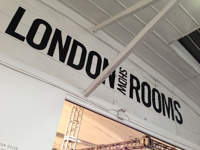
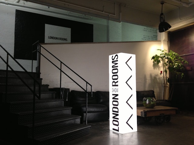
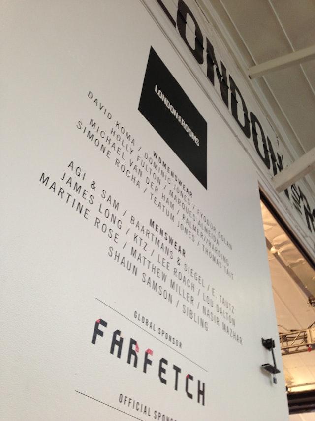
Digital Imaging Services (DIS): Brtish Fashion Council's LONDON Show ROOMS design
Brand: British Fashion CouncilTitle(s): LONDON Show ROOMSHeadline and copy text (in English): DIGITAL IMAGING SERVICES JOINS FASHION ELITE IN PARIS AND NEW YORKAgency: Digital Imaging Services (DIS), Wolverhampton, EnglandAgency website: http://www.digital-is.co.uk/Photographer: Mark BradleyAdditional credits: Managing Director of DIS, Mark Bradley organised and oversaw installationShort rationale (optional): Print specialist Digital Imaging Services rubbed shoulders with the fashion elite this month when it joined the British Fashion Council in New York to install the LONDON show ROOMS. This event is a continuation of a relationship which has already seen Digital Imaging Services create innovative event installations at previous LONDON show ROOM events in Paris, New York and LA. Digital Imaging Services undertook the logistics and installation for the event in New York, producing and installing vinyl graphics, light boxes, digital projections, graphic panels and walkway branding. The combined activity turned the event space at the Industra Superstudio in Manhattan into a high impact and sophisticated area for Britain’s fashion elite to showcase their collections.