My Creative Career: Sarah Moffat, chief creative officer at Turner Duckworth
It has been a quarter of a century at the design studio she loves, working on some of the world’s most loved and well-known brands. Here’s the story so far.

Chief creative officer Sarah Moffat
Sarah Moffat has always been creatively minded and believes we all have that ability within us. She describes her upbringing as “unconventional” in some ways. Her Dad was an inventor and engineer, so weird contraptions were always lying about the house. By the time she was born, her parents had already had two older children who were pushed toward more studious careers. By the time Moffat was deciding what she wanted to do in life, it was a case of “do what makes you happy.”
Initially, she thought she might be a forensic pathologist due to her love of the 1970s TV show Quincy, so she opted to study biology, chemistry, math and the like. A shocking revelation occurred when she realized that, if she went down that route, she would have to participate in those “intense and very serious” subjects for the rest of her life. That wasn’t going to cut it for the youngster.
After a gap year, Moffat found herself at Cumbria Institute of the Arts on a foundation degree, not knowing what it entailed but aware that it bought her another year of trying to figure out her career path.
“My response to every brief we were given somehow ended up being a communication answer. I’ll be honest, mostly because I can’t draw! I think that’s how a lot of people get into graphic design; they’re not particularly great at drawing or illustrating. You have to think about the problem in a different way. I was kind of doing that instinctively and intuitively.”
It took her late tutor, John Marshall, to tell Moffat that she should study graphic design at Kingston University, which she did. She says she owes a lot to Marshall. He was old school and had a tough yet motivating, non-nonsense approach that would probably land him in hot water with HR today, but he saw the potential in all of his students.
While Moffat was studying in the mid-90s, Turner Duckworth had very recently opened its doors a couple of years prior – reportedly in the corner of an old warehouse. While she was at Kingston, co-founder Bruce Duckworth came to the university to tell the students of a competition with Schweppes. It was to design trophies for an alternative Eurovision contest, called Eurobash, that Channel 4 was hosting. The prize was a week’s unpaid internship at the studio. Moffat’s design won.
“The winner [of Eurobash] was Sophie Ellis-Bextor, so I have these hilarious photos of her and me posing with the giant gold megaphone I made with the Schweppes logo,” she recalls. “So that’s how I met Turner Duckworth.”
During the internship, she recalls being completely shocked by the long days and laughs at her younger self for thinking that she was going to be called into design meetings right away. It didn’t quite pan out that way – in fact, she spent a lot of her time making coffee for people. When the week was up, she went back to university and finished her degree. The following year, she applied for a job at Turner Duckworth and the rest, as they say, is history. “I’ve been there ever since.”
Over the last quarter of a century, she has worked her way up through the ranks of the studio, working with mammoth brands like Coca-Cola, Amazon, McDonald’s, Campbell’s and even the band Metallica. The world-renowned agency is one of the most well-respected in the industry and the standout work encompasses branding, packaging and art.
Moffat’s favorite project to date is the work the team did for Coca-Cola back in 2008, even though it was testing at times. She confirms that it changed everything for her.
“It was 90% convince and 10% do,” she explains. Whenever we share the story of working on the Coke brand, anybody in the industry or a fellow client tends to just say, ‘Yeah, the work is great. We love it. But how did you get it to do it? How did you get it to sign off on it?’ And it was relentless. It took seven years.”
Moffat says that from the first meeting to delivering the final guideline, it took a great deal of patience from everyone involved. She continues, laughing that what keeps her up at night is starkly different from her friends who are doctors or lawyers, for instance.
“Could we get them to remove condensation droplets from the two-liter torpedo bottle? Is it the correct Pantone color of red? Can we get those droplets off that packaging?”
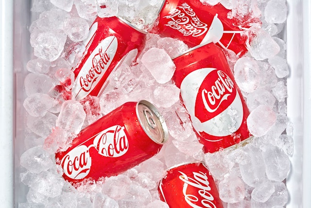
So, how did Moffat and the team convince a mammoth brand like Coca-Cola to rethink its packaging? “Perseverance,” she says. “It’s making a business case as to why it will improve. We are very careful to make sure that we’re not just recommending things because it’s something we want to do, something that’s cool, that’s going to make a splashy headline or that’s going to win an award.” At the end of the day, the client has to see what the business will stand to gain from change.
She poignantly says that it is like “bridging a gap between creativity and people who live their lives in spreadsheets.” It’s something that Moffat didn’t quite understand until nearer the end of the project when Sandy Douglas, who was president of the Coca-Cola North America Group at the time, presented.
“It was a little bit from his world,” remembers Moffat. “It was all spreadsheets and I’m like, oh my goodness, all this time we’ve been pulling you into our world and asking you to think the way that we think and now I’m looking at his world, no wonder it was challenging because, you know, the brain just works completely differently.”
When they were able to understand each other’s language, that’s when Turner Duckworth and Coca-Cola began to make traction on the rebrand. What transpired were simplified brand asset brand assets that were still unmistakable: the color, the timeless script, the bottle and the ribbon, which has gone on to become one of the studio’s most famous works.

Another career high for Moffat was working alongside heavy metal rock legends Metallica. Like any project, it began with an in-person conversation and Moffat says they were very open and amazing to collaborate with. “It’s such a unique situation because your branding is a band; it’s for people, but you’re branding a persona,” she says. “I think what I loved about it is that it was finally a brand that could speak for itself, as opposed to having a team of brand managers around it.”
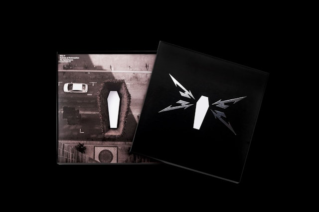
It was a product that could speak for itself and had a really strong identity, but for its ninth studio album, Death Magnetic, the band wanted to signal a return to their career-defining roots, which is when Turner Duckworth came in. Lars Ulrich is a personal friend of David Turner.
“We were right with them from the beginning,” remembers the creative. “We received a copy of their lyrics early on in a Word document; you just don’t think that James Hetfield sits down and writes them in Word!”
Moffat says that it was very cut and dry; something was either on-brand or off-brand for the rockers, but it was such a fun project and the whole team was involved. Turner Duckworth even helped the band come up with the name of the album – they wanted some outside perspective.
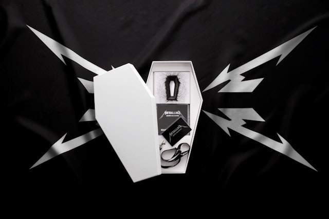
She describes the project as “very art school,” the photo of the baby was a friend’s child and the person lying in the sheets was the studio’s production director. Moffat explains that the whole thing was done on a shoestring budget and that people think “big band, big money,” but the truth is it was a labor of love.
One of the main designers on the project, Jamie McCathie, is a lifelong, die-hard Metallica fan. He was the one who would go over to the band HQ and he was the person who thought that the logo should be returned to James Hetfield’s original design. “Jamie had all that insider intel of who they were [as a band] from a fan point of view,” continues Moffat. “So, I think Metallica really appreciated that it wasn’t an ivory tower full of designers pushing pixels around.”
She’s now surpassing 25 years at the studio she loves and Moffat says her role is to smooth the path and create the stage for talented people to shine, which she also hilariously describes as “holding the shit umbrella.”
What she means is that, as a chief creative officer, it’s her duty to protect her team so that they have the space to do exactly what they do best and make the groundbreaking work that the studio is beloved for.
“I couldn’t really think of anywhere else I’d rather be,” she concludes.

