5 of the best whisky identity designs
Until a few years ago, single malt whiskies were regarded as the drink of choice for legions of grey haired conservative old men. They were the go-to gift for the father in law. The semiotics of the category were commensurate with its old fashioned image. Cream label + etching of distillery building / stag / rural scene + typographic flourishes + master distiller’s signature. Design by numbers.


Now, however, the single malt category is in the middle of possibly its biggest upheaval. Good Lord, even Christina Hendricks drinks whiskey! How cool is this tipple?
In design terms, a bold new aesthetic is emerging – modern, masculine, heavily typographic. Look closer, however, and you’ll see that the new wave of whisky design is as conventional as the one that it’s replacing. We are witnessing the exchange of one set of codes with a new set. What we’re not seeing is any imagination. Here’s five that have found a unique voice through design.

Caol Ila
Some pretty boring type on a plain label. A gray box with some more boring type. A vague feeling of industrial heft. That’s about all there is to Caol Ila, which is somehow its charm – it’s the anti-design single malt. It doesn’t even try. Which of course makes it the malt of choice for those who claim ‘not to be affected by packaging’.

Dalmore
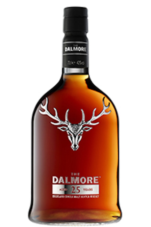
Heather-filled meadows, dramatic mountain scenery, craggy landscapes and stags… all of these are Scottish malt whisky clichés. No wait, they are Scottish clichés. Dalmore doesn’t care. Dalmore has a stag in their brand story, and they aren’t afraid to tell us about it. Yep, it’s definitely a stag. Made out of really shiny silver. In three dimensional glory. Right on the front of their bottle. Go Dalmore!

Laphroaig
Don’t you just love a brand that doesn’t try to be everyone’s friend? What a blessed relief. Laphroaig invites people to dislike it, and even celebrates the antipathy it elicits. Black type + white label + green bottle. Somehow such small twists on whisky packaging convention makes Laphroaig look as distinctive as it tastes. Or do we just transfer our knowledge of its polarizing taste to our interpretation of its aesthetics? There’s one for the sensorialists.

Jura
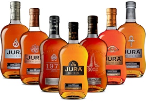
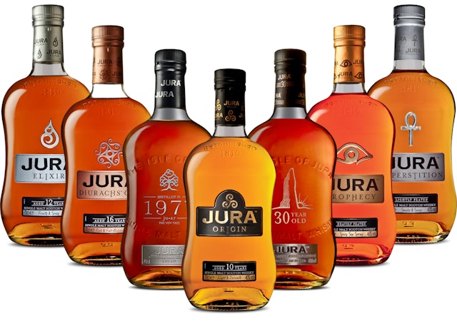
Jura has a design aesthetic that proudly rejects the codes of it’s category: a squat bottle with a curved waist, no traditional whisky neck, and a set of labels that feel positively new age.

Hibiki
Okay, so it’s not a single malt. Let’s not be sticklers though. Hibiki means ‘harmony’ or ‘resonance’ in Japanese, and its distinctive 24 faceted heavy glass bottle alludes to the 24 seasons in the traditional Japanese calendar. Broadly speaking, Japanese whisky is full of unimaginative identikit design. Hibiki is the exception, with a unique pack that makes it stand out at home and abroad. The only downside is that it’s become so popular that it’s almost impossible to buy.
Do you think we missed one? Email natalie.mortimer@thedrum.com with your suggestions.
Take 5 is made in collaboration with Katie Ewer of jones knowles ritchie.

