Starbucks: Starbucks Creative Expression
- Location:


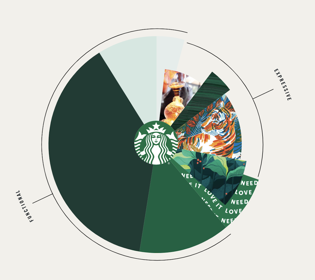
If you think it’s too soon for the pumpkin spice latte (PSL) at Starbucks, let yourself be distracted by the brand’s design evolution, which the coffee giant just made public on a website, with a complete rundown on the new brand expression.
“As we evolve to meet beautifully diverse customers all over the world, our brand has evolved too. Here we introduce a fresh new design system that maintains the core elements of our brand while keeping our customers’ experience central to creative expression,” the dedicated Starbucks creative site states.
The brand goes on to say that it is incorporating “beautiful, expressive moments with calm confidence in ways that are optimistic, joyful and recognizably Starbucks.” It will use its iconic Siren logo, along with an “expanded palette of greens rooted in our iconic green apron” as well as a “family of harmonious typefaces”, which it says will bring “purpose and cohesion” to every interaction customers have with the Starbucks brand.
Credits
Starbucks internal creative team
Creative Director: Ben Nelson