Sallie Mae rebrand by Co:Collective
- Location:


Student loan and financial services provider, Sallie Mae, has rebranded with a new logo, website and focus on responsible borrowers.
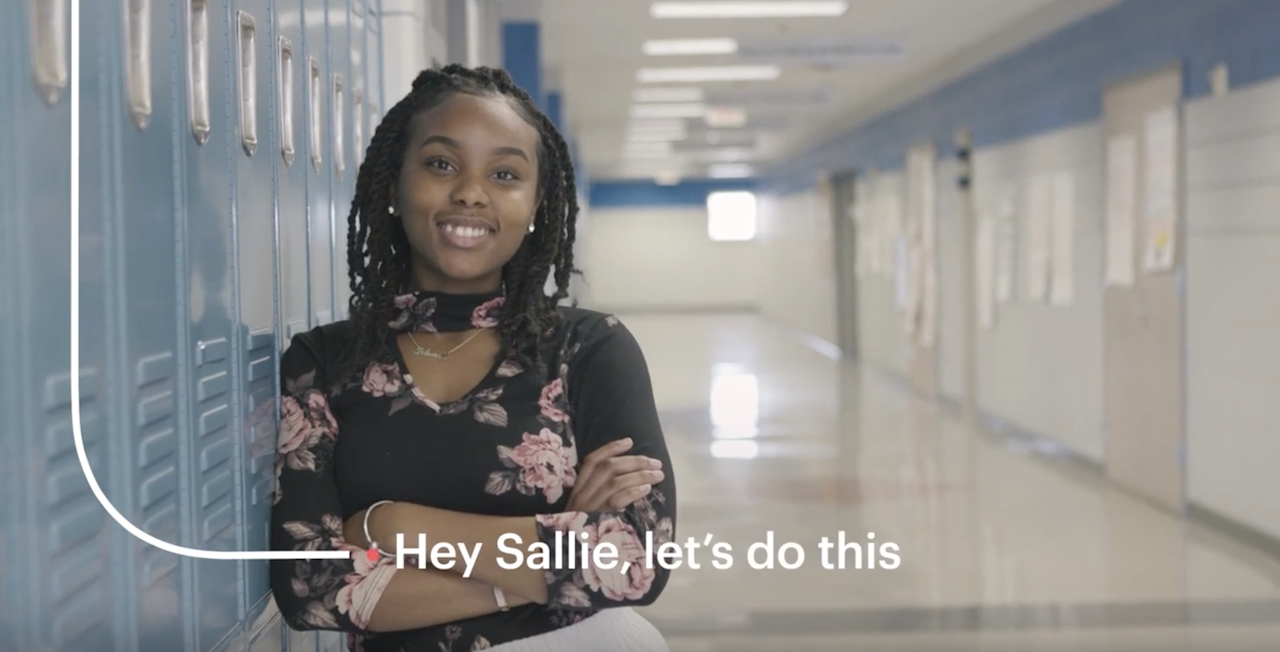
The new brand experience will feature a new Sallie Mae logo that symbolizes customers’ life journeys through flexible, differentiated storylines and a new font in lowercase. The coral dot represents the customer and serves as a starting point for their path, wherever it may take them, and how Sallie Mae can help them on their way, according to the company.
The rebrand is the biggest signal of the new Sallie Mae, one that promotes responsible financing. The campaign promotes being responsible and taking charge of finances. A video shows students being proactive, with a voice-over that states, “Hey Sallie, let’s do this. Let’s follow my dreams…because my dreams won’t wait.” Images promote the new credit cards along with the student and personal loans and savings options.
Credits
Agency: Co:Collective
Client: Sallie Mae