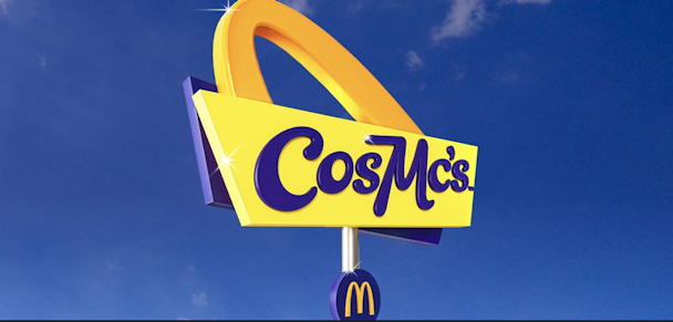
The McDonald’s CosMc’s logo isn’t retro enough to last
London College of Communication’s Craig Burston looks at McDonald’s surprising new coffee-sub brand CosMc’s. He thinks it lacks the human touch.

Earlier this month, the world-conquering fast-food chain McDonald’s announced a new ‘coffee-shop’-style restaurant, CosMc’s. The company states CosMc’s – pronounced ‘cosmic’ – is ‘inspired by nostalgia’.
Why is the burger giant embarking on a retro-themed coffee shop, and how well does its design communicate this surprising new direction? Not very well at all. In fact, I’d argue it has more in common with storage facilities than coffee shops.
According to president and CEO Chris Kempzcinzski, the plan is to address a mid-afternoon sales slump – when consumers opt for hot drinks and pastries rather than a Big Mac and fries. On paper, this may make sense – the coffee market currently generates $88bn per year and is expected to grow exponentially, with some experts predicting global consumption of coffee could double by 2050.2
In short, it wants to rival Starbucks – albeit with a drive-thru.
Advertisement
McDonald’s’ financial reasons for launching a coffee shop may seem logical, but its choice of identity is less easy to understand.
The CosMc’s logo can only be described as odd. It’s neither strictly retro nor is it particularly modern. The yellow and blue have more in common with storage facilities than coffee shops – although you could argue this is a potentially welcome change (and perhaps a deliberately oppositional one) to the old burgundies, brogue browns, and tasteful creams and greens we’ve come to expect from coffee chains. But McDonald’s choices seem jarring and confusing – especially to the sense of nostalgia it is trying to achieve.
The logo seems uncanny and not quite right, as though keywords had been entered into an AI, and this is what was spat out. To me, this represents graphic design by algorithm rather than smart minds making playful corporate aesthetics.
Advertisement
There is some logic to the name and color scheme, however: it refers to a once-forgotten McDonald’s mascot from the 1980s – a yellow, blue and silver robot-alien... thing. The trainer-wearing, multi-armed extraterrestrial surfer was introduced in a 1987 commercial and made its last appearance in 1992. The decision to bring this kitschy and altogether bizarre creation back seems to have been informed by the popularity of another mascot-themed product – their ‘Grimace Shake,’ largely helped by organic, viral marketing this year.
It’s difficult to see how an obscure character like CosMc would invoke the same levels of interest, let alone warm memories of a past era. It feels deeply post-modern, not unlike the era from which the character came. But surely retro only works when at least some people remember the reference points? CosMc’s may be meta-ironic, but that does not excuse poor concept or execution. If the new restaurant – named and styled after this peculiar corporate invention – is indeed inspired by nostalgia, what is it nostalgic for?
Instead of looking back to a past character that only McDonald’s remembers (and many others would probably rather remain forgotten), the company should have looked to a time of perceived limitless possibility and unbridled American optimism – the Space Age of the 1950s.
Suggested newsletters for you
We can see hints of this missed potential in the logo’s design. Its angular signage recalls old-school American diners, as well as the name itself – which need not refer to an unknown mascot but rather outer space travel, from a time when such a thing presented an exciting new horizon for humanity and progress.
Should Starbucks be worried?
CosMc’s may yet be a success, but so far, it has only plans to open 10 stores, after which McDonald’s will decide whether to expand. Financial forecasters do not seem to think the proposed store poses a threat. McDonald’s appears to have spent the last decade attempting to compete with the Starbucks of this world on their competitors’ terms – replacing red plastic benches with ‘Real Furniture’ – and now it wants to go back to the make-believe universe of plastic colors.
Props to McDonald’s for attempting to go leftfield with this design, but it hasn’t gone leftfield enough. It is Mattel who remains the masters of the dark arts of faux-retro (see the Mecha-sized Barbie reboot on the back of the enormously popular – and awesome – movie and the perennial Hot Wheels toy car brand).
If McDonald’s wants to truly challenge the established coffee chains and to do so in a way that has lasting impact, it needs a clearer, bolder, and more confident design. The CosMc’s logo doesn’t go far enough down the retro rabbit hole. It’s simply not cosmic enough.
Craig Burston is a senior lecturer in graphic and media design at London College of Communication, UAL.

