Designing beyond the shelf: how to make your product pop online
Tim Owen of Turner Duckworth says that in order for a product to succeed both online and on the shelf, its design must be photogenic, malleable and even a little weird.

For as long as we’ve had supermarkets, there’s been one thing above all else shaping the design of grocery brands – the supermarket shelf.
The big, final, conclusive (and expensive) test of any new packaging design has been the shelf test. The big, ’go-or-no-go’ questions have been shelf-centered – questions of blocking, find-times, navigation, claims, purchase intent and so on.
But from where many of us have spent 2020 – on laptops and smartphones, watching Netflix, watching ourselves on Zoom, scrolling through news feeds and queuing for a delivery slot – it’s clear that the reality of design experience is very different. It is still a complex, multi-contextual thing, but much of that reality is now online. And this has big implications for design.
Grocery brands show up online in all kinds of ways. They show up in camera, typically as packaging, in photographs of homes, kitchens, coffee shops, lunches, camping trips, festivals – in everyday life, social life. They show up in reduction, stripped back to a few pixels in the search results of an online store. And they show up in the stream of stuff – the stories, films, news, events, images that populate a brand’s social media feeds.
Amid all of this, the design that wins online, on a smartphone screen, is different. And there are three key reasons why:
1. It requires photogenic design
Designs that win online look good in films and photographs, and across multiple social contexts and multiple scenarios. It is design with presence and craft and social currency. Design with an immediate, emotional appeal – the ’I-love-that-what-is-it’ school of design. It is far from the photoshopped, ad-on-a-pack that has characterized much of grocery design since the 1990s.
2. It must be highly distinctive
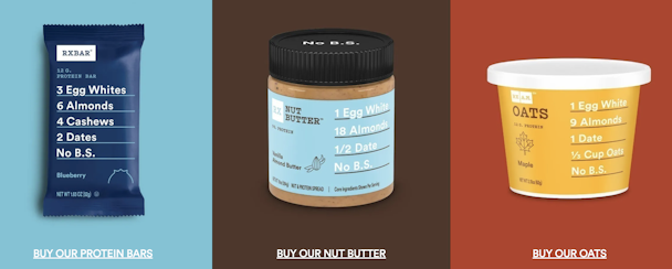
Distinctiveness and fame have always gone hand in hand, but the online space – with its infinite distractions – demands distinctiveness and takes it to a new level. The brands that are outpacing their peers online (the Krakens, Rxbars, Oatlys) are not just distinctive, they are not-normal. They are semiotically incorrect. They are weird. And they use their weirdness and their idiosyncrasies and their anomalies to cut through and to hold everything – from the avatar in an online shop to an Instagram post – together. Oatly’s social media feeds (and Turner Duckworth had nothing to do with Oatly’s success beyond drinking it, so this isn’t a plug) exemplify this, with its white-out, black-on, dirty-blue Sharpies giving form to an endless stream of creativity.
3. It must be an open-ended kind of design
It must be design with a flexibility, a malleability, an ability to come apart and reassemble as something else. Design offering up distinctive assets like Lego bricks for creative agents of all kinds to make of what they want. Design to be played around with, remixed, spliced, re-imagined. Design that, however central packaging is to the experience, goes way beyond packaging.
The brands that have these things – the photogenic qualities, the immediacy, the distinctiveness, the weirdness, the open-ended Lego brick-ness that can stream endless stick-in-the-mind stuff – have the advantage online and beyond. But few grocery brands achieve this kind of design. And the way design is evaluated – the focus on packaging, on shelves and on rational questioning – has a lot to do with that.
This moment presents us with all sorts of opportunities to rethink some of the things that we have been doing just because we have always done them. Flying, commuting, spending a thousand dollars a year on lattes etc. Design evaluation is another of these things. The shift online presents an opportunity to shift design evaluation to multiple contexts – multiple retail contexts and multiple social contexts – to see how design surfs the spaces of culture, and to get unthinking, emotional responses to design in these contexts. It presents an opportunity to create new KPIs for design that succeeds on being photogenic and weird. And an opportunity to evaluate the design of grocery brands not as packaging, but as systems from which all sorts of brilliant things can be made.
And by the way, this kind of packaging design that is simple, head-turning and inherently social also happens to be exactly the kind of design that wins on the shelves of a supermarket.
Tim Owen is head of planning at Turner Duckworth.
