Cereal Killers: how designers can adapt to Tom Watson's proposed packaging mascot ban
It’s almost a punchline: a politician asking a room full of advertising execs to ‘trust’ him. But that’s precisely what Labour’s deputy leader Tom Watson did last week.

Citing the inclusion of refined sugar in our foods and drinks as a major contributor to the UK public health crisis, Watson called on the ad industry to stop using cartoon characters on sugary food and drink packaging. In his Advertising Association speech, he sugar-shamed Frosties, Nesquik and Coco Pops, calling them (in a snappy strapline of his own): “billboards on tabletops aimed at tiny tots.”
Throwing down the gauntlet, he stated that if the UK ad industry could harness its collective might to take sugar off the table, he’d be its biggest advocate. And it if didn’t, brand owners and advertisers would soon be staring down the barrel of increased regulations.
Sugar-coating the Problem
No doubt Watson makes some valid points. Although it’s not just Coco the Monkey who’s at risk of extinction.
While cereals prove an easy target for political purposes, almost all categories now face some form of restriction, and there’s a clarion call for brands to navigate these challenges responsibly.
At Geometry we recently hosted an event as part of our Captivate series, inviting panelists to debate some of the key challenges facing the industry. With remarkable prescience, the topic was the role of responsible design – with a supporting exhibition called 'Cereal Killers' born out of the very same design challenge: what if you couldn’t feature Tony the Tiger on packs of Frosties? (And no, we weren’t leaked a preview of Watson’s speech.)
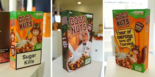
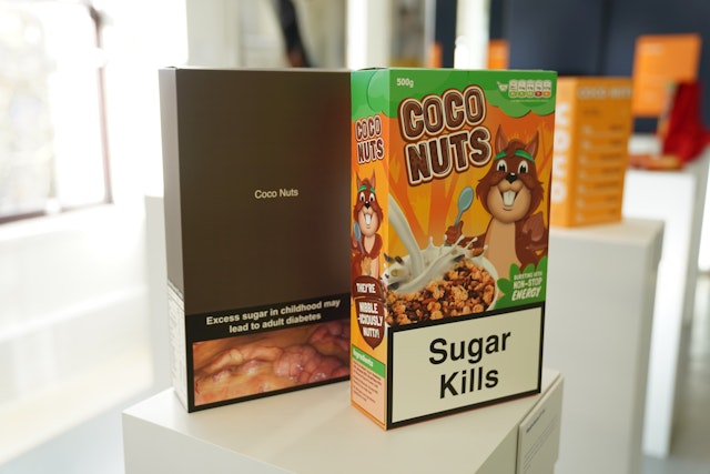
Ranging from the absurdist to the plausible, we watched the designs come to life with the creation of our own brand Coco Nuts, complete with cheeky character Nibbles the Squirrel. Our master pack deliberately copies the direct, and often naïve design codes of the cereal category.

These designs aren’t meant as design solutions, but creative provocations that explore the strengths and weaknesses of what responsible design really is – whatever the category.
1. Restrictions R Us
Health Warnings come in all shapes and sizes, usually dictated by local government. After all, evidence suggests these become wallpaper to the regular consumer of products carrying them. But the initial impact is no less shocking. Imagine this on your breakfast table every morning.

2. Visual Education
Nutritional information is all too often hidden away on packaging, often displayed in hard-to-read metrics. What if these core facts took centre stage of the design? In this instance, the cartoon character could actually play a beneficial role. On the surface it’s a more honest approach – but who decides the message to convey, and are the messages for the adult or the child?

3. Good Honest Packaging
What if the packaging focused solely on its ingredients to the detriment of other design cues? Presented in a way that tells people exactly what they’re putting into their body, per portion size, could this level of transparency bring about a change in behaviour?

4. Portion Control
The notion of portion control isn’t new. But to date, portion control packs have generally been used as a means of ensuring a convenient ‘perfect’ serve – not a balanced one. What if pack sizes were reconfigured to ensure that the serve matched the precise nutritional requirement (and restrictions) for people?

5. Countdown
Behavioural science tells us that changing human behaviour takes time, and the reality is that a taste for sugar remains for at least a few weeks. Is there a role manufacturers and even retailers can play in helping consumers reduce their intake of more ‘harmful’ ingredients through gradual change?

6. Ditch the Kids
Who said cereal had to be for kids only away? And why just at breakfast? A surprisingly high amount is bought by adults for evening consumption. If the core issue we face is ‘sugar and kids’ could we dramatically change the design of the pack itself to radically alter the perceived target audience, as well as blur the occasion?

7. Professor Nibbles
If we can’t feature cartoon characters, what other brand personifications could we use? Would an educational ‘professor’ retain the fun child-friendly feel, lend an air of credibility to the design, and provide a compelling conduit for information and education?

8. Where’s Nibbles?
One way to remove cartoon characters could include a designed transition. In this scenario Nibbles the Squirrel has disappeared. Consumers, including children, are invited to play a game to discover where he’s gone – and get used to the fact that he’s gone into hibernation now, potentially forever, and to understand the reasons why.

A Roadmap for Responsible Design
While this collection of designs doesn’t solve Watson’s concerns, it does highlight the challenges: responsible design isn’t the sole responsibility of brand owners. It’s part of a dialogue required between brands, consumers, government and nutritional bodies.
Get it wrong, and we could see cigarette-style health warnings invade our kitchen tables.
Get it right, and it’s a springboard for enhanced creativity. Responsible design could actually drive brand growth (for all the right reasons) in the face of increased marketing regulation.
The One Minute Briefs team took an irreverent shot at the mascot-less cereal brief, coming up with many madcap designs that brands may do well not to deploy.
Chris Ambidge is head of brand and design at Geometry UK
