Adland responds to the ‘We ♥ NYC’ backlash: ‘At least the heart is in the right place’
Do marketers ♥ ‘We ♥ NYC?’ We asked design and creativity experts at a number of agencies to comment on the updated version of ‘I ♥ NY.’

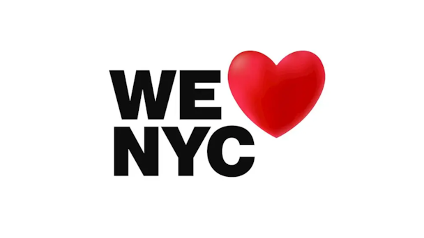
The 'We ♥ NYC' campaign has received a loud response from New Yorkers and beyond / Credit: New York State Department of Economic Development
It‘s been a little over 24 hours since Milton Glaser’s 1977 campaign, ‘I ♥ NY,’ became ‘We ♥ NYC.’
However, the public’s response to the campaign has been mixed at best.
On Tuesday, popular New York-centric meme page Nolita Dirtbag released a photo on Instagram comparing the work to that of a toddler:
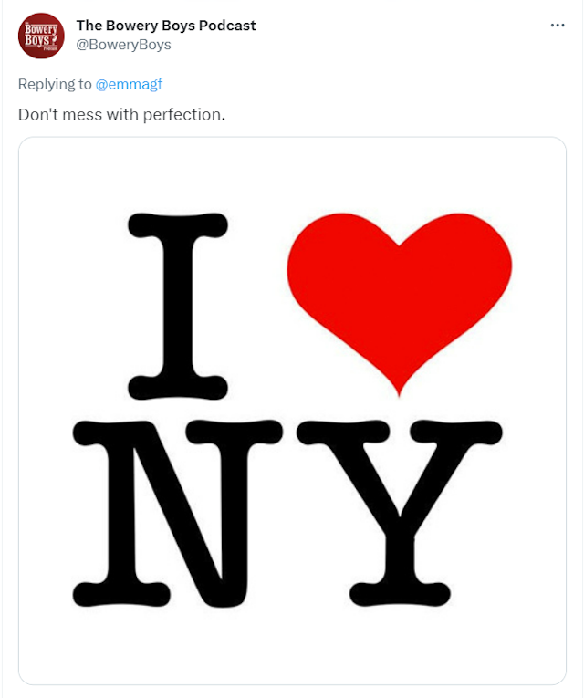
Meanwhile, The Bowery Boys Podcast, which focuses on New York City history, Tweeted not to ”mess with perfection.”

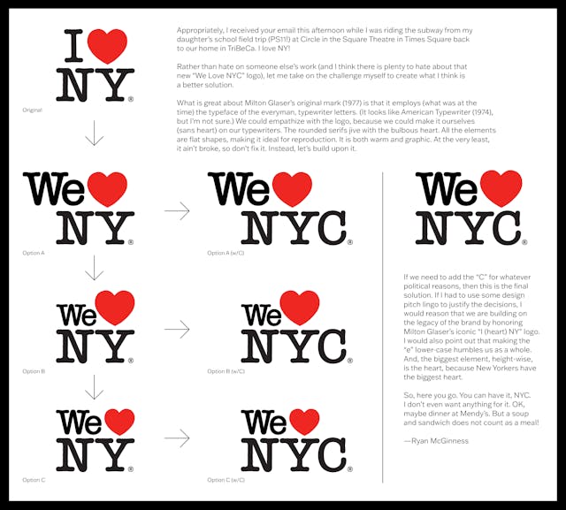
Manhattan-born artist Ryan McGinness completely redesigned the new logo – which blends the ‘We ♥ NYC’ messaging with Glaser’s typeface and heart – and offered it to the city for free.

Advertisement
A wave of critique
The Drum reached out to adland’s design experts to hear their thoughts on the controversial rebrand. Here’s what they said.
Wayne Deakin, global principal, creative, Wolff Olins: “To touch this icon is guaranteed to cause a stir. After all, it is a symbol of more than a place but also a legacy of attitudes that were born in a time when NY and [its] residents went through a period of soaring crime rates, low tourism, and near bankruptcy in the mid-70s. So, you aren’t just playing with a word here – you are playing with generations of meanings and associations as it’s more a tourism artifact than a mark. I get the ambition of the shift and the need to be inclusive – we should always embrace this ... This thing already represents a city that is, by its nature, diverse. A city of many villages of differences celebrated. The heart is a symbol of love and love is embracing and inviting in my head anyway.
I think it’s less about the word swap and more that Milton Glaser’s work is one packed full of associated meanings that have created tourism stories and experiences that people have connected with for decades. After all, this device had that feeling of imagery derived from my memories of carvings in tree trunks by two lovers. The ‘I’ has never been a singular meaning but a shared experience feeling of ‘we’ in my personal view. As an advertising campaign, I like the approach, but as a designer I am still loving the American letterform font on the original device. At least the heart is in the right place graphically and strategically.”
Veronica Padilla, head of design, Periscope: “We ♥ ’I ♥ NY’. I mean, we really ♥ ’I ♥ NY’.
“We ♥ Milton Glaser. We ♥ craft. We ♥ stability. We ♥ balance. We ♥ classics. We ♥ nostalgia. We ♥ homage. We ♥ a masterpiece. We ♥ so many things about ’I ♥ NY’.
“And, we ♥ inclusivity. We ♥ new ideas. We ♥ endeavors towards progress. We ♥ taking risks. We ♥ courage. We ♥ vulnerability.
“But, we still really really ♥ ’I ♥ NY’.“
Advertisement
James Adamé, executive vice-president of design & innovation, Doner: “Milton Glaser designed the original, ’I ♥ NY’, with great balance and simple perfection. Redesigning that iconic logo – something people love and appreciate – is a rather slippery slope.
“This new approach feels unbalanced, complicated and modernizes for the sake of modernizing. And that may have been a strategy, to get people talking and buying new hoodies. For me, the original is just perfect.”
Daniel Schloss, senior communications manager, LoyalKaspar: “Unless a design is particularly sublime, a new logo will more often than not be immediately met with this kind of out-of-proportion criticism, especially on social media. That type of reception—if it isn’t coming directly from the groups the brand represents, in this case New Yorkers, in most cases employees or customers—isn’t typically useful feedback. The clowning may be short-term fun and reflect some level of resonance, but more so it’s reactive, cheap, low-hanging fruit, and divorced from the layered context of behind-the-scenes decision-making between brands and designers; it’s certainly not something that any designer should be publicly aiming at another designer.
“Usage over time, in products, services, and experiences will be the main determinant of whether this new NYC brand is effective, and you could argue that the attention the brand has attracted in one day, in NYC and far beyond, is already a win, maybe even a calculated one.“
Suggested newsletters for you
Douglas Brundage, chief executive officer, Kingsland: “The campaign is not a smart move, it is a very bad answer to a false brief: the idea that Brand NYC somehow needs to be more inclusive. NYC is the gateway to America for generations of migrants, the birthplace of hip-hop, the heart of the Gay Rights movement and so much more. More than 300 languages are spoken on Queens' Roosevelt Avenue alone. We don't need more inclusivity; we need a city that's remotely affordable to live and do business in during an era of unprecedented wealth inequality – when $100,000 becomes $36,000 real quick. Whoever came up with the ‘insight’ here, they didn't talk to New Yorkers.
“It reads and looks like to me, essentially if the original I ♥ NY was designed by a committee, and no one on that committee understood the basics of brand marketing - differentiation and storytelling. The dynamic system is extremely derivative of LA's, but without the fun thoughtful illustrations. If I had to guess, few native New Yorkers were involved in this, and it's indicative of a larger problem in my hometown - the blanding of NYC. First we Disneyfied Times Square, now we're Disneyfying the entire city with no regard for the people that built it, and the culture it represents. In the press release they even mention ‘Broadway’ and ‘The Statue of Liberty’ as iconic NYC symbols. Where's the bodega cat? Where's the subway token? Where's the YERRRR of it all? There's no swagger to this, there's no confidence. It's a follower brand identity for a city that, in my extremely biased opinion, leads the entire world.
“I ♥ NY was a perfect campaign, maybe the best tourism-adjacent slogan ever. No one should have to remind the community to tread carefully messing with the designs of Milton Glaser, but it can be done - as it was post-9/11. This is a cynical, ill-conceived project with no real clear goal. I hope taxpayer dollars didn't go to support this, but I'm sure they did. Next time, maybe the city officials involved in this campaign should stick to fixing potholes and leave marketing to the experts. They can call me anytime. I love New York. I hate this logo. And apparently so do most New Yorkers (or at least the ones yelling on the internet today). So, in some ways, maybe it did unify us after all.”
Jerry Hoak, executive creative director, The Martin Agency: “After spending my entire advertising career in New York City and Richmond, VA, “I heart NY” and “Virginia is for Lovers” have become part of who I am. A change this drastic to either one would undoubtedly feel like the loss of a childhood home. But unlike my folks’ split-entry, the good thing about logos is that they are forever. So if this attempt doesn’t catch on, the old one lives in an .eps file ready for millions more T-shirts and coffee mugs. I’m personally going to avoid the gift shop at Laguardia until then.”
The organization behind the rebrand responds
The Drum also asked the folks who created the campaign, The Partnership for New York City, to comment on the public‘s response.
Maryam Banikarim, founder, NYCNext: “In 1977 … the world was not as complex as today. Digital was not a thing, so it was two-dimensional. We live in a world that’s three-dimensional in a digital space. We wanted to animate the mark, make it universal and customizable ... We are not trying to replace the mark – in fact, the mark is owned by the same one as I ♥ NY. It is meant to trigger a movement ... This is about saying, ‘We’re all in this together and it’s up to us to take back our city [after the pandemic].’
“What I say to people who have comments about the mark is, if it gets you engaged, come on in and do something … This campaign is a moment in time to drive participation. With amazing amounts of reverence, we deliberately decided to use the mark and create a companion in some ways to that mark.”

