Logos, lies and monochrome: the enduring legacy of Woolmark crest creator Franco Grignani
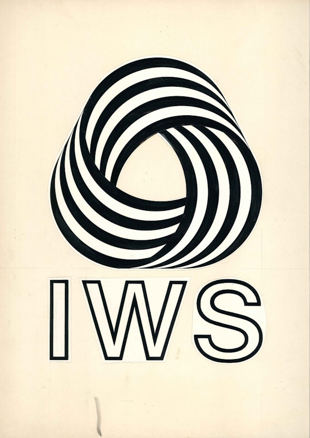
The Woolmark insignia is one of the most iconic of the 20th century and beyond; Creative Review went as far as to name it number one on its list of the top 20 logos of all time. The man behind the familiar nine-striped swirl was Franco Grignani, one of a select group of commercial crest designers to be remembered – celebrated, even – after their death.
The Woolmark logo was not devised in a boardroom after rounds of research and testing by a white-labelled agency. Its story in the graphic design world is almost mythical: there was a competition, a jury, and a lie that lived on for more than 15 years.

“This is an incredible story – I just have to tell you this,” enthused Enrica De Biasi, producer of the latest exhibition of Grignani’s work at the Estorick Collection of Modern Italian Art in London. “In 1963 the International Wool Secretariat [now Australian Wool Innovation] decided to launch a worldwide contest among designers to find the new logo to identity the maximum quality in the wool. Franco Grignani at that time was already a big star in graphic design and was invited to be part of the jury of this contest taking place in London.
“A few weeks before the submissions closed the Italian representative who was in charge of sending the Italian entries showed Grignani what he was about to send, and Grignani was very annoyed. He thought [the entries] were very poor and was really unhappy at the idea that Italy was not to participate on a good level.”
So Grignani, while still a juror, entered the competition himself under the pseudonym Francesco Saroglia. Naturally almost the entire committee selected his work as the winner, while the undercover designer nervously voted for another entry.
“He was very embarrassed,” said De Biasi. “Technically he wasn’t allowed to enter the competition but he didn’t know what to do, All the other jurors were trying to convince him that the quality of the job reminded them of his work.”
It was only in the 1980s that the truth came out. Which is strange, considering that the world never heard from a Francesco Saroglia again, and the uncanny resemblance between the Woolmark logo and Grignani’s body of work.


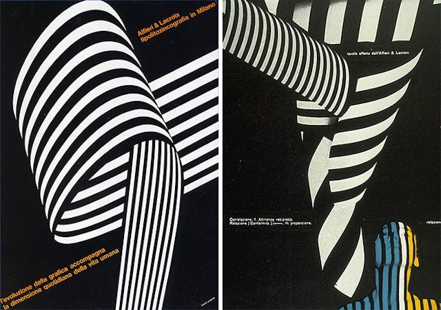
The Estorick Collection’s Grignani exhibition is dubbed ‘Art as Design 1950-1990’. It’s a title perfect for a retrospective of the artist who, De Biasi contends, “had the same approach to graphics as he did to artwork”.
“[He] never had the feeling that his graphic design work was different from being an artist,” she added. “Everything he did was on an artistic level.”
The new show, which is in situ until September, follows Grignani’s lead and displays his commercial work right alongside his artistic pursuits. Throughout both there is the influence of futurism, architecture, modernism and mathematical geometrics. His idiosyncratic style, however, somehow managed to translate into a number of distinct brand campaigns, usually for Italian companies such as Pirelli and Fiat.
Grignani died aged 91 in 1999. His influence is arguably stronger now than it was at his time of passing, considering the swathe of brands including Google and Instagram that have abandoned 3D effects in favour of flat colours and clean lines.

“Before coming here I had a chat with Vicky Gitto, who is the president of the Italian Art Directors Club [and also chairman and chief creative officer of Y&R/VML Italy],” said De Biasi. “He was saying how happy he was for this exhibition to be happening.
"For all art directors, especially Italian art directors, Franco Grignani is the North Star. He is an immense compass for all of us in the creative community.”
Video filmed and edited by Jamie McMurray

