Sarson’s limited edition bottle design targets younger consumers

Vinegar brand Sarson's is targeting younger consumers with a limited edition bottle design that features vintage-style cartoon characters 'Fish and Chip'.
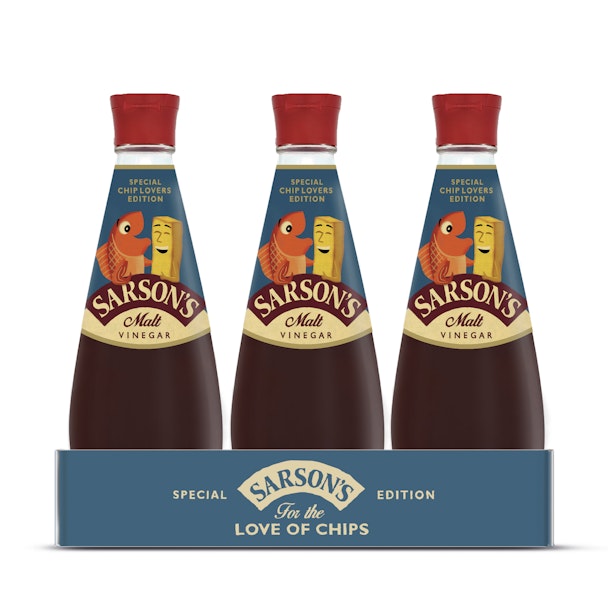
Sarson's worked with brand design agency Parker Williams for the bottle, which has changed its background colour from red – a feature that has remained unaltered for a decade - to blue.
Research carried out by the brand identified the positive brand associations the ‘Fish and Chip’ illustrations generated among consumers, particularly its connotations of Britishness, and a bygone style of advertising.
Noa Hasegawa, brand manager at Sarson’s, said: “When we debuted the ‘Fish and Chip’ characters consumers told us they loved them. We knew at once they’d work well across other parts of the marketing mix and Parker Williams did a stellar job of incorporating the illustration into our packaging. We can’t wait to see how customers respond.”
The illustrations were drawn by artist Paul Thurlby and packs are available in all supermarket stores until the end of this month.