Turtle Wax looks to appeal to women in packaging and ad overhaul

Car care brand Turtle Wax has revamped its packaging design and advertising for around 600 of its products as it looks to become more appealing to women.
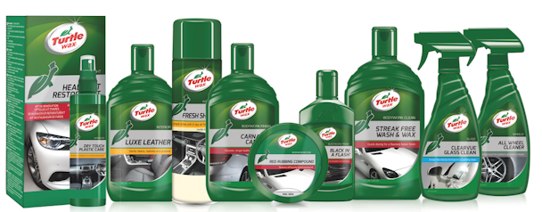
The brand recognised that 40 per cent of its consumer base are female and appointed Redshoe to make it more inclusive and appeal to both genders.
The new look and feel builds on its established brand equity, and leverages the Turtle Wax green and re-instates its turtle logo at the heart of the design.
In addition, the product portfolio has been restructured to simplify the purchasing process through a three-tiered system - Perfect Finish, The Main Line and Essential Range - to make it easier for consumers to more intuitively select products based on their needs.
Redshoe has also developed a new communications platform that is adaptable across Europe in press and online and includes a new ad campaign, ‘Life gets Mucky’.
Lesley Barratt, marketing director at Turtle Wax said that the overhaul of Turtle Wax in Europe is "daunting but exhilarating" for the brand.
"Redshoe has been pivotal in helping us put the Turtle brand essence back in the spotlight. The Redshoe team has an innovative way of looking at brands, which has transformed the way we do things and resulted in a more powerful and effective design and communication strategy. The latest design and brand positioning feels intuitive and relevant and we are confident it is going to be a hit with all consumers.”