We Are Bar: advert-body-2 by Ragged Edge
- Location:


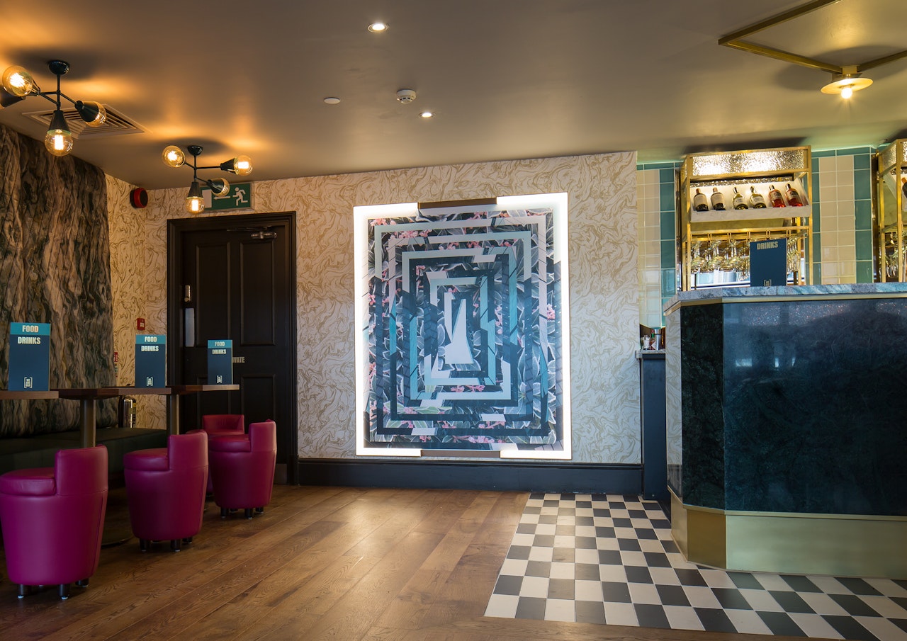


Integrated branding agency Ragged Edge has created a brand strategy and identity for disruptive new City venue, We Are Bar.
The brand was brought to life across a suite of menus, brand collateral, photography and a website: www.wearebar.com
A bracket device repeated in the interiors communicates inclusiveness, while a typographic-led system provides a distinctive tone of voice. The primary typeface, Anzeigen Grotesk is no nonsense, confident and direct, and was selected to match the bold tone of voice. It’s supported by Berlingske Serif, which was chosen for its character and legibility in the low light of the bar.
A set of illustrations for wall posters were commissioned from artist Luis Dourado to reflect the brand idea ‘The Beat of The City’ and juxtapose escapist imagery with photography of the city.
Colours used in the design touchpoints include a premium dark green, paired with a more contemporary light green and gold highlights. Ragged Edge worked closely with Grapes Design to ensure the interiors and design worked together harmoniously.
Credits
Co-Founder: Max Ottignon
Additional Credits: Grapes Design