
Adding the human element to tech-powered hiring
In a world where all businesses are digital businesses, recruiting and hiring top tech talent can be cut-throat. Doing that at scale presents an even bigger challenge.
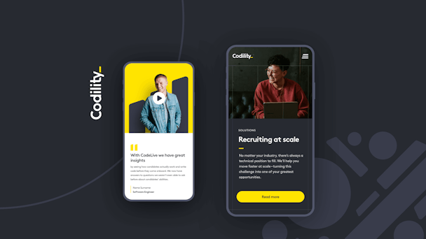
Codility, a software platform that helps tech recruiters and hiring managers, makes the process more manageable and efficient. It assesses potential candidates by testing their coding skills online and push prospective hires along the hiring funnel.
BRAND REVIEW
Their existing brand and website were no longer reflective of the company they have become.
Their online presence was undistinguishable from other scale-ups in their sector; their primary colour being ‘tech blue’, excessive use of ‘non-ownable’ graphics, and a lack of human element to their offer that differentiates them from the competition.
The “0” and “1” reference in their brand logo wasn’t as relevant as it perhaps was. And so, we injected a distinct personality to the brand and gave it a completely new look & feel. There are a number of unique geometric brand forms that can be found within the new Codility logo. The utilisation of these brand forms as graphic devices is core to the new brand system. To create rhythm and harmony within the brand forms, they should ideally be underpinned by a grid, providing an underlying structure whilst also giving the flexibility to work across various mediums.