Omada was craving a refreshed look and feel
The challenge –
Previously, the brand was blurred through a bland sea of blue, techy jargon, and an overload of stock photos with dark blue overlays which hardly reflected Omada’s true identity now or where they are going in the future. The new brand identity needed to lift up the human aspect in the product and from within the company.
The approach –
The rebrand started with a deep dive into all things Omada – business, brand, sitemap, and more. After stakeholder interviews, persona creation, and messaging frameworks, we were able to create the brand story, tone of voice, and personality. From here we could provide iterations of brand design systems to choose from and set the visual direction.
We optimized the website structure and UX for a thoughtful approach for content organization and migration. Once the strategy was locked in, we could dive into color palettes, visual assets, site mapping, navigation, and all visual materials to complete the refreshed Omada brand.
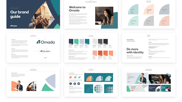
Creative choices included a new quarter globe logo to share their global reach. Quarter globe shapes can be seen throughout the Omada brand and assets. A modern, geometric, sans-serif font is now present in the logo as well as across all headlines and copy.
We are thrilled and excited to introduce our new Omada brand and website that marks the next phase on our journey.
Long gone are the dark blues and sharp contrasts of old Omada. Instead, a fresh, calm, personable color palette of secure navy blue, accessible, insightful greens, calm control lavender grey, and a trio of complementary greys are seen. The primary palette is contrasted by a vibrant set of secondary colors.
You can see the color palette shine through in bold shapes throughout the site exploded from the logomark. These add a bold, confident identity to illustrate the Omada story. These are locked in place to add a sprinkle of playfulness. All of these paired with crisp typography and conscious spacing create an easily digestible experience for the user.
The results –
The rebrand positions Omada as a confident leader, bold thinker, and trustworthy partner with a modern color palette, bold shapes, and updated clear typography. The result is a site that actively reflects the true brand identity in a clear, engaging, and especially human, brand. With a new site and new collateral material, The site actively reflects the Omada team can now more effectively share their brand in a cohesive way, through all channels, to all customers.
Our new brand is designed to reflect that we are a leader in Modern Identity Governance, a global company, and a diverse workplace for dedicated and talented people.
Check out the new Omada at www.omadaidentity.com