
How do you reclaim an iconic brand in 24x19cm?
We reinvented a global icon when we undertook Kellogg’s biggest redesign in a century.
After 100 years, Kellogg’s world-famous products were losing their relevance. The brand was struggling to be seen, the iconic logo drifting in a sea of sameness on the shelf. Our goal: reassert Kellogg’s as category leader and reclaim its sacred assets. We started by simplifying the packaging, updating the logo and cropping the wordmark to demonstrate that Kellogg’s remains spirited and modern. A new eye-catching colour palette takes inspiration from fresh, natural ingredients: pops of yellow, vibrant red strawberry and deep purple grapes. The portfolio became visually brighter and more cohesive, standing out dramatically on the shelf and positioning Kellogg’s as the bold leader once more.
Boxing clever
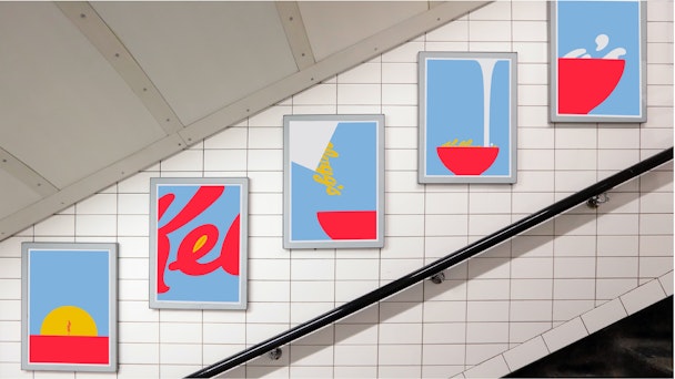
The keyword to rolling out the campaign was simplicity. Data revealed that consumers still perceived Kellogg’s as the true, authentic leader of the category, giving us permission to reclaim leadership status. We developed a packaging design system that celebrates what makes Kellogg’s, bringing the idea of natural grain goodness to the heart of the pack again. We made the most of the Kellogg’s logo, liberating ourselves from typical logo usage with bold cropping. Packs showed simple and tasty food depiction, with Kellogg’s characters bold and centre on the pack. These iconic Kellogg’s assets were leveraged to tell different stories around natural grain goodness across an outdoor campaign, taking the story far beyond the shelf.
+6% uplift in sales post re-design
“I’ll describe it as a huge success story.” Pete Matthews — Director, Brand Design & Operations at Kellogg Company