Mid-spring color palettes and color trends 2021

In spring, our world experiences a drastic change in the color palette
Seasonal creative campaigns often benefit from following color trends that are suggested for warmer seasons. The reason is that most people associate spring with new perspectives and a bright future, so even small visual hints provide positive context to your brand communication.
To help you with your trend hunt, Depositphotos has already translated spring color palettes into digital design and marketing. Dive deeper into this article to find out which 4 trending colors we recommend using in your creative projects, and what message is behind the images that correspond to the color trends of 2021.
Mid-spring color trends 2021. How did we find them?
Depositphotos curators wouldn’t be who they are today if they simply selected typical nature colors for you. This approach is not only trivial, but it also doesn’t help you stand out from the competition. For this reason, we decided to dig deeper.
What we offer you are both spring colors and trending palettes based on them. Our choices were determined by the demand surges for visual content on Depositphotos, as well as reports from Pantone Color Institute, Dulux Color Forecast 2021, Benjamin Moore articles, and fashion-related news. In addition, we relied on our Visual Trends Guide 2021.
We found 4 main colors for this year’s blooming season:
— Pastel Grey
— Awakening Yellow
— Refreshing Green
— Spring Forest
What they all have in common is that they are awakening and refreshing, but neutral enough to be used as aesthetically pleasing backdrops. These colors will make you feel hopeful and confident in the future, and they are also relatively easy to combine with corporate colors, as you will see below.
#DAD8CC
Vibe: confidence, pleasure, relief, balance
Colors that go together with grey: yellow, warm tones, shades of grey
Grey was included in color duo of the year 2021 by Pantone Color Institute. It was paired with a color called Illuminating, which turned out to be a soft and invigorating shade of yellow. We recommend using this pair if you want to motivate your audience to take action, but feel calm and comfortable at the same time.
Pastel Grey can also dominate your marketing designs. This color helps us psychologically recover, so it is a good solution for informative messages (for example, automatically generated order confirmation emails), educational material, and communication for the B2B sector.
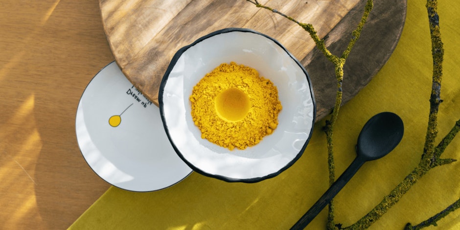
#F4E689
Vibe: optimistic, cheerful, invigorating, motivating
Colors that go together with yellow: green, orange, dark-gray, bold spring-inspired colors
Soft, non-aggressive shades of yellow are commonly associated with sunlight, spring flowers, fruits, bees, and other nature-related things. Awakening Yellow is a color that takes the best from Illuminating, Pantone Color Institute's second Color of the Year for 2021, and combines it with more natural shades of yellow.
Awakening Yellow can be used as the dominant color in your creative project, or as your background. If you prefer the second option, we recommend using black or dark gray for the text and details. This trending color looks great on spring-themed projects and banners, because it is designed to attract attention and evoke interest. Use it to highlight points on lengthy content such as blog articles or guides.
#BAD3B6
Vibe: vitality, productivity, positive changes
Colors that go together with green: yellow, brown, nude, grey
Green is always a safe bet for marketers and designers. As nature awakens in spring, meadows transform into emerald green carpets, and forests become clothes in youthful foliage. Green is a symbol of the thaw, the victory of life over death, the renewal of nature, as well as the promise of summer joy.
The shade we recommend for your creative spring projects is Refreshing Green. The tranquil color palettes based on it are versatile and well suited for large content formats (seasonal campaign, brand presentation, promotional video, eCommerce app). Refreshing Green is about finding adventure, creativity, productivity, and energy.
#738B6B
Vibe: new beginnings, power in nature, luck, personal growth
Colors that go together with green: white, gold, pastel blue, grey, violet
Global lockdowns are the reason we are becoming more responsive to nature-related landscape photography and still life. Due to self-isolation, people are starting to miss being out in nature. This is why visuals that remind them of forest walks are bringing back good memories
This year, Spring Forest is another trending shade of green. Unlike Refreshing Green, it is associated with the second half of spring. This color is all about that warm transition into summer.
We recommend using it as the main color in your designs. Product packaging, posters, and other printed materials in this color will impress and inspire. Use Spring Forest on banners or social media visuals for contrast.
Wrapping up spring color trends 2021
Colors are a powerful tool that can demand attention and evoke emotion. However, in order to master this tool, you need to know your audience, as well as understand the symbolism behind colors. It’s also important to find trending color palettes that include symbolic seasonal colors and your corporate tones.
As you can see, it’s important to select colors that are warm, peaceful, and soothing; you don’t want your color choice to trigger any negative emotion. Consumers are looking forward to spending time in nature, which is why they are more likely to respond to appropriate visuals and color choices.
Discover more by reading about 5 graphic design trends to avoid in 2021 and Graphic design trends to stand out in 2021.