Depositphotos has changed brand identity: how it looks

Depositphotos have updated their brand identity in a partnership project with CREVV, a creative agency from Ukraine
Designers from CREVV created a brand new logo for the company, introduced new typefaces, and updated the color palette as part of the redesign.
Finding a concept for a new brand identity
As the Depositphotos library is a go-to tool for creative individuals and teams working on all kinds of projects, black and white colors were chosen as the base colors for the brand’s new visual elements. As the Depositphotos community of contributors is an integral part of the business, a bright color palette was integrated to highlight the versatility of creative works that make up the library.
The new color palette includes every color of the spectrum, designed to be flexible when paired with photographs and designs. This gives more choices for Depositphotos’ in-house designers as they match visuals with layouts for ads, websites, and all new designs.
For ease of use, CREVV created sets of three shades that should be used together. The first color is always light, the second is more saturated and the third the darkest. It is used for buttons and additional elements when needed as accent colors. If the background is light, the text on it will be saturated and vice versa. If a designer does not have enough combinations from the palette when creating layouts, they can always choose new color combinations with the same scheme based on the images they use.
Typeface choices
The new corporate typeface was developed by a Ukrainian typeface designer Dmitry Rastvortsev. It has several fonts, one of them is an ordinary grotesque font and four additional ones are more unusual and creative fonts.
A clean and sophisticated font is an update to the main one traditionally used by Depositphotos, and the four additional ones were introduced to reflect the creative part of the brand.
Additional fonts are based on four art and design movements from different parts of the world. The original typeface used in the Depositphotos logo prompted the team to create a Bauhaus-style typeface. The need for a square typeface grew into a Bauhaus-related Vkhutemas. Naive Script's cheerful style draws inspiration from childish calligraphy, and the daring Brooklyn Zoo is a reference to the Brooklyn subway trains during the early days of graffiti culture.
The idea behind the new logo
The logo development started with a search for new shapes and many sketches. Different options appeared in the progress of developing the new design. One of them was the abbreviation “dp”, but it did not pass the uniqueness check.
While working on the textual part of the logo, the design team analyzed the original version and realized that there’s a particular rhythmic pattern. This is achieved by alternating the wide, round letters -d-e-p-o and rather narrow ones -s-i-t-. It is also worth noting that the letter -h- stands out from the general rhythm. It is very particular due to the letter’s unusual elongated right stem. Designers transferred the rhythmic features and the letter -h- to the new textual part of the logo, where all the characters were redrawn again. We also increased the spacing between the letters to make it easier to read.
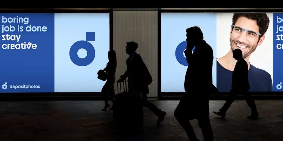
The final logo icon is based on a camera lens. We have kept the consistency with the previous version of the icon but gave it a modern touch. The new logo has become more recognizable and in its form is now more coherent with the textual part of the Depositphotos logo. In essence, it embraces the idea of a camera lens and the shape of the lowercase letter “d” which gives the design more character.
Banners and email newsletters are among the main means of communication for Depositphotos. CREVV designers developed a system and variations of the logo placement for these formats, so that all the designs and visuals can look more coherent. They have also created a series of branded animations for social networks in the process.
The refined brand identity helped Depositphotos mark the beginning of a new era in the history of the company and better translates the positive changes yet to come. The Depositphotos is hinting at exciting things ahead for both clients and contributors in the near future, and hope that this small change in design will be appreciated by their customers, contributors, and the bigger creative community.