Re-inventing a British icon: how Aardman own individuality in a world of uniformity
Aardman is the world-famous animation studio behind Wallace and Gromit, Shaun the Sheep and Robin Robin. A bastion of creativity and endearing characterization, their recent rebrand carried the weight of their longstanding reputation as a British Icon. Nick Horne of agency True Digital (who handled the rebrand’s translation into a new website) chatted with Aardman’s Gavin Strange for a peek behind the curtain of the rebrand.

True Digital consider the redesign of iconic production studio, Aardman Studio's website.
At the age of 45, Aardman has become a global powerhouse from a quirky corner of the UK. They produce a range of work, from stop motion features to 4D immersive experiences and full production console games. Aardman have indeed outgrown their previous, almost hand-crafted, visual identity. It was time to re-invent the public face of the brand.
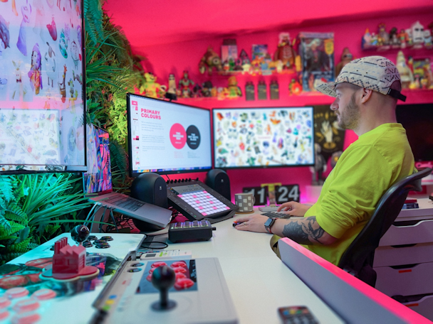
In-house director and designer Gavin Strange who handled the rebrand said, “it wasn’t about throwing out what had come before, we’re immensely proud of everything we’ve created to date, Creature Comforts, Morph, Wallace & Gromit, the claymation stuff people often associate us with. It’s a big element of our work, but it’s not the only side to Aardman.”
Re-working such a loved brand comes with big responsibility. “I really wanted to have a go, but was also terrified”.
“A touch wonky”
To find the commonality running through everything that Aardman does, they looked to the people behind it. “We wanted a brand that represented everyone, that everyone could use, and reflected all of the talents and styles we have here at Aardman.”
‘Individuality’ became the guiding principle. Not only does it tell you something about the nature of working there, of the employee ownership and what it’s like to work with them, but it’s visible in everything Aardman produces. It’s what stands them apart from their competitors.
Often, competitors are ruled by appealing to the masses through uniformity and sanitization, by reflecting the broadest audience back in the work. Aardman has always portrayed the uniqueness and idiosyncrasies within. Their characters don’t feel like marketing personas, but like real individuals, all different, often a little left-of-center, a touch wonky.
“Maintaining the heart”
Aardman’s mission was to progress the brand in a way that works at global scale, across the many arms of the business, while maintaining the heart of what it means to be Aardman. The old brand, in particular the logo, was intentionally rough around the edges, speaking of its humble table-top beginnings and human touch, but it was hard to work with across media and it didn’t always render well in lower-resolution spaces.
In digital, the fight between brand spirit and the requirements of scale seemed starker still. Digital design over recent years has pushed toward uniformity. Value is placed on repeatability, systems that can be used and re-used in many ways without breaking. Harboring slick aesthetics that simplify everything to the nth degree and elevating frictionless experience over brand values.
As a creative director in a digital agency, I’m not going to trash this, but it clearly felt at odds and forced us to rethink the rules, or at least find new ways to adhere to them.
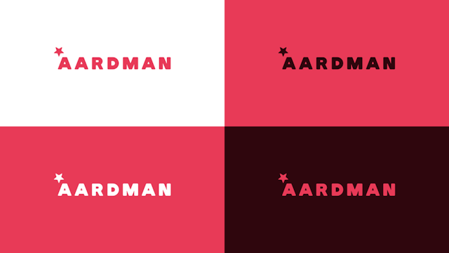
Gavin simplified and modernized the palette, introduced new fonts and made the logo stronger, bolder, and more confident. The scale and position of the star was reconsidered to lock up better, allowing for more flexibility of alignment, while the logotype maintained a soft and playful edge.

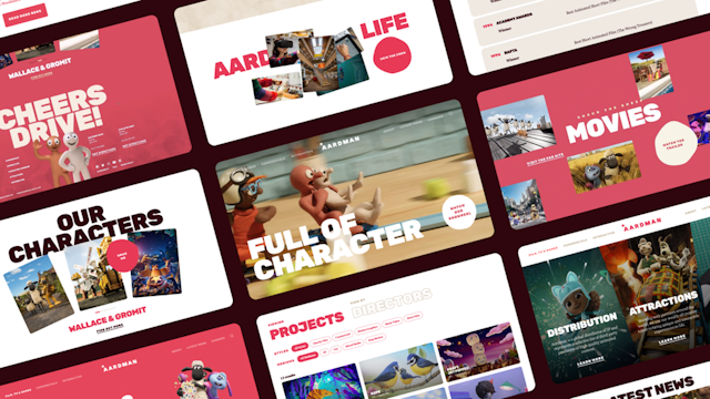
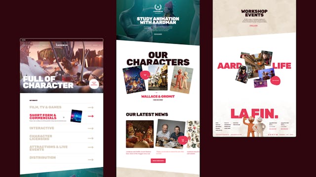
The principle of confidence was a key factor we looked to engender online too, playing with the styling and scale of the new font throughout the website. The scale immediately helped to deliver a sense of playfulness and fun to B2B customers.

The introduction of thumbprints, synonymous with Aardman’s signature Claymation style, became a signifier of the many individuals behind the scenes, each having had a hand in creating the work.
This was carried through online, with subtle use of the thumb-print texture as a backdrop but also as a key content and UX principle, raising up employees within the hierarchy. This created the opportunity to give every staff member a profile, putting names to faces and making the right contact identifiable to the user.
Shortening and easing journeys to allow users to make the right contact rather than a general contact was a clear decision to increase new business leads.
The only brand value left to land was a sense of non-conformity that comes from the great minds of those individuals – their creativity, playfulness, and unique thinking, all summed up as ‘The Wonk’.
It manifests in personality, tone of voice, behavior and literally wonky lines. Online, this ‘wonk’ became the container for a number of components. We didn’t want it static, so it drops clumsily into place as you scroll; a small touch but one that works no matter where it is placed across the site, responding to the color and layout of the components flanking it. When we demonstrated it to Gavin, he excitedly exclaimed, you’ve built us a “full wonk system”!

The trait is also evident across the site in wobbly CTA interaction design, carousels that flick through with a slightly comedic gloop and plop, a playfulness that doesn’t smack you in the face but reveals itself continuously with each interaction.
It felt to us that the success of the rebrand came from gripping on with all we could to that guiding truth of individuality. Embracing the fact that it wasn’t an empty promise; it’s Aardman’s own work but also burnt into the way we worked together, allowing everyone at Aardman and at True to take ownership, to place their own signature on the brand, to explore their own personal flights of fancy, and deliver their own A-game.
Content by The Drum Network member:

true
19 years ago true was founded with the aim of being different; straight-talking, to the point, focussed on delivering long-term growth, not through chat, but through...
Find out more
