3 principles to design the perfect display ad in 2021
James Pentland, a senior designer at Essence, shares his best practice in design for digital display advertising, sharing the view that the perfect banner ad takes more work than you could ever imagine.

When it comes to display ads, often less is more
Banner ad design can look deceptively simple, elegant and unique, but it can also be some of the most challenging design work you will come across.
Digital design in advertising has grown from strength to strength in the last decade. Audiences consume so much digital content in their everyday lives that an ad is not only a way for marketers to sell a product or brand message, it has become a part of the narrative in everyday life.
American art director and graphic designer Paul Rand famously said that “design is so simple, that’s why it’s so complicated.” Brands constantly battle with needing to make elegant digital ads, while maintaining certain form and functionality within the aesthetic of the ad design.
This can be anything from simple hierarchy, ensuring readability and accessibility of color, to how the ad is viewed on small, large, vertical and horizontal screens.
In my opinion, there are three design rules to follow to create best-in-class digital display advertising.
ASAP Principles
Any second ad principles (also known as ASAP) in the world of advertising is how we prioritize the way content is displayed through digital display ads. The industry standard is to maintain brand awareness via a logo, font type and imagery that gives context and a clear call to action with legal disclaimers.
Following these principles in our work recently on Google Store DR has shown an uplift in return on ad spend (ROAS) year-on-year.
Keeping these functionalities always on allows the brand to be upfront and honest about what they’re selling to consumers.
A logo can be an instant reminder – a picture instead of a thousand words. For consumers, a logo gives an easily recognizable shortcut to a brand’s messaging or story, which is invaluable in a world rife with content constantly demanding our attention. Brands such as Google, Airbnb and BT have distinctive logo color palettes and use a similar motif or pattern across all design collateral. It is also the first design element seen on a digital display banner – to ensure brand recognition and awareness.
Font type that is legible and clear with a defined call to action is essential. For example, if a price discount is included in the ad then it’s important to vary the weight of the font from semi-bold to regular to give contrast to the ad. A call to action is always the key element of a design decision, and by working closely with a copywriter or marketer the right message can be tailored to the target audience.
Finally, the legal lines. A designer must always consider whether there is a way to ensure the legal disclaimer doesn’t distract from the ad or key message.
Clever ways to hyperlink it to legal web pages or pop-ups can be built in. Hover options are a great way to deliver key messages while ensuring the right detail is displayed on a digital display, in spite of the size or format.
Design for format
Designing for format is a key aspect of best-in-class digital advertising. Apple’s Steve Jobs suggested that “design is not just what it looks like and feels like. Design is how it works.”
There are various digital screen sizes that display content. For the smallest format of a mobile sticky banner, the design should be as simple as possible and aligned to brand guidelines. It’s worth keeping in mind that the effectiveness of load time can affect how your creative displays online.
However, the bigger sizes such as a homepage takeover (HPTO) can be a great way to navigate and explore key messaging. Utilizing bigger visuals, more animation and explanations about the product or service through bold and visually striking graphics can help an ad resonate with the target audience.
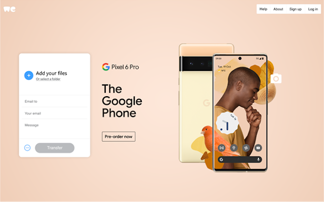
Recently for the announcement launch of Pixel 6 Pro on October 21, we launched our first HPTO with WeTransfer, using different visual elements that had a montage from the overarching Google Pixel ad campaign. It utilized a bright, purposeful background with clear messaging and an engaging Pixel phone with subtle animation transitions.

As a designer, it’s always worth sense-checking whether you’ve over-engineered the design (which many of us do every day) to showcase your design skills – or whether it’s better to keep it simplistic. It’s important to keep an ad design consistent throughout the creative cycle.
Simple but functional
In Mad Men, Don Draper’s message of “make it simple, but significant” has always stuck with me. In ad design, less is definitely more. Sometimes, designers can be overloaded with content, such as messaging and visuals, and are unsure how to pair them.
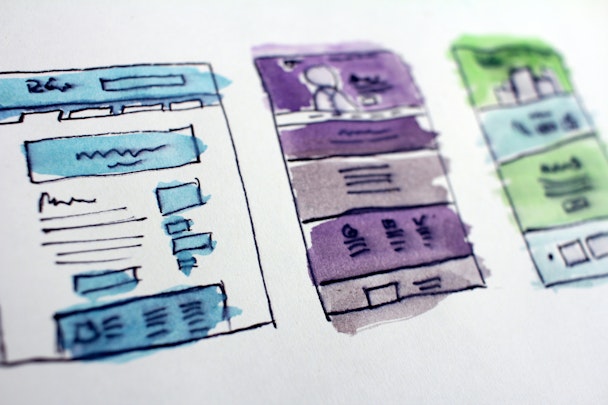
A great way of pairing the ‘less is more content’ is to use a wireframe or scamp the banner in a notepad to see where the content fits. Having a basis of what you need to include can help convey the right frame count or visual hierarchy to split across multiple frames.
Creating something functional is important in UI and UX design, but for digital ad design it should primarily cater for digital display.
Color and font accessibility should be a priority in creating display advertising too. It enables all audiences to discover and enjoy digital ad experiences, visually impaired or otherwise. This is an ever-increasing consideration in ad design. In fact, a specialist eyewear brand has recently launched the first-ever outdoor ad campaign tailored specifically for color-blind people.
The best approach to creating an accessible digital ad is to review the contrast between the colors and check that the text is legible. Be sure to check that it doesn’t blur into the background, and follow WCAG guidelines.
As brands continue to evolve and discover new platforms with new immersive experiences, following these three simple steps with digital display advertising will ensure that your design work is on the right track for success and gives you a creative benchmark for success.
