No logo: how to apply a minimalist approach to creativity
Simple and instantly recognisable, last week Leo Burnett unveiled its OOH work for McDonald‘s, to much applause. While the print ads were satisfyingly minimal in execution, they were far less 'simple' to get right. Bow & Arrow's Natasha Chetiyawardana reflects on what it takes to make minimalism work.
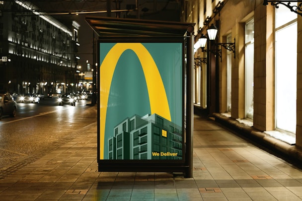
Promoting McDelivery, the OOH work features just half of McDonald's iconic ‘golden arches’ with no brand name in sight
Ostensibly, the efficacy of Leo Burnett's work for McDonald's is about minimalism. But in reality, its impact lies in the way the puzzle pieces of brand strength and a big idea click neatly together.
We’ve seen strong brands such as Starbucks, Coca Cola and Spotify lean on their brand recognition in this way. Similarly, Apple's 'Shot on an iPhone’ removed its name and other extraneous information to great effect. But crucially, when these brands have got it right, they haven’t been gratuitous about it. It’s when they haven’t rested on the laurels of their brand in totality that they succeed. Heinz does this too.
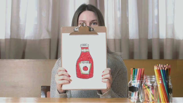
You see the impact in the reaction from customers when they see these images. The nod of the head or the ‘like’ is the recognition from the customer that the brand knows its strength - and they have used it to their unique advantage.
The success lies not in reduction on its own. Minimalism for minimalism’s sake tends to fall short; you cannot have successful minimalism without a strong idea. That simply becomes a dilution of potency. When minimalism is done right, it is through – in the words of the venerated Glenn Tutssel – “great ideas, beautifully crafted”.
Let’s break that down.
Great ideas are often ones that aren’t spelled out for you. The brilliance of these McDonald’s ads is that nothing is pushed at you, apart from an image. Your brain fills in the gaps.
One of the greatest images of all time is the book cover for 1984 by David Pearson.
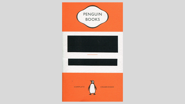
The spark prompted by the connection makes your heart beat faster – the gauge of good design, as The Drum Awards for Design Judge Rosanna Vitiello always says.
You just need some brave people at the top to commit to this kind of creative execution. Of course, it is easier to say yes to this kind of execution in a transient medium. The New Yorker employs this technique to great effect, and often. These two Trump-focused covers were stronger than most words could have been. I’m not going to say anything about them. I don’t need to.

On to beautifully crafted - this is crucial, it's make-or-break when it comes to a piece of creative work. The McDonald’s ads seem, to me, to be inspired by the illustrations of the dystopian worlds created by Chris Ware. Both are amazingly detailed, using ‘off’ colours and strong contrast with meticulous execution.
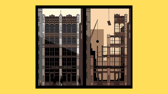
I would argue that without this level of craft, and the disruption of the image with the golden arches, these ads wouldn’t be half as arresting. You would ignore them. And you need know nothing of craft for it to draw your eye and hold your interest.
Great ideas, beautifully crafted. What else matters? Well, context is key, too.
Trend-wise, we’ve seen minimalism to maximalism and back again. Fashion brands’ almost simultaneous reductionist approach where decades of history were seemingly thrown out in favor of almost identical styles, has been met with some consternation. Because there didn’t seem to be an idea there, but perhaps...category consensus?
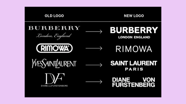
Yet context is about timing as well as category. Maybe all these brands had planned to do this and it just happened at the same time, which made us kind of ignore it. Timing absolutely affects our perception.
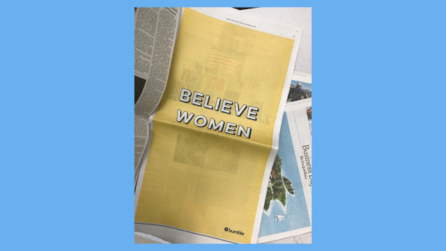
See this ad from Bumble. What a message. From the 'rarest of rare' – a young female billionaire. Except it was created in 2018. Not this week. The context changes everything about how you perceive that image. (@Bumble, please run it again this week?)
Yes, timing is the last piece of the puzzle. Right now we are all fatigued and our brains can’t process much more. Leo Burnett captured this at the right time – there is resonance in so many ways. On top of that, it really hit home because it is about home; it appeals to our hearts and our minds right now.
We are overwhelmed. And we need light and comfort. Delivered. Right. Now.
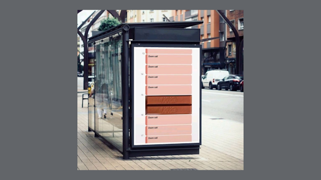
And as we sit staring at screens interminably, I’ve seen backlash against creative that’s not in our ‘right now’ context. For the McDonald’s ads, and Kit Kat’s latest execution – being shown at a bus stop.
Why? Because we’re not going out. No, we probably don’t see the bus stop ads right now. But in this case, that doesn’t matter. In fact, it’s anachronistic context is tacitly important. That bus stop context shows us that there is hope. That we will be out and about one day. And that we don’t want to continue to just keep staring at these screens all the time. But for right now...there's something out there that delivers.
Natasha Chetiyawardana is co-founder and creative partner at Bow & Arrow. She is also co-chair of The Drum Design Awards 2021 with John Mathers.
