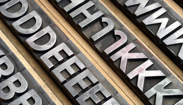
Fashion shot the serif: homogeneous logos and luxury branding intertwine
So long, serif font family? Well, that’s what the global fashion houses would have us believe. The often all-caps, wide-spaced aesthetic to covet seemingly no longer requires fussy strokes, firmly waving goodbye to elaborate lettering. Basically, they’ve gone all sans-serif on the logo game, with only miniscule variations and it hasn’t gone unnoticed.

Coined as ‘blanding’ by some, who’s digging the new look, you ask? Everyone from Balmain and Burberry, to Saint Laurent, Celine (they’ve dropped the accent) and Balenciaga, plus many more major players. The visuals speak for themselves, yet curiously, it’s possibly not until you view a selection of redesigned luxury logos, aligned side by side, that you begin to absorb just how strikingly similar they really are.
The sans-serif industry rebrand collective connotes modernity, minimalism, purity and simplicity for the current logo landscape. Equally, this cherry-picked typography group also translates and displays perfectly for the digital world, offering crisp definition for screens, both big and small, across the land.
For many of these brands, the unveiling of a shiny new logo comes after decades of iconic heritage. Take Burberry for example. Founded in 1856, the quintessentially British fashion house, which hadn’t altered its logo in years. However, under Riccardo Tisci’s creative lead, and a fresh logo from graphic designer Peter Saville (known for his album artwork for Factory Records), the familiar knight on a horse was erased and simplicity has ensued ever since.
“Burberry needed an identity that is fluid and able to cross over into all the categories that are required of a big luxury clothing and accessories brand – something to transcend the company provenance without denying it,” Peter Saville told Dezeen.
The contemporary, no-frills logo announcement was made on Instagram, underpinning the shift again being made for generation digital. Although, the redesign gained inspiration from the Burberry archive, with its utilitarian feel, which certainly works harmoniously with the roots of the trench coat.
At the very core, is there more to this cohesive design upheaval across so many notable brands, where unity is favoured over standing out? Various commentary on the subject has nodded towards a planned departure from the past, perhaps moving away from negative, stuffy or elitist brand values that no longer marry up with today’s inclusive culture.
Others conclude that the evolution is simply to encourage increased focus on each brand’s creativity, allowing the luxury goods to speak for themselves. Either way, no brand wants to be stuck in the past – that’s for sure. Renewal also brings fresh enthusiasm and with that, the tills begin to ring.
Ultimately, how does the consumer react to renewed brand identities? From a design perspective, is it closer to sans-individuality, quite literally following the crowd? Or, is digital modernity taking its hold with super-slick, fuss-free fonts for the foreseeable? One thing’s for certain, the less-is-more overhauls are set to continue across the sector and they’re likely to opt for a bold new era. Watch this luxury space.
Ashleigh Giesler, senior creative at Paradise.
Content by The Drum Network member:

Paradise
Paradise London is an independent fully-integrated creative agency dedicated to enhancing, connecting and refining brands worldwide.
Find out more
