What the 'evil genius' Brexit Party logo can teach Change UK about branding
‘My milkshake brings no joy to Farage’ was a rather lovely tweet in response the Brexit Party’s leader being liberally doused in a big cup of Five Guys’ salted caramel shake.

What will bring joy, however, to the ‘Pound Shop Enoch Powell’ (not my words, but those of the ‘Pound Shop Messiah’ Russell Brand) is just how well some basic graphic design tricks have served his newly formed party.
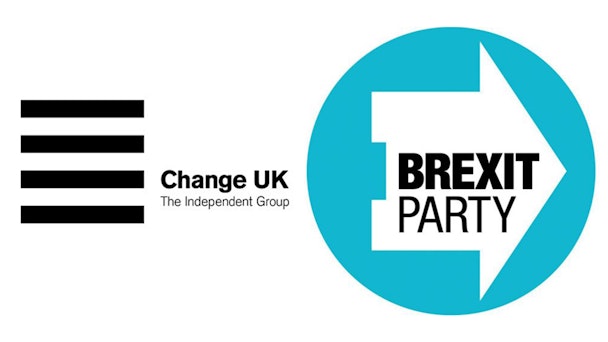
Even putting the politics to one side, the new Brexit Party icon has genuinely created quite a stir. Its form, a right leaning house, is basic but robust. It’s also faintly recognisable, maybe due to its colour palette of Thatcher-era blue.
When seen on a ballot sheet, however, its arrow-like shape feels close to genius/evil genius (delete as appropriate depending on your Brexit beliefs). There’s no proof that it will subconsciously influence people to put an X next to their name (a similar approach didn’t work for Hilary Clinton – but then again the US voting system is slightly different). But as the referendum result from 2016 proves, today’s elections live or die on a fine tolerance so there is an outside chance of some effectiveness.
I once mocked this logo design. I mock it no more. Holy Shit. pic.twitter.com/kByDaKbjyt
— trevor beattie (@trevorbmbagency) May 14, 2019
Its brutal (borderline election-rule-challenging) design efficiency is made even more effective in relief against the ineffectiveness of Change UK’s identity. Watching Chuka Umunna discuss the intricacies of logo design on the Andrew Marr show on Sunday was a peculiar experience. The eponymous interviewer spent a fair chunk of his interview interrogating Umunna on the branding capabilities of his party as much as his policies.
The Independent Group, or Change UK as they are now confusingly known (herein lies the problem: get a name agreed before you start on the creative) has approached the challenge of branding one of the few new mainstream parties in years with the approach of someone who’s read a lot of books about Dieter Rams.
For those who haven’t seen the Change UK logo (many who have may not realise they have), it’s a bit of sans with some lines, which has a certain simplicity, looking a bit like a UI ‘burger’ that has more content to reveal. But in its aim of being an identity for everyone, it says not quite enough to anyone. That said, Umunna must secretly like the fact the acronym for his new part is ChUK.
Why does any of this matter? It matters because design and the wider notion of identity and presence can and does change elections. I’ve written before about the power of political brand at the time of the Scottish referendum. Back in 2014 the scribbly little NO campaign won against the chunky Helvetica ‘YES’ campaign. YES to independence spoke to a nation like a nation, hard and brisk. The NO to leaving response, in contrast, was more individual, softer, warmer and a bit goofy, like a wobbly little kiss. But most of all the NO campaign had the one thing the YES campaign didn’t – a replicable icon. A big fat hand-drawn cross. The thing everyone in Scotland was going to recreate the moment they stepped into the booth, irrespective of who they were siding with. It could well have been a graphic ‘hanging chad’ that nudged a few of the undecided.
All logos should stand for the things the party they represent believes in. Where the Brexit Party has perhaps upped the anti is that it has also remembered that standing out matters too.
Standing out has been very unpopular in this era of conservative (small c) public personas and party stances. The worry of losing a potential vote means parties have kept comms and messaging to bland soundbites. Even the conference messaging – once bold statements that filled an arena backdrop – has been reduced to 150 pt type to the top right of the speaker's lectern so it frames neatly for YouTube.
And this scaling of messaging is pretty much the only concession to a new era of digital politics. All parties are woefully behind the times when it comes to maximising their presence for screen and social. Nearly all political identities are printed, placard-first projects: motion, for example, doesn't get a look in.
From a sweaty Nixon to a lightbulb-headed Kinnock, via John Heartfield, Jamie Reid and the New Labour poppy reboot, political imagery and iconography can swing political debate. We may never know if in the European elections it will have played a winning role, but it does highlight that design and creativity matter in the important things in life.
Chris Moody is chief design officer at Wolff Olins
