Smaller images, fewer colors: 5 ways to make a rebrand more sustainable
The UK’s national advisor for design has shared how brands can reduce the carbon emissions of their visual identities.

Design Council's own rebrand implemented the new guidance it has launched / Design Council
The Design Council has revealed a refreshed visual rebrand that prioritizes accessibility and sustainability. Now it wants to help other brands do the same.
The organization says it aims to help set a new standard for graphic design principles that are more inclusive and responsive to the climate emergency and to people with accessibility needs.
As a result, when overhauling its own visual identity, The Design Council conducted a sustainability and accessibility audit of its own guidelines. The organization believes it may be the first time a sustainability audit has been included in a brand review, which was led by Mia Allers, design lead on gov.uk at the UK Government Digital Service.
As Allers explains: “When you understand the impacts of what you do, you are more likely to design in a considered and strategic way. Conducting a sustainability and accessibility audit is just the start. And for the Design Council, it’s a new approach that I hope to see adopted by more brands. Sustainability and accessibility guidelines will help steer the strategy of each piece of communication created from now on. It all comes down to clarity, usability and impact, which are foundational to good design.”
Advertisement
The sustainability audit took into account broad considerations of how the brand may be applied to communication materials. However, there isn’t a formal set of rules to follow to keep the carbon impact of branding to a minimum, as with accessibility standards.
“With a long legacy in a future-looking sector, we have a unique story to tell and so we have gone on a journey to update our visual branding and properly represent that identity,” says Design Council designer Maryam Atta.
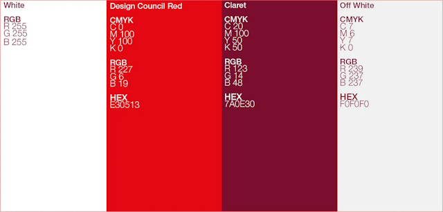
“Creative studio OPX created a simplified design system for us that is fresh, clean and warm. They introduced the classic Helvetica font, a streamlined color palette and carefully selected hero imagery.
“With our mission to Design for Planet, we decided to try and walk the walk and enlisted the help of Mia... From typography to imagery, color choice to file formats, we learned through her how to make small adjustments in digital and print that will help keep the planet at the heart of our work.”
Here are some of the core principles of a sustainable rebrand, as laid out by the Design Council.
Advertisement
Minimize the number of colors in your palette
Color use makes a difference to the carbon footprint of digital applications – especially when using complex combinations. The Design Council logo uses two CMYK inks, red and yellow, instead of a spot color as many contain polluting metals.
Meanwhile, darker colors have been shown to use less energy on modern screens and red pixels use less energy than blue or green pixels. The Design Council explains that white is the most emitting digital color as it’s made up of a combination of many others.

“We revised our primary colors to include an off-white that is less impactful for digital formats, but since white space saves on ink in print formats, we have also provided this option,” says Atta.
Provide options for printing in a single ink
Although the Design Council removed black from its primary palette, it advises having black and white versions of logos and suggests using black ink when printing to reduce the carbon impact.

Reduce the amount and size of images
Images are one of the biggest contributors to carbon emissions on most websites and the larger the file, the larger the impact. Considering even a small reduction in image size through cropping can be beneficial for the amount of ink, materials and energy used to print or display images.

Atta says brands “could consider setting an ’image tax’ per page and saving files in SVG format to help you manage your website’s load times and emissions. We are also using the green hosting service Krystal to run the Design Council’s website on a renewable energy source.”
Suggested newsletters for you
Limit fonts
In order to use fonts digitally, font files need to be loaded and hosted creating emissions for both the host and user. On the accessibility front, multiple fonts can also increase page load times and this causes particular issues for those relying on screen-reading technology.
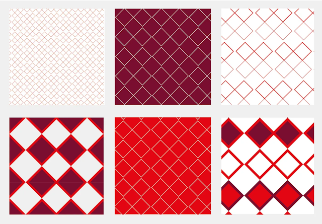
Pattern reduces block color printing
Flooding paper with one solid color can make the de-inking process used during recycling more difficult and so using patterns to break up the color can help, explains Atta.

Dense ink coverage may also require thicker paper leading to more emissions. Uncoated paper is generally more sustainable and easier to de-ink and recycle.
“As our brand application relies on color blocks, Mia advised that we could look to provide visual strategies for decreasing ink coverage on printed material where possible.”
Overall, Atta says that through the process of learning and optimizing the Design Council has “discovered a world of possibilities and potential pitfalls.”
She concludes there is a balance to be found to not compromise on accessibility and aesthetic quality. “It’s not an exact science by any means and so the best policy is to take small steps, one at a time.”

