‘It is fun to push buttons’: Beavertown creatives spill on creepy hand-drawn film
Beavertown’s zany creatives share how they blended their iconic design with the aesthetic of a dark 18th-century poem that uses a color palette straight out of Disney’s Fantasia.
Founded back in 2011 by Logan Plant, the son of Led Zeppelin frontman Robert Plant, Beavertown is known for its iconic graphic design and punk ethos.
“Gamma Ray launched the whole brand because it was a bottle of beer with colorful spacemen on it and that was something that didn’t really exist,” explains Nick Dwyer, creative director for the brand. “Both Logan and I loved the attention and the feedback. We thought, how can we capitalize on that? How can we keep filling the space? Now you look at beer fridges, they’re pretty bright and it’s nice that we feel a part of that.”
Advertisement
According to Dwyer, it’s easy for a brand that sells products to get a bit bogged down by data and numbers, which is why he’s always on the lookout for strange little projects to work on that will resonate with the Beavertown audience. This is exactly what The Rime of the Ancient Mariner film turned out to be.
Taking “massive” inspiration from The Simpsons ‘Treehouse of Horror’ episodes, especially the Edgar Allen Poe ones, Dwyer linked up with animator Alice Bloomfield to bring the vision to life. The duo had to walk the line between being a little bit disturbing, while also still being commercial enough.

“Nowadays, animation can be a little bit slick and computerized, but my practice is very much the hand-drawn, frame by frame. It’s more organic and there’s a nice feel to it,” she comments. “I find it a lot more engaging because it’s not super predictable and slick or smooth. It’s a bit more jumpy and exciting. You can tell someone’s put their own work into it.”
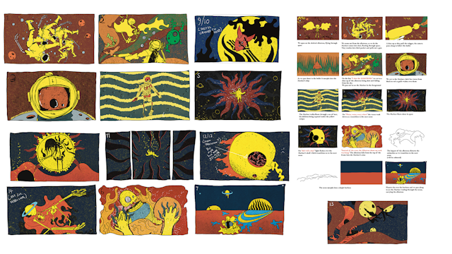
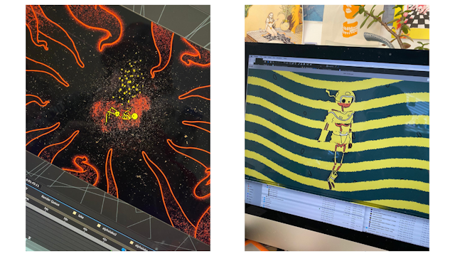
Picking out parts of the poem he wanted to use, Nick then drew what he thought the scene might look like and Bloomfield interpreted his drawings, acting as the project’s director. The whole process took around a month to complete and was hand-drawn on a Wacom tablet – 12 frames every second, to be exact.
“You draw out each scene shot by shot,” notes Bloomfield. “Then you do the animatics, where you cut those drawings together with the voiceover. There’s a lot of prep, and then you actually can animate.”
It was a first for the brand, which made Nick a little bit “nervous” but also excited. Beavertown has a very distinct band color palette and deviating from that was fun for the creative director.

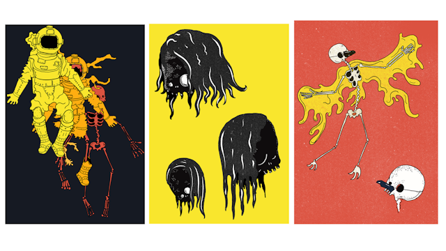
“We have serious recognition from the Neck Oil orange and yellows. We chose what we thought worked best for the tone. There’s pretty much the Fantasia palette,” he says. They embraced the imperfections of the drawings and gradually adopted a darker palette as the film progressed.
Advertisement
“Staying slightly ahead of people, that’s the challenge and that’s the reason why we have to find these strange projects to do,” he adds. “If you took this to a marketing department they’d say ‘you’re nuts’ and they would show you a load of data.” It is his belief that if “30% of people see it and 100% get it” then that’s better than “100% people kinda getting it.” Plus, in his words, it’s fun to “wind up” marketing departments and “push buttons” from time to time with some off-the-wall ideas.

It’s a tactic that has long worked for the brand. Even its skull logo is “intentionally crap” and anatomically incorrect. “It used to be a character that I liked to draw quite a lot. We had the triangle logo before that Logan was keen on it because it was his idea. It took a long time to hammer in that people really liked the skull characters,” recalls Dwyer. “It’s really easy to spot when people are copying it because it’s just wrong.”
Suggested newsletters for you
You get a sense that it’s the “unfinished” aspect that excites Dwyer – the possibility to continue expanding this intriguing world and keep people talking about the brand.
“You can make people a bit creeped out, and they’ll walk away feeling creeped out, but they’ll remember it,” he concludes.
Interested in creative campaigns? Check out our Ad of the Day section and sign up for our Ads of the Week newsletter so you don’t miss a story.

