YouTube’s design refresh explained: ‘it’s easier on the eyes’
YouTube is rolling out new video navigation tools and a fresh look.

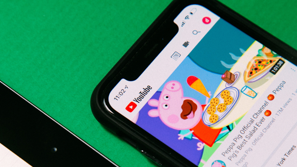
YouTube is getting a slight facelift / Charles Deluvio
YouTube is getting a bit of a makeover. The Google-owned video platform announced today that it is implementing a design refresh and at the same time debuting a handful of new features meant to enhance the user experience.
The changes – which are being rolled out over the coming weeks to users across the globe – were informed by users’ feedback. “We gathered input from thousands of viewers around the world and heard that there was a desire for a cleaner, more lively design that better represents what we’re all about,” said Nate Koechley, the company’s user experience director, in a blog post today.
Advertisement
Here are the details you need to know:
-
Pinch to zoom available for all: After testing a number of new user features this year, YouTube will make some of the most successful tools available to all users, including its ‘pinch to zoom’ feature. “You can now easily zoom in and out of a video while on your iOS or Android phone,” said Koechley. “And when you let go, the video stays zoomed in so you can enjoy the rest of the video in greater detail.”
-
Precise seeking debuts: This is designed to help users more easily find a specific moment in a video by displaying thumbnail images of moment-to-moment action. On both mobile and desktop, a user can drag or swipe up while seeking to see a thumbnail display. In today’s blog post, Koechley explained that this new feature builds on a broader effort to improve content navigability at YouTube: “Precise seeking builds on our recent improvements to video navigation that help you quickly find the parts you’re most interested in. We launched the ability to long press anywhere on the player to seek and to double tap with two fingers to skip chapters. We also added a graph that shows frequently replayed moments in a video.”
-
Color is a key focus: “We wanted to add vibrancy to our apps without detracting from viewers’ habits, whether that’s enjoying their recommended videos or browsing for new content,” he said. What came of that thought process is the platform’s new ambient mode, which, through dynamic real-time color sampling, automatically adjusts the app’s background color to complement the video. It was inspired by the cinematic feeling of light that emanates from device screens in dark rooms. The feature will be made available on mobile and desktop in dark theme. YouTube video playlists will get the same color treatment, and the platform is introducing additional details about playlists to make things easier for users.
-
The dark theme gets an update: A change made in accordance with user feedback, the new dark theme will be made even darker across web, mobile and smart TVs.
-
User experience to make YouTube easier on the eyes: In a renewed focus on the video player, links in video descriptions will become buttons. Plus, common actions such as ‘share’ and ‘download’ will also see design updates meant to make the watch page “easier on the eyes,” per Koechley. Changes include a shiny ‘subscribe’ button in a new shape and featuring higher contrast.
Advertisement
All of these announcements represent small but significant changes to the platform, which is celebrating its 17th anniversary this year. In today’s blog post, the company’s chief product officer Neal Mohan reminisced on the platform’s history and evolution. “When the first YouTube video was uploaded in 2005, YouTube had a search bar and a list of video tags on its homepage,” he wrote. “Since then, you could say we’ve gone through some changes.”
For more, sign up for The Drum’s daily US newsletter here.

