Why the ‘hell’ did San Pellegrino change its iconic cans?
Each week, the marketing community brutally judges rebrands on social media like it’s a modern gladiatorial arena. Last week’s blood (orange) sport was brought to them by soda brand San Pellegrino, which fizzed up said group with a new identity and packaging including thinner cans and no foil overlid. The Drum asks, what gives?

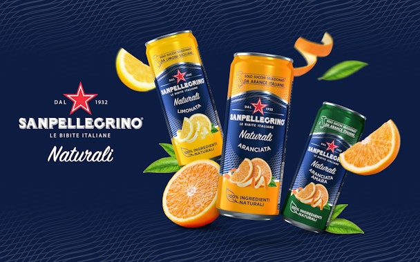
San Pellegrino’s new cans are taller and are missing the recognizable foil overlid
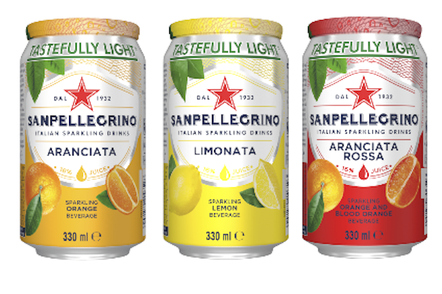
The Nestlé Water-owned sparkling beverage brand recently rolled out newly-rebranded cans across numerous markets including the UK – irking some marketers who believed this eroded a once distinct design for something more generic. The premium sparkling juice brand is well known for its bold design and foil overlid (which added an extra element of hygiene and value to the product, which so few rivals had). However, it has now stepped away from this beloved design.
On LinkedIn, Rob Campbell, chief strategy officer of Colenso, asked: “What the hell are you thinking ... from distinctive and definitive flair to mediocrity beige.” He assumed it was a financially-driven decision that missed the mark on quality. This post was reflective of a couple of heavily-engaged posts across LinkedIn and Twitter.
Of 94 comments on the post at the time of publication, most were in agreement that the new look just ain’t quite up to scratch. One commentator said the new can looks like an off-brand knock-off. Another applauded the new minimal approach, but stressed it should still have the foil like the old cans pictured below.

The Drum approached Nestlé Water for clarification. It said that the new visual identity for its Tastefully Light and Classic Taste Sparkling Fruit beverage ranges was rolled out globally from the end of 2021. It will touch down now in 120 countries.
It said: “The new design features updated visuals reinforcing our distinctive values of natural ingredients and Italian origin, offering consumers a ‘top drinking experience’ from products that provide the best quality and ‘premiumness,’ while respecting the world in which we live. Validated by consumers, the new packs communicate taste and refinement, while enhancing the link with the mother brand and greater on-shelf visibility.”
It talked up how the sleek cans are more “forward-looking.”
Upon research, the rebrand was conducted by an agency called Gentlebrand. It explained its process on its website. “All-new and refined, the image supports the premium positioning backed up by the products’ elevated flavor, quality and experience and founding values like heritage, ‘Italianness’ and naturalness.”
It said it “revisited” the brand identity of the wider portfolio for the 90-year-old drink after conducting “in-depth analysis of the market and target ... to define the strategic drivers for the new identity and come up with several alternatives, from conservative to disruptive innovative designs.”
There were 18 flavors in the portfolio to interpret, as well as localized versions for the US, Canada, Europe, Japan and Australia. Each flavor is more distinct and recognizable, even if arguably it’s not immediately San Pellegrino as we know it at first glance.
The new look will be supported by a 360° summer campaign covering ATL, digital and social media, led by the tagline: ‘Life sparkles under the sun.’
The website provided no clarity on the can-shape change or the removal of the foil, however back in 2018 the brand had embraced taller thinner cans for its spring water brand inspired by its ‘Vichy’ green glass bottles. The performance of this line has clearly inspired the broader roll-out – the water brand also boasted the now-missing foil top.
At the time, Danit Eisdorfer, group manager for San Pellegrino, said: “With the addition of San Pellegrino in sleek, modern cans, any meal occasion can be transformed into something special.” More pertinently, he outlined an eagerness to be distinct from the shape of market-leading sodas.
“Consumers have been turning away from sodas for years and looking for fizzy alternatives that are healthier, such as sparkling mineral and flavored no-calorie drinks. San Pellegrino is adapting to these changes by packaging its mineral water in aluminum cans, while still speaking to its long history and tradition, making it easy for new consumers looking to avoid sodas or longtime customers who want a better way to enjoy their sparkling mineral water.”
Four years later, even San Pellegrino’s sodas have followed suit.
The consolidation of can shape across all ranges is likely more cost-effective for Nestlé Water. Furthermore, the taller, thinner cans are becoming more common in the category. Drinkers will still receive 330ml of San Pellegrino, but there are benefits.
More of these cans can be placed on the shelf – fuller shelves are more encouraging to shoppers, furthermore there’s a higher chance of product availability. This also means a greater amount of choice, which the brand is urging wholesalers to stock. These cans chill faster (it’s a physics thing) and, finally, consumers apparently feel less guilty about necking the whole can when it’s skinnier (even if it holds the same amount of fluid).
So that makes sense. But why remove the foil? In 2014, the overlid was being showered with praise by Joe Juliano of Nestlé Waters North America.
He said: “Market research shows that the Eco cap lid is receiving a very positive consumer perception and that it conveys a premium image and prevents the can from becoming dirty (therefore allowing you to put your mouth on a ‘preserved,’ more hygienic surface). In Italy, San Pellegrino was the first company to launch the Eco cap, and now competitors are starting to imitate it. We also have very positive feedback from Australian consumers too because of the hygienic aspects of the lidding.“
One potential explanation is the coming cost-of-living crisis. This premium brand could better navigate coming difficulties by decreasing unit costs, expanding its range, making them more visually distinct and making them easier to stock. The new look ticks those boxes, but at what cost?
A recent op-ed run in The Drum urges luxury brands to “value your value” in the face of the cost-of-living crisis. The Nestlé Water brand is about to find out if it remains a premium brand minus the overlid that signified such a market position. If not, at the other side of this crisis, the return of the cap is merely another rebrand away...

