Two agencies, one brief: here’s how This is Going to Hurt launched in the UK and France
Two agencies were given one brief: launch the BBC series This is Going to Hurt to screens. Here’s how the two approached the task, with remarkably similar results.
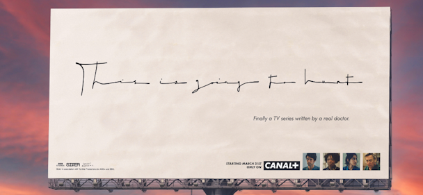
BETC’s billboard campaign for This is Going to Hurt / BETC
Based on the best-selling book by real-life junior doctor Adam Kay, the TV show details the chaotic life of an NHS worker. It’s painfully funny and heartbreakingly honest, which has resonated with audiences all over. But how do you convey that through an ad?
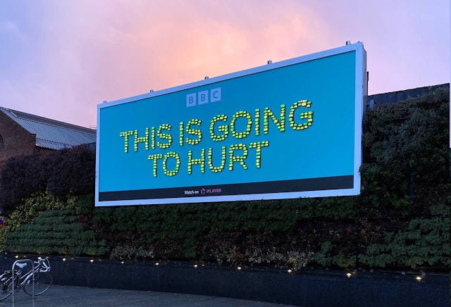
Back in February, BBC Creative started the promotion of This is Going to Hurt with an attention-grabbing out-of-home (OOH) activation featuring over 300 working pagers. Earlier this month, French viewers were introduced to the medical drama through a billboard campaign by BETC featuring a handwritten doctor’s note.
Approaching the brief
For BBC Creative, it decided to approach the brief through the lens of ‘relatability’ and making the audeince feel like they were in the position of being a junior doctor. Its campaign was devised by duo Shannon Cripps and Beth Wood.
“We thought that by having so many different pagers on the billboards, and having them being rung, makes you feel that overwhelming feeling that he gets in the show of being out of control, constantly being worked,” says Wood.
Meanwhile, to capture the attention of French audiences, the BETC Paris team had a harder job of trying to stand out against the myriad of other medical dramas on screens.
Ellynore Attia and Melissa Hofman, creatives at the Paris-based agency, led the account. “The brief was pretty simple – how could we create a billboard that will both stand out and give a fair idea of the show’s originality, ie its truthful take on hospital life?”
Creative approach
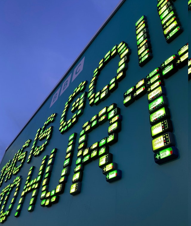
In London, the BBC Creative team assembled a beeping billboard with flashing LED lights showing messages including ‘Labor ward,’ ‘Gynae,’ ‘Miss stag do’ and ‘Sleep in car‘ that hinted at the show’s plot themes and tugged on viewers‘ heartstrings. It was one of the first ideas they pitched and it stuck.
“It was such a prominent feature within the series,” says Cripps. “He’s about to leave the hospital and then he gets buzzed, and he comes back, that kind of thing. For us, that was definitely one of the key iconographies within the show.”
BETC’s approach was much more minimalistic.
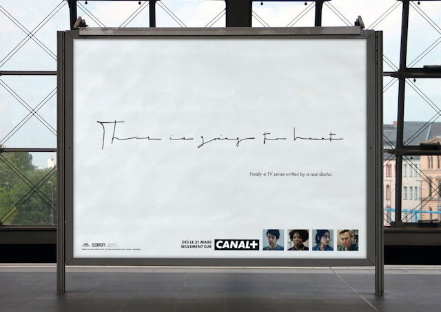
“When you see it, you already get the fact that it is not just any handwritten message, and you immediately recognize the rushed gesture of the doctor,” say Attia and Hofman.
“You imagine him holding a pen and writing prescriptions. We could even see his arched eyebrows hidden behind serious glasses. A whole universe that fits into a simple font. And what we liked here was the irony of the concept: we wrote an unreadable ad; and it’s because it is unreadable that people understand its meaning.”
Throughout both campaigns there’s an element of humor, which is a nod to Kay’s style of writing and the kind of ironic tone of voice Brits are often known for.
“Among the things that are true about doctors in real life is that no one can read their handwriting,” say Attia and Hofman.
“For us, it was a way of saying literally that the series was written by a real doctor, which was at the heart of the show and was a way of bringing humor to the situation. Irony is woven into the series. It was a good way of bringing this very typical type of British humor into the campaign.”
OOH activations
Interestingly, both teams felt that the best medium to convey the erratic nature of the show was a billboard to capture locals’ attention in London and Paris and, although the approach to the brief was similar, the execution was widely different.
“They were strategically placed near hospitals. They utterly embody the life of these workers and this was a nice nod in their direction, a kind of ‘we see you,’” add Attia and Hofman.
The experiential feeling runs parallel in both the campaigns, with the two teams aiming to give viewers a sense of hectic hospital life in a realistic way.
“It’s almost an attention-grabbing thing and if you walk past it you feel a little bit stressed yourself, you hear that noise and it’s quite overwhelming,” says Cripps.
“We made sure that it was an eye-level poster. So, if you were there at the site it allowed you to walk up to it and actually read the pagers when you were standing on the floor, which I think we felt was important because we didn’t want it to just be something you could see in close-up images.”
Aesthetically, both ads are extremely different, but creatively they both do so much to draw the viewer in. They give a real sense of what can be expected from the show using relatable humour and recognizable imagery, with reactions to both campaigns being overwhelmingly positive.

