Advertisement

This image has been used by ad agencies to launch out-of-home campaigns for at least three years / The Drum
The same image of the same billboard, somewhere in London, keeps appearing in press images of out-of-home campaigns. To find out why, we embarked on digital duck hunt for the billboard and discovered a story of creative frustration, philosophical questions and homesickness.
Every new campaign is an advert for the agency behind it. Successful new work might attract your next client or recruit your next creative director, which is why agencies tend to post TV spots to Vimeo or YouTube, so that those outside their client’s target audience can find them.
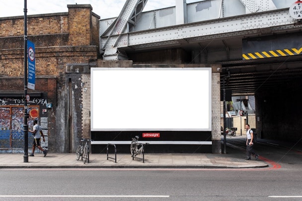
If that campaign includes an out-of-home element, that might mean a photograph of the work in situ, on the side of a bus stop or a billboard. This billboard, perhaps.

Does it seem familiar to you? Look closely, at the bicycles fastened to street furniture, at the man striding on his way, perhaps en route to a business meeting or romantic date. If any of this is ringing a bell, you’re not alone – because this image has been used by ad agencies to launch out-of-home campaigns for at least three years.
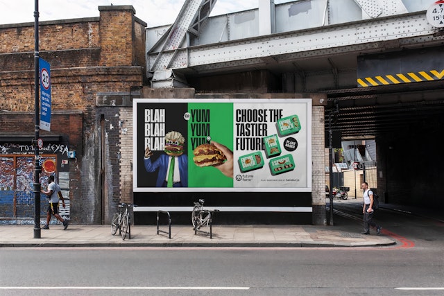
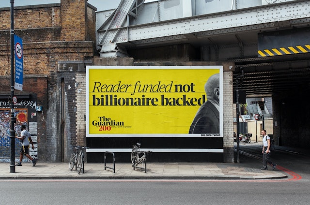
The Future Farms campaign, for example, was unveiled by Impero this year. But here’s the same billboard in 2021, marking the 200th anniversary of The Guardian.

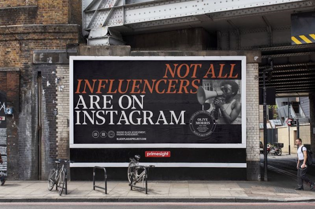
And here it is in 2020, bearing the work of Havas London for its award-winning Black Plaque Project. The brickwork and leaden sky suggest Britain, probably London. But there’s few other clues to its location and a reverse image search only yields more images of the billboard and its bicycles.

What’s so special about this one billboard? Is there some innate quality it possesses – the perfect angle, relative to the railway bridge, for viewing from the ground? The ideal amount of urban miscellany nearby to make it seem part of the city, whichever city it is? Could it be the ultimate, archetypal billboard against which all other out-of-home media locations must be measured?
In his seminal work Simulation and Simulacra, the philosopher Jean Baudrillard suggested that the more artists, photographers and other creative professionals relied on existing images for inspiration, the less connection to reality their work possessed. Images based on images – a photograph that references the arrangement of a Renaissance painting, for example – were in his view simulations, rather than ’real’ images.
Eventually, he wrote, image-making would become completely dependent on other images already based on existing work, totally disconnected from any relationship to the world. What would the postmodernists make of our mystery billboard? More importantly – does it actually exist? And did the ads shown within its aluminum frame ever run at that location – or any location?
Following the money, or at least the logo on the billboard frame, led to Global, the OOH media owner that bought Primesight’s billboard inventory in 2018.
According to a spokesperson for the firm, the billboard is located in Hoxton, London, at 38 Kingsland Road. You can see it on Google Street View, complete with chained up bikes. They weren’t able to confirm whether or not the campaigns for Future Farm, The Guardian or the Black Plaque Project ever ran at the Kingsland Road location, but they did solve the mystery of the recursive billboard – it’s a staple of free graphic design template sites, just one of millions of images uploaded as fodder for mock-up graphics.
Agencies wanting to publicize their new campaign might send a photographer out to capture the work in situ. But that takes time, cash and luck with the weather and lighting – so to save time they use a mock-up.
This is where our mystery leads to a real issue for creative professionals, because mock-ups aren’t just used for PR efforts – they’re an important tool for visualizing creative work while it’s being worked on, to show clients and other stakeholders what a campaign might look like in the flesh.
But according to Thomas Worthington and Greg Ormrod, a creative team at Havas London, decent mock-ups are hard to find freely on the web – leading to situations like our mysterious repeating billboard.
”When we started out, we struggled,” says Worthington. ”It’s always hard. There’s a few websites that do free mock-ups, but that’s where the problem is because everyone’s using those same mock-ups.
”From a creative point of view, we’ll put it in there to show the clients or us what it looks like. And often the designer will have their own bank of mock-ups as well and they’ll just put it in there for the sake of presenting it internally.”
Good mock-up imagery is a trade secret for some creative directors, says Worthington. But he and Ormrod have created a free-to-use bank of imagery for students and fellow creatives to plunder, called KnockOffMockups.
”I’ve saved my mock-ups and kept adding to the bank for about two years,” Worthington tells us. ”We do a lot of talks at ad schools, like the School of Communication Arts, and I thought it’d be useful to give it to them. Instead of just going ’here’s a file’, though, we thought we’d try and make it into something a bit better. And then we took the job too far.”
The resource includes shots of billboards and other media they have collected over the course of their careers, as well as new material shot in their hometown of Liverpool – a small effort to make mock-up imagery less London-centric. They’ve even gone as far as creating a teaser trailer for the service. In Ormrod’s words, it’s ”like Robin Hood, but for a far less noble cause – and without the tights”.
”We went back to Liverpool and every time we saw a good billboard we’d take a picture, so some of them are our own as well,” says art director Worthington.
It’s not just a pocket tool for designers, but an aid to copywriting too, says Ormrod. ”As the copywriter of the two of us, it has helped me too, to be honest. If Thomas is off on holiday and I’m making a terrible mock-up, I can put it into one of these billboards with Thomas’s background and it just looks better.
”For us, it helps sell the work in. We always give it as a tool for our placement teams so they can take those mock-ups and put them in situ. It makes their ideas feel bigger when they’re selling it to a creative director, for example. It can make it seem like a really good idea that should be out in the world. But it shouldn’t extend further than that. It’s purely a tool to sell it in better.”
Mike Tran, associate creative director at Impero, was one of the creatives behind the Future Farm campaign above. He says billboards are still considered key tools for making brands such as Future Farm famous. ”For Future Farm, out-of-home was a really great way to get reach. It wanted a campaign that created a lot of impact and create conversation, and that’s what we delivered. Out-of-home really helps us get the message out there.”
It is also a favorite creative outlet. ”I absolutely love it,” says Tan. ”Coming up as a student, of course you want to work on TV and stuff like that, but billboards are all over the show – everyone sees them and can tell that you’ve made stuff.
”They have a tangibility. I used to work in digital and I feel there’s something about a billboard that just has so much more impact.”
When each Impero campaign launches, he says it’s an agency tradition to embark on a short walking tour to see the creative assets displayed across the city.
”For this one, the Future Farm campaign, we did a little walking tour from Leicester Square to Piccadilly Circus and around Oxford Street. We followed a couple of bus routes to see the campaign and take a few photos. Ultimately we ended up in the pub.
”It’s something we do every time; we’re very proud of our work. It’s nice to see something like that at a large scale go live and go big. So the whole team gets together and appreciates the effort we all put in.”
Tran says the best billboards – at least for his creative purposes – are in easy-to-find, high traffic locations.
”That gets a lot of eyes on the campaign. And something like that mock-up that everyone uses, it has a mix of audiences seeing it. You’ll get high foot traffic, a lot of cars driving past if it’s by a traffic light. It’s one to get good reach out there. Especially on a campaign like ours, where we’re making a bit of a bold statement... we want people to engage and look at it.”
In contrast, Worthington says the perfect mock-up image needs to be a little obscured. While the billboard must be well lit and flat for easy Photoshop work, he says it should ideally look integrated into a city – perhaps partially obscured by a tree branch or with a landmark elsewhere in shot. The bike loops and hurried pedestrians in front of our phantom billboard are likely part of the reason it gets reused so much.
”They need a bit of life in them, a nod to a city,” says Worthington. ”It’s all in the semiotics. The ones that have a bit of life in them, if something overlaps the billboard or if there’s a tree trunk in front of a bit of it or if there’s a bit of depth of field, then it looks real. It sits more naturally.”
Even these more authentic mock-up billboards can carry odd associations for creatives. Tran recalls one image that crops up a lot in student portfolios. To others, it’s just another billboard in just another city, but to him it’s recognizable as downtown Auckland, his home city.
”It’s by the ferry building, down near the waterfront. I’ve got an odd, fond memory of it. It always makes me weirdly homesick.”