Winners of The Drum Awards for Design 2021 announced
The Drum Awards for Design celebrate the teams and individuals that solve problems through elegant and innovative design, providing users with a better experience of their world.

Impero, Idean, MRM UK and APS Group are among the winners at The Drum Awards for Design
A global competition that seeks to highlight the best art direction, strategic thinking and execution, it was judged this year by senior figures from Wolff Olins, Templo, Urban Symbiotics, RAPP, Pearlfisher, Dear Future and other award-winning design agencies and consultancies.
The jury was led by co-chairs Natasha Chetiyawardana, creative partner and founder at Bow & Arrow, and chairperson of the British Design Fund John Mathers. Their unanimous pick for the Chair’s Award was Idean’s Cards for Humanity.
The top honor of the night went to a joint entry from Diva Agency, Red Consultancy, MediaCom, TfL, AJ Wells and Links Signs for an out-of-home campaign for PlayStation UK.
You can read more about some of the winners below, or catch up on the virtual awards ceremony if you missed it.
Grand Prix/Brand Campaign
Agency: Diva Agency/Red Consultancy/MediaCom/TfL/AJ Wells/Links Signs
Client: PlayStation UK
Campaign: PlayStation 5 Launch – TfL Takeover
For the launch of the PlayStation 5, PlayStation UK partnered with TfL for a hero execution that highlighted the scale and importance of their new console. The campaign took world-renowned London Underground signage and paired it with PlayStation’s brand iconography, the shapes that have represented PlayStation since 1994.
The campaign went further with multiple Easter eggs. The shapes were subtly incorporated throughout the Oxford Circus signage, while four Underground station takeovers were completed across London with playful names inspired by fan favorite franchises, including the likes of ‘Ratchet and Clankaster Gate’ and ‘Miles End’. The PlayStation 5 ultimately had the most successful UK console launch of all time, establishing a dominant position despite launching nine days after its rival.
What the judges said: Clean, memorable, simple. One of the most consistent themes we talk about is the power of design to take the simplest of ideas – the core elements of your brand – and communicate them powerfully in different contexts. This one of the most powerful manifestations of that principle.
Chair’s Award/Design Impact
Agency: Idean
Design: Cards for Humanity
Idean has found that organizations often see inclusive design as a ‘nice-to-have’, or accessibility as a box-ticking exercise. But businesses are losing customers by not designing for everyone, so the team decided to create a fun, collaborative and sharable tool that would help change the industry’s mindset.
Cards for Humanity is an online game to inspire empathy and raise awareness of inclusive design. To play, you deal two cards, a person and a trait, to get a random user scenario, then flip the cards to reveal more information. Teams can use these scenarios to test new propositions, generate ideas or audit products and services, helping organizations consider everyone’s needs throughout the creative process.
Cards for Humanity has taken the design community by storm, played by at least 21,000 people in over 119 countries. Idean has also run workshops with key clients using the cards, raising awareness of inclusive design within large organizations like British Gas. This helps embed an inclusive framework into existing processes at those companies, influencing the creation of more inclusive future products and services.
What the judges said: Great tool and stimulus to start the conversation. Scalable and brings up different elements of inclusivity. A clear and exciting way of bringing it to a client and developing a commitment with them. Highlights how inclusivity can make life and design more interesting by shifting the focus away from the barrier. As a follow-up, this should be married with bringing people into the room, or we avoid speaking to the real people. Huge potential for young designers and students.
Resourceful Design
Agency: APS Group – Creative Agency Scotland
Client: Isle of Harris Gin
Design: The Ceilidh Pack
APS created limited edition 350ml bottles for Isle of Harris Gin, hand thrown by ceramicist Rupert Blamire. With the iconic original glass bottle used as inspiration, the design needed to embody the spirit of the island while helping to foster a sense of connection and community during the Covid-19 crisis.
Of course, the packaging needed to protect and present the bottle well. Each unique bottle is presented in a bespoke 2-ply cardboard holder, which opens up to reveal information, graphics and guides to the ceilidh concept. The holder is encased in a perforated sleeve comprising three landscape scenes of Harris and an embossed front panel with the unique ceilidh iteration of the branding.
The pack and postal outer are created from one piece of corrugate, making it materially efficient with little waste. The sleeves can then be repurposed as postcards – and it’s all recyclable.
The pack is released in small batches due to the hand-made nature of the bottle. Releases of 300, 500 and 700 bottles have been made, with each selling out within hours. The raffle system for distribution saw 11,000 entries for 700 bottles.
What the judges said: Local, artisanal, excellent craft. Designing for the changing modern world – celebrating sustainable process as well as the design outcome itself.
Motion Craft Design
Agency: MRM UK
Client: Tommy Tippee
Campaign: Nipplevision
Tommee Tippee’s goal was to re-position the brand and its flagship product (the bottle) as the closest thing to breast feeding. While breastfeeding is generally recognized as the best option, only 34% of parents are able to breastfeed without problems. The last thing parents need is to feel judged for their choice to bottle feed.
Since entering the debate on breast v bottle was a no-go, MRM’s strategy wasn’t about changing the conversation but joining it. They made the bottles ’boobier’ – the next best thing to breastfeeding.
The campaign built around these bottles was so ’booby’ it became necessary to animate it, so it was allowed to be shown on social. The videos were viewed 250,475 times, with 99.4% of people watching them all the way through. The campaign drove over six million impressions, and click-through rates were 6x above industry benchmarks – driving 88,000 visits to the website in March alone.
What the judges said: This demonstrated an openness in tackling what previously might have been a taboo or unspoken area. Inclusive ad and excellent use of restrained language. Innovative application of creative thinking made this successful, showing not only the power and bravery of the design industry but also the new openness and courage of clients.
Effective Ageing by Design
Agency: GSK Consumer Healthcare and DCA Design International
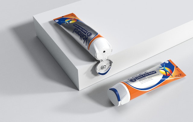
Design: Voltaren Easy Open Cap

Joint pain is one of the main conditions affecting the older population. Applying pain-relief gel is a daily necessity for sufferers, but the simple act of unscrewing a conventional cap, painlessly and without help, can seem impossible. The brief from Voltaren, the leading topical pain-management brand in Europe, was to rethink the common screw cap to meet the needs of its customers.
More than just another flip-top cap, it’s a genuine first for the category. Inclusive and versatile, it flips effortlessly. The cap accommodates different hand sizes, and its larger surface area, paired with a soft-touch material, reduces the pressure on joints. Strategic use of Voltaren’s blue clearly signposts how to open the cap.
The new cap has transformed the user experience for older people with high pain, empowering them to apply the gel independently when they need it. In usability testing, 65% of older customers preferred it. Its success reinforces Voltaren’s positioning as a dedicated, trusted expert in pain management.
What the judges said: A clear structural innovation, we were left wondering why no one had designed in this way before. Not only is it a clear opportunity, it is also designing for changing lifestyles and to improve quality of life.
Self-Promotion Design
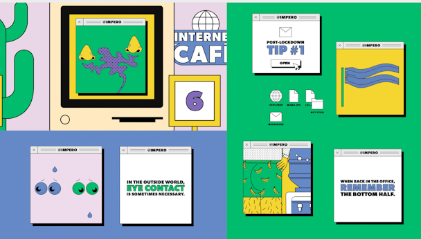
Agency: Impero
Campaign: The Impero Guide to Post-Lockdown Life
Impero wanted to freshen up the Covid-19 conversation with some positivity and humor. The Impero Guide to Post-Lockdown Life is full of light-hearted tips about returning to ‘normal-ish‘ after months locked down.
The team began by asking people to share concerns about life post-lockdown. Borrowing from the iconic style of ’90s pop-ups created a comforting, nostalgic look.
Fly posters were used to land the message, as well as starting conversations on social media. It then took the idea of pop-up advice to the next level, using AR to move it into the real world and virtually transforming locations around London. Pubs, beauty ads, offices and police stations became topical AR triggers.
Apart from the thousands of views and likes across LinkedIn and Instagram – and baffled interactions with the AR – Impero ended 2020 with 15 brand new clients, suggesting that The Impero Guide to Post-Lockdown Life was a roaring success.
What the judges said: Lighthearted, joyful, fun design in a moment that we all need it, AR element is innovative. Great to see self promotion serving greater good.
The full list of winners can be found on the website for The Drum Awards for Design.
To find out what events, awards shows and deadlines are coming up, visit The Drum’s new calendar.
