Advertisement

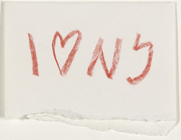
I ♥ NY concept sketch, 1976, by Milton Glaser / Image courtesy of MoMA
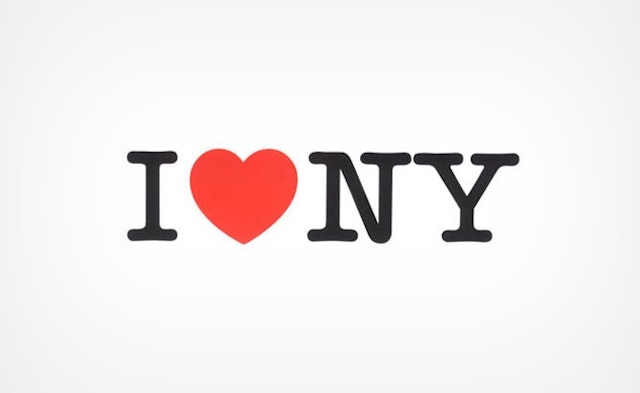
Of all the motifs in all of the world, I ♥ NY is a strong contender for the most far-reaching, the most replicated and the most recognisable. Proliferated across the globe, it is integral to the identity of the city it loves and is arguably the most famous work by its revered designer, Milton Glaser, who died in June of this year.
Emblazoned on merchandise the world over and the reason we punctuate messages to loved ones with an amorous emoji, the I ♥ NY logo has endured. Designed by the late Milton Glaser in 1976, its cultural impact in the years since has been momentous.
Serving as more than a mere brand logo for the Big Apple, the classic motif has become synonymous with New York City itself, and the tourist board that still owns its trademark and licensing.
Yet, as told to The Drum by designers who knew and continue to admire Glaser, while the I ♥ NY logo may be just one of his many influential designs, it speaks volumes about his wisdom and profound legacy.
Commissioned by the New York State Department of Commerce in 1976, I ♥ NY served as the logo for a wider campaign, ‘I Love New York’, which aimed to promote tourism in the city. At that time, New York City was facing bankruptcy in the wake of rising levels of inequality and subsequently high levels of dissent.
The logo, famously sketched by Glaser in red crayon in the back of yellow taxi, has a simple premise – by replacing the word ‘love’ with a heart, the verb becomes a visual and the sentiment speaks for itself.
Although as Don Smith, the former creative director and now founder of 1nhaler who first met his hero in 2013, tells The Drum: “What’s interesting about I ♥ NY as a piece of design work is that I don’t think it actually represents Milton that well.
“Historically, he was very much against the Swiss style of design that was made popular in the 50s and 60s and was more grid-like and structural. Push Pin Studios, and the colleagues that he worked with there like Seymour Chwast, were all interested in a more freehand, artistic style.”

Compared with Glaser’s other work, which includes bold and psychedelic designs on everything from Bob Dylan’s Greatest Hits to Mad Men posters, I ♥ NY is strikingly simple. But as the writer, designer and host of the Design Matters podcast, Debbie Millman, says: “It is, as Milton always described it, like a puzzle.
“When you create something that people are able to figure out fairly quickly, they feel really good about it. It creates a deep neural pathway in the brain. So it’s a word, a symbol and an abbreviation that, at first glance, gives you the opportunity to figure it out. And that then becomes embedded in the brain.”
There is a further secret to the motif’s success, says Smith, and that lies in the choice of typography. “The typeface is the same as a traditional American typewriter, so it looks like it was done by a person and not a big company. It has a humanity to it.
“I also think the reason it has been adopted on so many levels is the universality of this idea that people have an affinity for things. How many things do you love? He found a simple way to express that in a visual form, so it’s no wonder it became ubiquitous.”
So ubiquitous, in fact, that it is responsible for the heart emojis found on every digital keyboard. Every typeface created and used today incorporates the symbol into its signary. The legacy of the logo lives on in present day New York and continues to ring true even as the zeitgeist evolves.
As Millman says: “I think the affinity [for the design] has only grown in more recent times, from just after 9/11 and the reintroduction of the design in ‘I ♥ NY More Than Ever’ to now and the way that the design laid the foundation for our communication through emojis.”
In its present-day form, the I ♥ NY logo is perhaps best known for its appearance on the merchandise purchasable on virtually every corner in the city.
“The smart thing about it is that it works as beautifully in a square as it does horizontally, so it works on any kind of merchandise,” says Smith.
However, the logo itself is a registered trademark and service mark owned by the New York State Department, and all uses of I ♥ NY must receive permission before replication. Furthermore, the campaign has expanded since Glaser’s day to include not only the city of New York but the state in its entirety, including its 11 vacation regions.
Every use of the logo, therefore, is funneled back into the state’s tourism and hospitality funding, which continues to employ over a quarter of a million people in the five boroughs of NYC alone – approximately 1-in-11 workers.
For the first 10 years of its existence, however, the logo remained uncopyrighted in order to allow it to permeate the culture, and Glaser himself never saw a cent of the multi-million dollars now made from his design annually, having agreed to do the work pro-bono for the benefit of the state.
Yet affection for the motif has sustained and most would agree it remains very much a part of the visual language of the city.

“I think there are so few people whose work has created a visual language for the environment or who have helped define New York through a visual vernacular, that I don’t believe this will ever go away,” says Millman.
I ♥ NY isn’t the only example of the contribution Glaser made to the visual vernacular of the city, however, having also designed the masthead for the iconic New York Magazine, which he helped to found in 1968.
Recalling Glaser himself, Millman explains that he was someone “who truly enjoyed culture”.
“In fact, he not only enjoyed culture, he created culture. But I don’t think he would have been able to do it as effectively if he didn’t genuinely participate in it. He took enormous pleasure in beauty, whether it be through food and drink or his surroundings. He was a true example of how to lead a life filled with design.”
Indeed, Glaser is so often recalled as a man whose philosophies of design were very much in line with his philosophies of life. As Smith says: “The I ♥ NY logo might be his visual legacy, but there are millions of designers who have done incredible work and learned to express themselves clearly and lead fulfilling lives because of his teachings. And that’s the real legacy.”

Millman can attest: “Milton changed my life. He had an influence on my work and the path I’ve taken in life. I don’t know that I’d have had the life that I’ve had without him.
“I was his student in 2005 and took his summer intensive program at the School of Visual Arts. That class fundamentally changed the trajectory of my life... his guidance through the years, his honest feedback on my work, his counsel... it was really the centerpiece of my professional career.
“Milton was the type of person who, if you sent him something – a book or whatever – would send a handwritten note back. That was just the type of person he was.
“He was a gift. He was a gift to designers and he was a gift to the world.”
In a 2017 interview, the late Glaser recalled a conversation in which someone told him that in their language there is no way to say ‘I love you’, and that the phrase used in its place means ‘I see you’.
Glaser responded: “That’s it. Merely to see the person in front of you is as close as you’ll ever get to loving somebody because it means you have understood and accepted what you see.”
At a difficult moment in the city’s history, Glaser’s logo placed emphasis on loving something despite its flaws, and its enduring popularity throughout New York’s turbulent modern history is a testament to this.
When it comes to the heart in I ♥ NY, we don’t need to say ‘love’ to understand the sentiment. We need only to see it to feel exactly what it means.