Lays packaging set for first packaging revamp in over a decade
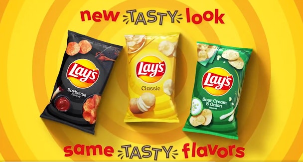
The familiar sight of Lay's crisp packets peering out from supermarket shelving is set for a shake-up after the snack brand confirmed it would be updating the pervasive packaging with a new look and logo – its first such redesign in 12 years.

Lays crisp packets set for first packaging revamp in over a decade
Rather than reinvent the wheel the PepsiCo-owned brand has opted for a subtle update to nudge the brand into the present without losing its glance recognition built up over the past decade.
New sleek look, same delicious taste. pic.twitter.com/8Nye8sBctb
— LAY'S (@LAYS) September 18, 2019
As such FritoLay has opted for a slightly smaller logo and tweaked font, repositioned to sit front and centre of each poke above a Sun-like orb and radiating rings following two years of careful thought.
To complete the change Lay’s have also produced new photography of their contents from a top-down perspective – a conscious nod to the rise of food photographers on social media.
Jon Guerra, senior director of design at Frito-Lay, said: “We wanted to convey with colour photography and a logo refresh that Lay's is a joyful and flavorful brand.”
The new look bags will emerge across the US and Canada in the first instance before appearing across global markets.
Lay's have previously been on a brand mission to spread smiles among snackers with The Marketing Arm.
Content created with:

Lay's
Find out more
