Advertisement

Graphic Standards
The colored bullets and stark Helvetica signs of New York’s transit network are now as synonymous with the city as its towering skyscrapers and steaming sidewalks. But the subway wasn’t always so unified in brand nor navigability.
The Drum visited the New York Transit Museum’s Changing Signs, Changing Times exhibition at the Grand Central Gallery to find out how design and designers turned the subway from a tangle of brands and tunnels into one of the most recognized visual identities of the modern world.
One month ago, on the hottest day of the year in New York, the city’s subway went into meltdown. Again.
Trains on a whopping six lines experienced delays simultaneously in every respective direction, while tourists in between the guidebook sites of Times Square and Grand Central Station were stranded as the shuttle train ground to halt.
The city-wide breakdown perfectly illustrated why so many hate to love the subway. Those who have ridden trains in other metropolitan systems (the hypermodern MTR of Hong Kong perhaps, or Moscow’s grandiose Metro) cannot fathom how the system in one of the wealthiest cities on the planet can simultaneously feel so iconic yet so out of control.
The answer to both lies in the New York subway’s history.
Unlike the centralized feats of engineering such as the London Underground, the system was, at one stage, comprised of tracks operated by three separate companies: the original Interborough Rapid Transit Subway (IRT), the Brooklyn–Manhattan Transit Corporation (BMT) and the Independent Subway System (IND).
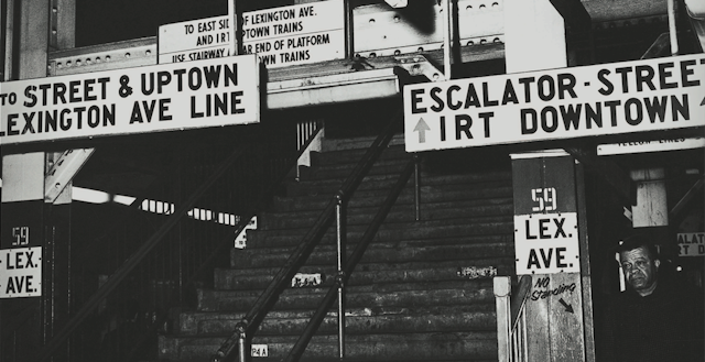
The signage of all parties was invariably flowery, wordy and hard to read. But to make matters worse, competition between the three meant each line had its own identity when it came to design, voice and communication. This crisis of visual clutter – to use a New Yorker phrase – should have lasted until unification in 1940, but continued for much longer.

The three-way tussle for customers is the reason today’s trains are named after a mixture of numbers and letters – the IRT ran with the former and the BMT and IND ran with the latter. Similarly, wayfinding information that linked all three systems, such as maps and designs, was virtually non-existent.
“Our system is very complicated – it’s made up of three companies built at cross purposes that were forced to play nice in 1940,” said the exhibit’s curator, Jodi Shapiro, referring to the unification that occurred between the companies just before the US entered World War II.
When the conflict was over, the manpower that once told passengers where to go in the form of ticket inspectors and train conductors had vanished, lost in and to the conflict. The city began to understand the value of design with regards to getting millions of people safely from A to B via a series of underground tunnels – but only after it had received enough pressure from the general public to change its mind.
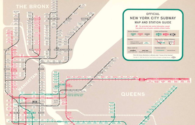
In the current exhibition, Shapiro refers to those who wrote letters describing their frustration with the system as “activists”. If these activists had a leader it was George Salomon, a graphic designer who, by 1957, had grown so tired of the inefficacy of the system (“the same station name used for multiple places” being a particular bugbear) that he submitted an entire redesign of the Subway’s map and nomenclature to the New York City Transit Authority (NYCTA), completely unsolicited.
“He basically said, ‘I can't take it any more’,” explains Concetta Bencivenga, the director of the New York Transit Museum. “So, he titles his project, ‘Out of the Labyrinth’ and just mails it to the Transit Authority.”

Now amenable to the prospect of a modern design – and anticipating huge changes about to occur to the layout of the underground network – the NYCTA opened its dilemma up to the public in the guise of the Subway Map Competition.
Raleigh D'Adamo and Stanley Goldstein’s concept of a color-coded track system was given the green light; in 1970, the European designers Massimo Vignelli and Robert Noorda of the agency Unimark International were appointed to recalibrate the idea into the direct ancestor of today’s subway map.
“Salomon's map is highly evocative of where Vignelli and Noorda ended up years later,” says Shapiro. “[His] proposal was, we think, passed along to [them].
“One of the things I wanted to show people with this exhibition is that unification of wayfinding and a branding system did not start with Vignelli and Noorda, although they’re the people that get a lot of the credit—the design was inspired by the ideas of Salomon, and all of those other people who wrote the Transit Authority."
The changes made thereafter to form the map we know and use in 2019 were nothing but practical. The water turned from beige to blue, Central Park grew in size, stations were positioned to more geographically accurate location and the lines lost their technicolor angularity.
For designers, the adjustments were nothing short of aesthetic blasphemy.
"There have been a number of well-documented crimes against American design heritage over the years," says Matthew Jones, partner and creative director at Accept & Proceed. "There was Nasa reverting back to the ‘meatball’ over the ‘worm’, and the forgettable reworking of Rand’s UPS logo, to name a few.
"But way out in front is the abandonment of of Vignelli’s original 1972 subway map for the subsequent plebiscite versions that have taken its place."
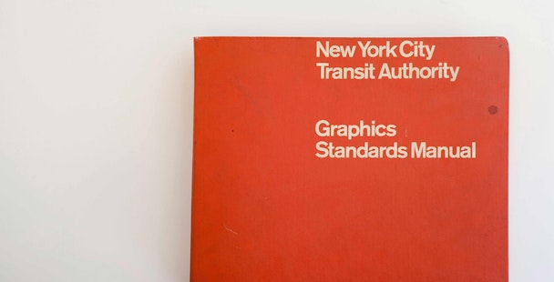
The Unimark map may now be out of use, but its designers' legacy is kept alive in the NYCTA Graphic Standards Manual.
Published in 1970, the weighty graphic bible was written to be more than just that: it still acts as a user experience roadmap, advising the staff on exactly when and where to present commuters with a sign, so that their decision-making process and consequent journey through the system became as foolproof as possible.

The Standards Manual also christened the modernist, sans-serif Standard typeface as the font of the subway. Standard was eventually replaced by Helvetica due to sign makers’ shift to digitization – although Shapiro, a purist for Standard, notes there are still some places on the subway network where Standard signage, not Helvetica, can still be found.
Vignelli and Noorda’s wayfinding design principles have remained in use for 50 years. They’ve withstood the grime and graffiti of the 80s, switching from black on white to white on black to avoid the paint of the spray can. They’ve been hurriedly printed onto temporary paper signage to direct New Yorkers when the World Trade Center towers came down and all sense of place was lost south of Tribeca.
Now they’re digitally displayed in 15 languages at subway stations across the city, and available to purchase on socks, mugs and even nail polish at the Transit Museum’s two outposts in Brooklyn and Midtown Manhattan.
Shapiro may be biased but believes the design of New York’s transit system is as bound up the city’s identity as the Statue of Liberty or the dollar pizza slice.
“You see Helvetica, you see the MTA ‘meatball’ [logo] and you see the subway bullet [service labels] and you immediately think of New York,” she says. “As far as a brand goes, I think it's one of the most recognizable on the planet.”
To Bencivenga, the subway design is the “quintessential New York story”.
“New Yorkers are not a shy and retiring bunch,” she explains. “One guy in the 50s is like, ‘I cannot take this any more – just do this instead', and mails a manual. And then, in the 60s, the Transit Authority says, ‘alright, you think you can do better? Cool, let’s have a contest’. It’s very New York.”
There are, Bencivenga, notes “a lot smart people – like Raleigh D'Adamo and George Salomon” who are more than happy to let the MTA know when it goes awry.
Perhaps now the second generation of designer activists are waiting in the wings, ready to mail their proposals when the system goes into meltdown once more.

Changing Signs, Changing Times: A History of Wayfinding in Transit is on view until 6 November at the New York Transit Museum’s Grand Central Gallery