‘Born in the California sun’: how Pentagram rebranded the 61-year-old Warner Records
A 15-year legal lockdown kept the independent Warner Bros Records from rebranding away from its former parent company. Now, the label has dropped the ‘Bros’ and unveiled a minimal, SoCal identity – the result of a year-long creative collaboration between the label and Pentagram.

Warner Records and Pentagram were inspired by the setting Californian sun
“They didn’t want it to be a shield, look like a shield or resemble anything remotely like a shield,” recalls Pentagram partner Emily Oberman.
The designer led an agency team on the rebrand of Warner Records, a company that had spent 61 years with the iconic WB logo in all of its flat, 3D and animated forms – 15 of those which were enforced by the legal terms of Time Warner’s 2004 sale, which restricted the brand from celebrating its independent status through branding.
The shield was famed and revered as a marque, but it was also “confusing” given its ties to Warner Bros Entertainment, Oberman said. So, one year ahead of the legal restrictions lifting, she and Todd Goldstein, Lorenzo Fanton and Matt Varner set to work creating an entirely new brand identity that would be just as iconic as its predecessor.
Pentagram worked particularly closely with the client on the project; Oberman gushes over the interest the label’s co-chairs, Aaron Bay-Schuck and Tom Corson, took in the design process.
“They were incredibly giving of their time and experience and really clear about the direction they wanted to take the label in,” she said. This isn’t surprising; the duo’s arrival at the company in 2018 roughly coincided with a move to a new headquarters in downtown in LA and the resignation of former chief executive Cameron Strang, so a rebrand signified a stake in the ground for them as much as the brand.
“For the first time in the label’s history, we’ve had the opportunity to create a distinct, modern identity entirely of our own,” they said in a statement. “The timing couldn’t be better, since we all feel the label is at a moment of reinvention that builds on our legacy, while moving into a future driven by fearlessness and creativity."

Oberman’s team spent months conducting interviews at the company to educate themselves in the history of the brand. The highlight of the process however, was getting to spend a day at the Warner Archive – a hangar packed with original recordings, artwork, photography and other miscellaneous memrobilia.
“It was like diving into this pool of amazing creativity, probably one of the best days of my life,” said Oberman. “It helped us really understand the personality of Warner Records through the years, how they’ve been this big label with so much personality in everything they do. They used to publish these funny, smart internal magazines, for instance – beautifully designed and quirky and funny and personal.
“We learned about this big, legendary label that they dealt with everything on an extremely personal level.”
This was the idea for “the germ and genesis” of the refreshed brand statement – a mega label that can sell out a stadiums but also make something great with the most unknown of artists.
“That’s the duality we found in Warner Records: born in the California sun, and at home everywhere on earth.”
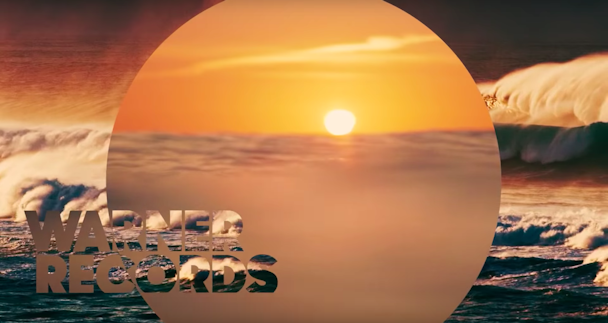
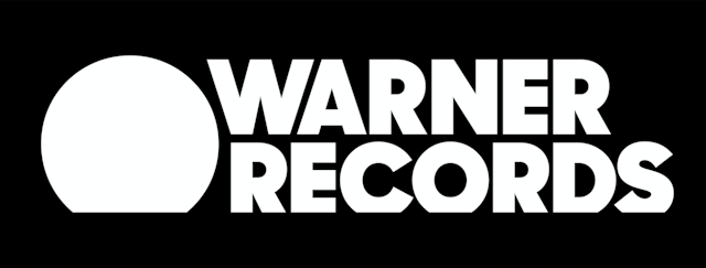
The final identity hinges of a clean circular icon, which represents the record label’s vinyl heritage, the globe at large and the sun setting over the Pacific.
“The idea of having an icon be able to be just a circle with a little slice taken off the bottom seemed so clean and simple,” said Oberman. “It’s the most pared down representation that we could think of. It’s like that old Coco Chanel quote – ‘Before you leave the house, look in the mirror and take one thing off’ – it’s that version of an icon to me, as simple as it could possibly be.”
It may be a circle but the logo is also a sponge, too – one that can seamlessly soak up any colour, platform, artist, animation or space. Norman Wonderly, Warner Records’ executive vice-president of creative, has already “taken this identity and run with it”, according to Oberman.
“The strength of any identity always comes from what you do with it,” she said. “I hope that what we do doesn’t look like it just came out of any agency.
“What everyone at Pentagram stands for is the idea that everything has an idea. It’s not an algorithm that created this. We like to know the depth of what something is and was and can be.”

