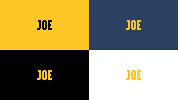
Joe updates logo to reflect the recent growth of the brand
Digital publisher Joe Media has unveiled a new logo and identity as the brand looks to deliver a more coherent look across its numerous sub brands.

Joe
The company, founded in 2010 by Irish entrepreneur Niall McGarry, has largely held the same identity for the last decade. Its look has been updated by an in-house team to run better on mobile and evolve to better reflect the intent of the company.
In particular, it has expanded from Joe Media to also encapsulate verticals such as Football Joe, Sports Joe, Politics Joe, Comedy Joe, MMA Joe, Fit Joe and Rugby Joe. As a result, it required an identity that can better adapt across numerous platforms and audiences.
Rebecca Fennelly, head of brand and communications, told The Drum: “The new design reflects our heritage as much as it does our growth, evolution and big ambitions for the near future. We are still the same Joe – same mission, values and personality. We want to enrich lives by entertaining and inspiring through our original content. We still pride ourselves on our continuous investment into legacy journalism and modern-day storytelling. But we are always innovating.
“It is something we’ve become known for. When it comes to new logo designs, there tends to be knee-jerk assumptions made that they mean a 'rebrand' or a move away from a previous identity. When others may need to change up shop in big ways, Joe is building on something we’ve been working hard on from day one. ‘Brick by Brick’ as we say here. We are very proud of our roots and the distinct brand heritage we’ve built for Joe, and it is all enveloped into the carefully calculated subtleties of the new logo design."
The project was led by Joe’s head of design Jack Homan, having previously worked at Channel 4 and Channel 5, and was delivered by an in-house team.
On the work, Homan said: "Breaking out from Joe’s old box means we can be more playful with our logo. For big editorial and commercial features we’ll look to build bespoke artwork featuring our logo, using the word-mark itself as the boundary box. The old Joe logo was boxed in, we wanted to break out and let the typography speak for itself.
"The logo now has a balance that the old did not. The ‘J’ and the ‘E’ are the same width. The aperture of the ‘O’ is the same size as the top bar of the ‘J’ and the middle appendage of the ‘E’. Turn both the ‘J’ and the ‘E’ in on themselves and they will meet in the middle of the ‘O’. This balance allows us to more easily lock our new logo up with commercial partners and our sub-brands."
He concluded: "Whilst a lot of work went into this new design, it was important we didn’t move too far from our original logo, but rather embrace the best of it in the new iteration.
Late in 2018, The Drum sat down with the title's, head of content Evan Fanning, to learn about how it is scaling up promising talent in order to take on more-established media players.
He said: "Going to a place like Joe with the freedom to attack things without the newspaper deadweight was really exciting. We say we do ‘traditional media, but digitally’."

