Mastercard CMO Raja Rajamannar on why the brand dropped its name from its logo
Mastercard's chief marketing officer Raja Rajamannar has explained the thinking behind the global payment provider's fresh look, explaining why a picture is worth more than words in the digital era.

The shift marked the culmination of 20 months' intensive market and field research / Mastercard
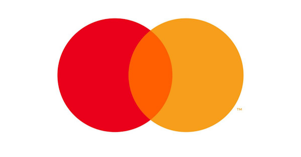
Announced yesterday during the CES tech conference in Las Vegas was the decision to expunge the Mastercard name from the brand's famous intersecting circles logo.
The shift marked the culmination of 20 months' intensive market and field research to gauge reaction from consumers, merchants and banks.
Speaking to The Drum's editor-in-chief on the ground in Las Vegas, Rajamannar said: “Today is probably one of the most important days for our brand. After 50 years we are dropping the name Mastercard from our logo altogether. That’s a huge move for us.”
Outlining the rationale behind the change Rajamannar said: “As consumer interaction with devices changes the real estate in digital is coming down dramatically. So it’s important to show up in a prominent way to attract attention on the one hand and on the other to make the right impact.
“Our brand is very attractive and has a high level of recognition around the world but how do we take it to the next level?
“In the given real estate for a smartwatch or a smartphone, the space available is not big and to have 10 characters for Mastercard competing with - or in relation to - the two interlocking circles. If you take off the name and occupy the whole space with red and yellow interlocking circles the visibility is more prominent."
He added: “Consumers now see the brand as being more contemporary and modern, but most importantly the brand is equally relevant and inspiring for our 2 billion Mastercard consumers.”
The Mastercard logo was last overhauled in 2016 with the unveiling of a simplified design by Pentagram.
You can watch the interview in full below.
Content created with:

MasterCard
Find out more
