Mastercard removes name from circles logo in an act of digital ‘simplicity’
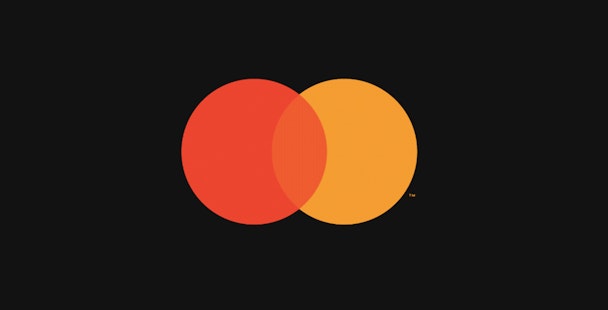
Mastercard, the brand best known for its credit cards, has removed its name from its intersecting circles logo for the first time since its 1968 creation.

Mastercard removes wordmark from logo
The red and yellow Mastercard symbol will now stand alone without the wordmark across all digital and physical communications, including sponsorship properties and retail locations.
The brand said in a statement that the ‘flexible, modern design’ will allow the mark better across digital media.
Raja Rajamannar, chief marketing and communication officer at Mastercard, hinted the change was on the horizon back in 2017.
Today he noted that “more than 80% of people” recognize the symbol without the brand name, according to its research.
“Reinvention in the digital age calls for modern simplicity,” he said, adding the company “felt ready to take this next step in our brand evolution”.
“We are proud of our rich brand heritage and are excited to see the iconic circles standing on their own.”
Mastercard made the announcement at the Consumer Electronics Show (CES) in Las Vegas, which officially opens tomorrow (8 January).
The move sees the brand join the likes of Nike, Apple and Lacoste, which have nurtured their logos to stand alone without wordmarks. It also follows in the footsteps of Formula 1, which reworked its logo last year for the digital age.
A visual history of the Mastercard logo
1967

A federation of bankers launches The Interbank Card Association (ICA) in Buffalo, New York. They adopt a monochrome ‘i’ for their logo.
1968

The ICA adopts the catchier moniker of ‘Master Charge: The Interbank Card’ and unveils the first interlocking circles in red and a dusty ochre. The ‘i’ symbol is still included in the bottom right-hand corner for purposes of continuity.
1979-1980

Master Charge becomes Mastercard, and the ‘I’ symbol disappears from the logo.
1990

The ochre circle is replaced by a brighter yellow and the sans serif wordmark is italicised. A total of 23 bars lock the circles together.
1996

In true 90s fashion, a drop shadow is added to the text. The interlocking bars diminish in number.
2016

A highly simplified version of the logo is unveiled by design agency Pentagram. Like the logos of digital brands such as Airbnb and Facebook, it features flat colours and lowercase lettering, while the interlocking lines between the circles have been smoothed over.
2018

Mastercard proves its confidence in the logo’s ubiquity by removing its name.
Content created with:

MasterCard
Find out more
