Advertisement

Time Out main
It was 50 years ago today (well, almost) that Time Out magazine began life on a kitchen table in London. The company has since fluctuated with the publishing landscape to become more than a mag, yet its covers still remain graphic, confident and true to the cities it serves.
Time Out’s first ever issue from August 1968 made a dark and slightly mysterious first impression. Founder Tony Elliott, then just 21 years old, folded an A2 sheet into an A5 booklet and printed a publicity shot from the ‘Cybernetic Serendipity’ exhibition onto a black background for the first ever cover.
“It didn’t stereotype Time Out as a hip music or fashion magazine,” he recalled. “It felt completely right.”
It was a bold choice, but one that shaped the cover style in the years that followed. Caroline McGinn, Time Out’s global editor-in-chief, noted that the best front pages featured in Time Out’s current exhibition “are not really about a particular editor or art director or star imposing a look” but are united in their purpose: to capture a cultural, urban moment in time.

“There aren't a lot of ‘slebby’ shoots: Time Out covers are a window on the city and its cultural moment – and they have a strong message and frequently a puckish sense of humour,” she told The Drum. “They're much more diverse than most mag covers but that's what they have in common.
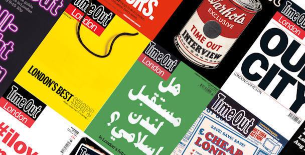
“Also – this sounds nerdy but it's true – Time Out's font, Franklin Gothic, is so strongly associated with the brand, and it's a fantastic font for big statements like the #ilovelondon cover, which Time Out did to bring the city back together after the London riots.”
The #ilovelondon cover, published as the shattered window glass of 2011 was swept away, spawned a movement of its own to counteract the demonization of London’s youth. It forms part of a venerable miniseries of Time Out covers that addressed moments of upheaval head-on: stark lettering declared ‘Our City: London Carries On’ in the aftermath of the 7/7 bombings while a two-fingered salute went out to the late Winston Churchill – controversially – on what would have been his 100th anniversary.

The June 2007 issue was another to feature the familiar bold text – but this time it was typed in Arabic. Gordon Thomson, editor from 2004-2009, wanted to make a statement on the importance of London’s Islamic community as fears over extremism continued to rise.
“Looking back, I’m not sure we got it right,” he said. “It was definitely the worst selling issue during my editorship.”
McGinn no longer has to worry about issue sales: the Time Out switched over to a freesheet model in September 2012. The first free mag was, again, marked with a bold, typographical cover: ‘Take Me, I’m Yours’ printed over a background of brand’s signature red.
Has the removal of a cover price changed how important Time Out’s covers are, given that they no longer need to stand out on shelves?

“I'm not sure many mag covers really do stand out on the stands,” said McGinn. “It's definitely a different game and mode of distribution. I think some editors of paid-for publications are envious of the freedom that you have when you don't feel like you have to stick a big aspirational picture of a woman and a load of cover lines on the front every week.
“With free distribution, the window of choice is even smaller than it is for a newsstand browser – commuters will glance for less than a second, and what informs their choice is the brand.”
Yet she believes that an eye-catching, impactful cover “definitely” contributes to pick-up rates. “For a paid-for magazine, you have to get people to the till. In a freemium mag, you have to engage people in a super-crowded attention stream. I think free mags have to think about design much more holistically and make a magazine that can be enjoyed in 60 seconds or 60 minutes.”
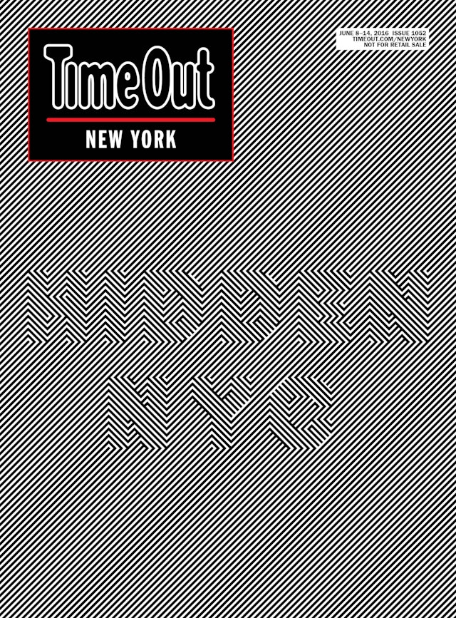
Still, when McGinn sets her pragmatic understanding of modern publishing aside she admits a special fondness for Time Out’s art covers (Banksy, Tracey Emin and the Chapman Brothers have all contributed to the front page alongside up-and-coming London artists), as well as “intelligent, optically weird covers” such as the New York’s ‘Hidden NYC’.

“I'm also really looking forward to the international family of covers which are coming out all over the world to celebrate Time Out 50,” she said. “With Time Out, the concept is global but the execution is local, and I think these will really reflect the global identity of the brand, as well as its local, authentic specificity wherever it is.
“From a wonderful typographic cover in London featuring 50 iconic cultural moments of the last 50 years, which our head of design EMEA Tom Havell commissioned, to a futuristic Bangkok cover where a kid is gazing up in VR goggles at the next 50 years, it makes me very excited and proud to see how far it's come and how far it has to go.”